| Image |
Comment |
| 03/25/2004 01:36:08 PM |
|
 Photographer found comment helpful. Photographer found comment helpful. |
| 03/17/2004 05:57:40 PM |
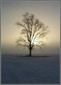
Into The Blueby gandersComment: I like this shot. I like the way the vertical line is parallel to the frame on the right, rather than in the centre like it usually is in these types of shots. It gives it something a bit more unique which is good. I think in post-processing you should have added a little more contrast as it seems a little flat at the moment. Its a shame that the bird isnt sharper. It's kinda the focal point, being on a 3rd line, and breaking the clear sky, but the fact that it is blurred spoils it unfortunatly. |
| Photographer found comment helpful. |
| 03/17/2004 05:49:39 PM |
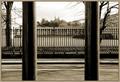
.by KaveyComment: I really like this shot. The 2 main paralell lines separate the image into 3 nice parts with the 2 edge ones being very similar. The repetition of them further away across the other side of the road works really well as it puts them into context. I think it looks slightly off balance tho, the right section being a bit smaller than the left. It might be the same size but it looks different, probably because of the tree. I think the sepia tone works well, along with the border. |
| Photographer found comment helpful. |
| 03/17/2004 01:34:25 PM |
|
| 03/17/2004 01:31:03 PM |
|
| Photographer found comment helpful. |
| 03/09/2004 11:47:32 AM |
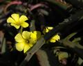
Silk & Thornby steoComment: Critique Club
Hi. I'll start by pointing out a couple of reasons why I don't think this broke the 5 score barrier.
1) The focus seems soft.
Sometimes it can work, but here I think it is too subtly out of focus to look like it is meant to be. It may just have been soft from resizing down to 640x513 without applying unsharp-mask, in which case a quick USM would do the job. Most of the time, DPChallenge voters like a photo to be perfectly crisp, that's just the way it goes.
2) It's a flower shot.
Flower shots are the most hates of cliché's on this website, after kids. Some people see a flower and automatically vote it down without looking for it's qualities. As your connection to the Conflict challenge seems to me to be quite weak with this photo, even with the thorn, I expect many people voted you down for that.
I think this photo could also be improved by cropping in closer on the flower by the thorn, and leaving out all the dark black area around the edge which seems to have no purpose. This would make more yellow so the photo would be more appealing to the general audience. |
| 03/07/2004 11:04:44 AM |
|
| Photographer found comment helpful. |
| 03/07/2004 11:04:20 AM |
|
| 03/07/2004 11:04:13 AM |
|
| Photographer found comment helpful. |
| 03/07/2004 11:03:43 AM |
Silence!by kosmikkreeperComment: Excellent photo. It has that 'kosmikkreeper-style' to it, which means it will probably place :) - 10 |
Home -
Challenges -
Community -
League -
Photos -
Cameras -
Lenses -
Learn -
Help -
Terms of Use -
Privacy -
Top ^
DPChallenge, and website content and design, Copyright © 2001-2026 Challenging Technologies, LLC.
All digital photo copyrights belong to the photographers and may not be used without permission.
Current Server Time: 07/26/2026 05:40:14 PM EDT.