| Image |
Comment |
| 10/01/2004 10:47:42 AM |
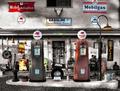
Gasolineby GringoComment: Woah, selective desaturation to the max! That or its a very colorless building. Either way, I think the shot is too busy. It's nice that there is a lot to look at and keep interest, because I keep spotting new things, but as a photo overall it just seems to cluttered. 6 |
 Photographer found comment helpful. Photographer found comment helpful. |
| 10/01/2004 10:46:08 AM |
The Kozakby smokeditorComment: The DoF does well to blur out the background. It would have been nice to get some catchlights in his eyes (or drawn them in during post processing) just to give the shot a little more emotion. 6 |
| Photographer found comment helpful. |
| 10/01/2004 10:45:19 AM |
Parrot Portraitureby buzzrockComment: The white part on the face looks a little blown out to me, but other than that, its a nice photo with good vibrant colours and sharp detail. 7 |
| Photographer found comment helpful. |
| 10/01/2004 10:44:29 AM |
Ethan, Dirty Face and Allby smellyfish1002Comment: This is a really good candid portrait. I really love the high contrast and the shallow DoF. The slightly off-centre composition is good and the expression tells a story :) 9 |
| Photographer found comment helpful. |
| 10/01/2004 10:43:47 AM |
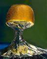
The Splash of a Kiwiby terjeComment: This is really nice, clear, and sharp, but it does show some signs of bad editing, specially the glow around the kiwi, which is a shame because it spoils the photo for me. 6 |
| Photographer found comment helpful. |
| 10/01/2004 07:51:23 AM |
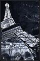
Paris, Las Vegasby Pep VentosaComment: I would be interested in seeing this in colour, but as it is, it has an interesting composition with leads the eye around effectively. 7 |
| Photographer found comment helpful. |
| 10/01/2004 07:50:27 AM |
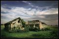
The Ruinby e301Comment: I would have liked to see this a little sharper and with a little more contrast in the tonality, but it's a really nice shot. 9 |
| Photographer found comment helpful. |
| 10/01/2004 07:49:53 AM |
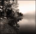
Misty Morningby jodiecostonComment: I like the toning, but it looks like you dodged the sky after toning it. I say that becayse there is a yellow halo around the white part of the sky, which doesnt match the toning in the rest of the photo. Normally I re-tone photos after I use dodge or burn to match up all the tones again. I might be wrong and you didn't do that, and if so, call me an idiot and ignore this comment :P Its a good photo with a nice composition and a nice hazy dreamy feel. 7 |
| Photographer found comment helpful. |
| 10/01/2004 07:47:34 AM |
"Back" Cover Girlby DougPazComment: Clever shot. You got the faces to line up really well! I think a more interesting chair and background would help the photo tho, it looks a bit snap-shotty at the moment, in my opinion. 5 |
| Photographer found comment helpful. |
| 10/01/2004 07:46:32 AM |
Interludeby PedroComment: I really like the toning and the contrast. The DoF is used to great effect too. We can see he is still on the street but it isn't distracting us :) 9 |
| Photographer found comment helpful. |
Home -
Challenges -
Community -
League -
Photos -
Cameras -
Lenses -
Learn -
Help -
Terms of Use -
Privacy -
Top ^
DPChallenge, and website content and design, Copyright © 2001-2026 Challenging Technologies, LLC.
All digital photo copyrights belong to the photographers and may not be used without permission.
Current Server Time: 07/28/2026 01:54:53 AM EDT.