| Image |
Comment |
| 11/10/2004 08:33:42 AM |
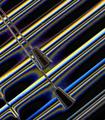
Window Blindsby wlevyComment: I'm really not keen on the post processing, and thinks it takes away from what could have been a great B&W photo. |
| 11/10/2004 08:31:53 AM |
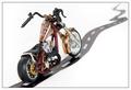
Chopper Rideby BrenbComment: I like the DoF. The road seems a bit too small for the bike, hehe :) |
 Photographer found comment helpful. Photographer found comment helpful. |
| 11/10/2004 08:31:28 AM |
|
| Photographer found comment helpful. |
| 11/10/2004 08:31:11 AM |
Jointedby ellulsComment: Seems to be tipping to the right a bit, which is distracting. The DoF is good, but I'd like to see more contrast in post processing to really bring out the rusty colours. |
| Photographer found comment helpful. |
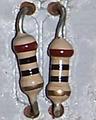
| 11/10/2004 08:30:24 AM |
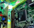
Micro technologyby piratao2Comment: Good shot, but would be better if you made it bigger to fit the 640 pixel limit so we can see more detail. |
| Photographer found comment helpful. |
| 11/10/2004 08:29:40 AM |
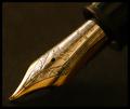
On The Dotted Lineby WarbyComment: Excellent macro shot. The lighting is great, as is the detail captured and the DoF. |
| Photographer found comment helpful. |
| 11/10/2004 08:29:12 AM |
|
| 11/10/2004 08:25:58 AM |
|
| Photographer found comment helpful. |
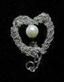
| 11/10/2004 08:25:18 AM |
An Oyster's Prideby spencewComment: If you use the full 640 pixel limit we'd be able to see much more detail in this shot and vote it higher. Its too small now. |
| 11/10/2004 08:24:39 AM |
|
| Photographer found comment helpful. |
Home -
Challenges -
Community -
League -
Photos -
Cameras -
Lenses -
Learn -
Help -
Terms of Use -
Privacy -
Top ^
DPChallenge, and website content and design, Copyright © 2001-2026 Challenging Technologies, LLC.
All digital photo copyrights belong to the photographers and may not be used without permission.
Current Server Time: 07/28/2026 10:57:33 AM EDT.