| Image |
Comment |
| 11/10/2004 09:50:21 AM |
|
 Photographer found comment helpful. Photographer found comment helpful. |
| 11/10/2004 09:49:54 AM |
|
| Photographer found comment helpful. |
| 11/10/2004 09:49:04 AM |
|
| Photographer found comment helpful. |
| 11/10/2004 09:48:28 AM |
Turkshead Knotby nsmithComment: The detail here is good, but there isn't really a focal point for my eyes to rest on. |
| 11/10/2004 09:45:31 AM |
At The Readyby BigMoComment: I really like this shot, its very interesting and the composition is good. B&W would have looked better though in my opinion. |
| Photographer found comment helpful. |
| 11/10/2004 09:44:42 AM |
Curlicueby nicolepComment: A less shallow DoF would put everything in focus, which I think would have looked better. ALso, it would have been good if you could avoid the shadows on the background. |
| 11/10/2004 09:44:02 AM |
Complex Carvingby sndsgnl1Comment: The harsh shadow is very distracting, and the composition is too centered in my opinion. |
| Photographer found comment helpful. |
| 11/10/2004 09:42:29 AM |
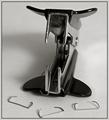
JAWSby gaurawaComment: Very good DoF and an interesting photo. I thought it looked like an evil moster or something before I looked at the title, so you succeeded in your message. The only thing I think is wrong is that the middle staple is too close to the edge of the frame. |
| Photographer found comment helpful. |
| 11/10/2004 09:40:43 AM |
Lock and Keyby webkingComment: I think there is too much empty space on the right compared to the left. A different angle might have made the composition better. |
| 11/10/2004 09:39:40 AM |
Expressionby PeterhennComment: I think the DoF is good, but the white balance is wrong and makes the person look ill. Also I think the eye is too centered. |
Home -
Challenges -
Community -
League -
Photos -
Cameras -
Lenses -
Learn -
Help -
Terms of Use -
Privacy -
Top ^
DPChallenge, and website content and design, Copyright © 2001-2026 Challenging Technologies, LLC.
All digital photo copyrights belong to the photographers and may not be used without permission.
Current Server Time: 04/13/2026 01:26:31 PM EDT.