| Image |
Comment |
| 11/13/2004 08:54:48 AM |
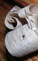
Wood Shavingsby doveyComment: This would look a lot better with a close crop so we cant see the wood in the background, and also in B&W. |
| 11/13/2004 08:54:25 AM |
the key to proceedby SandymayaComment: The harsh shadow is distracting, looks like you just used the flash. Try lighting from different angles if possible. |
 Photographer found comment helpful. Photographer found comment helpful. |
| 11/13/2004 08:53:53 AM |
Weather and Noiseby SkipComment: Excellent DoF and composition. I'm unsure how the title related to the photo but that doesn't matter. Good shot. |
| Photographer found comment helpful. |
| 11/13/2004 08:53:28 AM |
|
| Photographer found comment helpful. |
| 11/13/2004 08:53:11 AM |
|
| 11/13/2004 08:52:56 AM |
Mmmmmm!!! Limey!by RatedRComment: The 2 colours go well together but I think there is too much red space. I would have cropped a bit closer. |
| Photographer found comment helpful. |
| 11/13/2004 08:52:03 AM |
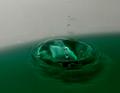
Drip, Dropby nakedtoadComment: If the green carries on through the whole photo this would be even better, the colours in the splash are great. Nice and tropical :) |
| Photographer found comment helpful. |
| 11/13/2004 08:51:27 AM |
LOOK DAD I WON A RIBBON!by SDWComment: I really dont like your choice of border colour. A subtle black or white would have worked much better in my opinion. |
| Photographer found comment helpful. |
| 11/13/2004 08:46:33 AM |
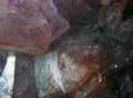
my favorite rockby lightningComment: The abstract shapes are good but the lighting is too flat and the contrast is almost non existant. The subject has a lot of potential but it's up to you to release it all. |
| 11/13/2004 08:45:47 AM |
|
Home -
Challenges -
Community -
League -
Photos -
Cameras -
Lenses -
Learn -
Help -
Terms of Use -
Privacy -
Top ^
DPChallenge, and website content and design, Copyright © 2001-2026 Challenging Technologies, LLC.
All digital photo copyrights belong to the photographers and may not be used without permission.
Current Server Time: 07/27/2026 07:39:07 PM EDT.