| Image |
Comment |
| 01/16/2006 09:48:38 AM |
Salvation Brassby cislanderComment: I think you should have used a bigger size to let us see all the interesting-looking detain in the reflection of the bell. |
 Photographer found comment helpful. Photographer found comment helpful. |
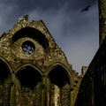
| 01/16/2006 09:48:12 AM |
Rock of Cashelby jayrodComment: Excellent shot! I love the mix of the 2 main colours, and the bird is a great added touch. Nice high-contrast processing too. |
| Photographer found comment helpful. |
| 01/16/2006 09:47:26 AM |
Monumentby nicoledbComment: Looks like there is a bit of camera shake from the low-light, but I'd have thought an application of USM could sort that out. I like the colours all being around the same brown tone, however I think the photo needs a bit more contrast to give it extra impact. |
| Photographer found comment helpful. |
| 01/16/2006 09:44:02 AM |
Lonelinessby PainielComment: I'm not a fan of the very strong grain here, but the composition is interesting. I think it could do with being a bit brighter too, as the colours and contrast are currently a bit dull. |
| Photographer found comment helpful. |
| 01/16/2006 09:43:07 AM |
|
| Photographer found comment helpful. |
| 01/16/2006 09:40:56 AM |
Cheers!by debitiptonComment: The expression on the dogs face is so cute! I really like the composition and the white background is very well done. |
| Photographer found comment helpful. |
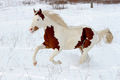
| 01/16/2006 09:21:28 AM |
Winter Runby loriprophotoComment: Really nice shot! Great exposure in difficult conditions, specially with such a light coloured horse too! I think I would have left a little more space on the left for the horse to leap into compositionally-wise though. |
| Photographer found comment helpful. |
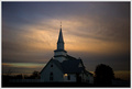
| 01/16/2006 09:20:09 AM |
St. John's Lutheranby undieyatchComment: I think this is a bit grainy - maybe a light application of neatimage could fix it? Ignoring the grain, I really like the lighting and centered composition. |
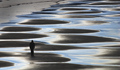
| 01/16/2006 09:19:21 AM |
Crossingby AndelainComment: Excellent patterns in this shot, and the figure adds the extra focal point it needs. Really nice shot. |
| Photographer found comment helpful. |
| 01/16/2006 09:18:42 AM |
Scenic_Munnaarby laindComment: I think if you had used the full 640px limit we could see the detail in this better. It also seems to be rotated too much to the left. |
Home -
Challenges -
Community -
League -
Photos -
Cameras -
Lenses -
Learn -
Help -
Terms of Use -
Privacy -
Top ^
DPChallenge, and website content and design, Copyright © 2001-2026 Challenging Technologies, LLC.
All digital photo copyrights belong to the photographers and may not be used without permission.
Current Server Time: 07/24/2026 09:26:56 PM EDT.