| Image |
Comment |
| 12/09/2008 12:13:21 AM |
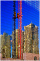
Constructionsby KincaHUNComment: there are too many contrasts here, the colors seem super saturated, and the wavy reflections against the solid brick is to polarizing for me |
| 12/09/2008 12:12:18 AM |
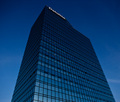
All the way by Ragga2000Comment: simple clean and neat. I love the cool color all the way through. My only issue (and one you cant do much about) is the building name at the top i find distracting. |
 Photographer found comment helpful. Photographer found comment helpful. |
| 12/09/2008 12:11:23 AM |
Straightedgeby gunsmith6Comment: Im not a fan of religious photos, but that aside there are artifacts all over the background area, looks like you didnt bother to do any clean up with your post processing. the reds are too harsh and look out of place like the top layer was just put on the cross as an after thought. this is just not doing anythign for me. |
| Photographer found comment helpful. |
| 12/09/2008 12:09:43 AM |
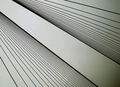
Bridge Linesby tigmoComment: this shot is not doing much for me. i like the angles, but the grey tones with the black, it looks more like digital art than photography. |
| Photographer found comment helpful. |
| 12/09/2008 12:09:00 AM |
|
| Photographer found comment helpful. |
| 12/09/2008 12:08:30 AM |
|
| Photographer found comment helpful. |
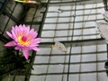
| 12/09/2008 12:07:59 AM |
Conservatory of Flowers by leslie84Comment: Its a beautiful flower and I like the colors, and the reflection in the water works, but there are many distracting elements such as the piece emerging from the water the plants on the top abd right side should be cropped out. |
| 12/09/2008 12:06:52 AM |
Awaiting the Fashion Showby superwoman6233Comment: nice take on this challenge topic. I find the lighting ackward though. Its bright immeadiately at the front but dropps off on the 2nd chair... must have been the cameras flash, this really needed additional lighting. |
| 12/09/2008 12:05:36 AM |
|
| 12/09/2008 12:05:03 AM |
the lines of the bridgeby chimaeraComment: thats some bridge, the only thing that is really bothering me is the bright yellow on it when the rest is so muted, perhaps b&w would have worked better for this shot |
| Photographer found comment helpful. |
Home -
Challenges -
Community -
League -
Photos -
Cameras -
Lenses -
Learn -
Help -
Terms of Use -
Privacy -
Top ^
DPChallenge, and website content and design, Copyright © 2001-2026 Challenging Technologies, LLC.
All digital photo copyrights belong to the photographers and may not be used without permission.
Current Server Time: 07/17/2026 10:28:47 PM EDT.