| Image |
Comment |
| 09/05/2007 11:35:04 AM |
|
 Photographer found comment helpful. Photographer found comment helpful. |
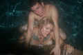
| 09/05/2007 11:34:35 AM |
Sports Illustrated Swimsuit Editionby trnqltyComment: Hey, nothing wrong with this babe :) Still not quite what I would see in SI, they usually go with warmer tones and blown backrounds, more closeups of the models but this is pretty good. I don´t really like the pose though, it isn´t really flattering. |
| Photographer found comment helpful. |
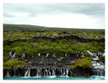
| 09/05/2007 11:24:52 AM |
Lava Fallsby ArnaRosComment: Hey, I know this place :) Sky is a bit blown though, could stand to be darker. |
| Photographer found comment helpful. |
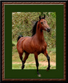
| 09/05/2007 11:17:54 AM |
Stepping Outby karenkComment: Yeah, sure is but I am actually not really liking that part of the photo, I think the choice of green in the frame is what kills it, had you selected white it just would have looked cleaner and more realistic. |
| Photographer found comment helpful. |
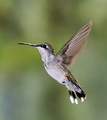
| 09/05/2007 11:16:57 AM |
Lady Hummerby wetlandComment: Not bad but compared to the yellow ribbon winner in "speed II" this doesn´t really stack up in regards to image quality. |
| Photographer found comment helpful. |
| 09/05/2007 11:16:10 AM |
I can see into your soul.by TacTZillaComment: What I like least about this photo is the eyes, in particular the lack of catchlights in them, makes them seem, well not dead, but they would have been so much more interesting and "alive". |
| Photographer found comment helpful. |
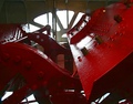
| 09/05/2007 11:15:00 AM |
The Old Paddle-Wheelby bjoernComment: Sorry but there is absolutely nothing interesting about this photo, to me this is just a snapshot of something you came across this month. Gave a 3. |
| Photographer found comment helpful. |
| 09/05/2007 11:14:18 AM |
|
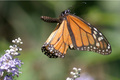
| 09/05/2007 11:12:30 AM |
Butterfly in Flightby mar10029Comment: Great that you caught it in flight but that doesn´t change that the focus is off, hence I gave a 4. |
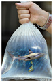
| 09/05/2007 11:12:04 AM |
Foundby HighNoonerComment: Great idea but I would have skipped adding "nemo" to this shot as he is not nearly as well masked as the shark and the lighting on him doesn´t really fit with this image if that shark was on top of him. Gave a 6, would have given better if the execution of this great idea had been better. |
| Photographer found comment helpful. |
Home -
Challenges -
Community -
League -
Photos -
Cameras -
Lenses -
Learn -
Help -
Terms of Use -
Privacy -
Top ^
DPChallenge, and website content and design, Copyright © 2001-2026 Challenging Technologies, LLC.
All digital photo copyrights belong to the photographers and may not be used without permission.
Current Server Time: 07/24/2026 11:04:36 PM EDT.