| Image |
Comment |
| 03/19/2007 04:51:01 AM |
|
 Photographer found comment helpful. Photographer found comment helpful. |
| 03/19/2007 12:13:47 AM |
Red Lightby yankoComment: Hmmmmmmmmmmm.............right...red scores well again....now will ya listen to me Richard? |
| Photographer found comment helpful. |
| 03/19/2007 12:13:08 AM |
|
| Photographer found comment helpful. |
| 03/19/2007 12:12:35 AM |
|
| Photographer found comment helpful. |
| 03/19/2007 12:04:22 AM |
|
| Photographer found comment helpful. |
| 03/19/2007 12:03:56 AM |
|
| Photographer found comment helpful. |
| 03/19/2007 12:03:34 AM |
|
| Photographer found comment helpful. |
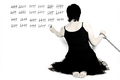
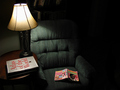
| 03/18/2007 07:25:02 AM |
Mind Travelby levyj413Comment: Hi, Greetings from the Critique Club:
Composition: I had to work this to show you what I mean. I am glad you were inspired by another photographer...but there are some areas that have let you down. There is way too much vacant space. It is good to have vacant space...but I can still see some detail in it...and that just confuses and then loses the viewer. I know the image that inspired you had books...but it was also taken at a different angle. Please see my version below. This could have been better if I had worked on the large version...but it is just to give you an idea.
Technical: As you can see I have darkened the book area some more to alleviate the distraction...and the image becomes more peaceful, more relaxing. The chair seems welcoming. I also touched the Hue/Saturation and Brightness/Contrast.
Overall: I think you were on the right track...you wanted an old feel to the image and yet to be inviting and calming. You did that but you were lost with a few of the details. Watch your details in the future and you will find the image you are looking for.
 |
| Photographer found comment helpful. |
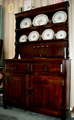
| 03/18/2007 07:12:22 AM |
Old Charm Dresserby rosiehallComment: Hi, Greetings from the Critique Club:
Composition: I like the idea and the richness of the dresser. However, I don't like the clutter on top and around the dresser, especially the open doorway and the object on the lower right of the item. Maybe try a different angle for this image. There are two ornaments (??) on the lower part of the dresser...I can understand the candle but I can't make out the one on the right, therefore I cannot relate it to the story. That is basically what you have to think about...telling a story. If any part of that image is not necessary...then get rid of it.
Technical: I like the lighting and the focus for the image. I can see you have cropped in, judging by your Aperture and the Focal Range. I do like the richness of that wood...and that really does hold the viewers attention...but as I said before the clutter is damaging to not only your image but your score.
Overall: Great try...and a beautiful sample of a piece of Furniture...but wrong composition for the best way to display this subject.
NOTE - I was just about to finish this critique when I read your about. Why do you crop and resize so close to opening the image. You never know when this would make a great print. I always do any adjustments first and save as a PSD. I also save as a new image in JPEG and that is the one I will then open and crop/resize/sharpen/sfw. It gives you greater control when you are working on a larger image. |
| Photographer found comment helpful. |
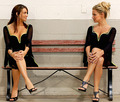
| 03/18/2007 07:01:28 AM |
Bench Endsby neophyteComment: Hi, Greetings from the Critique Club:
Composition: This is great. It is well balanced and yet shows great detail work. The different women and hair really adds more interest to the image instead of a simple mirror style format. I like the idea of different shoes and am pleased you stayed with the same colour range.
Technical: Lighting, focus and settings spot on. No improvement there. I would've, however, cloned out that hideous wall plate. It is very distracting and drops the cleanliness of your image.
Overall: I think you were so close to being up there on the first page...just a tough challenge and only very minor details in your image held you down. |
| Photographer found comment helpful. |
Home -
Challenges -
Community -
League -
Photos -
Cameras -
Lenses -
Learn -
Help -
Terms of Use -
Privacy -
Top ^
DPChallenge, and website content and design, Copyright © 2001-2026 Challenging Technologies, LLC.
All digital photo copyrights belong to the photographers and may not be used without permission.
Current Server Time: 05/10/2026 01:11:07 AM EDT.