| Image |
Comment |
| 09/19/2005 01:34:12 PM |
Into Her armsby RefwhettComment: Good image. The contrast is good and I like your choice of black and white. I would like to see the cropping to include more space "in front" of the statue and less "behind" it. |
 Photographer found comment helpful. Photographer found comment helpful. |
| 09/19/2005 09:04:57 AM |
|
| Photographer found comment helpful. |
| 09/18/2005 11:03:32 PM |
Old Houseby LeeDComment: ...edit Message edited by author 2005-09-18 23:04:23. |
| 09/18/2005 10:55:56 PM |
Old Houseby LeeDComment: Yes, you're right... I cheated and used gothic glow, a bit of desaturation and there you have it. |
| 09/18/2005 10:54:17 PM |
By any other nameby conglettComment: ** Critique Club **
First impression: I love the clarity of this image. It's very sharp and clean. The lighting on the rose also helps to bring out it's texture and color while reflecting perfectly in the dew drops.
I think the previous comments pretty well hit the nail on the head. The contrast is OK, but the cropping could be a bit better. The white object in the background competes with the rose IMHO. I've sat on this image for a few days trying to think of a better critique, but honestly I don't see much to critique about it. It's a great capture and other than the couple of things pointed out in previous comments, I see nothing wrong with it.
Good job!!! |
| Photographer found comment helpful. |
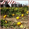
| 09/16/2005 11:26:12 AM |
pumpkinpatch2b.jpgby trobergeComment: I'm honestly not too crazy about it.
Compositionally I don't like the tent, crates, and building in the background. They make the overall image too busy IMHO. The image composition would be better if the building "stuffs" were cropped out.
The image itself appears overprocessed, smudgy, blurry, something I can't quite put my finger on. It's just simply not very clear. I like the glow on the individual pumpkins, but the lack of clarity detracts too much. Did you use NeatImage?
I would like to see the original. I think there may be something to work with here. I like the use of complimentary colors (green and yellow/orange) in the pumpkin patch and feel like there is much more potential in this image. |
| Photographer found comment helpful. |
| 09/12/2005 06:39:21 AM |
|
| Photographer found comment helpful. |
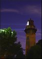
| 09/09/2005 07:32:57 AM |
Nightlightby RulerZigzagComment: Great color and composition! I really like this image. The only thing I would change would be the hot spots in the tree tops. Possibly burning these areas or maybe even cloning them out. Slight hue adjustments could also bring out more purple tones and give the image more "punch". |
| Photographer found comment helpful. |
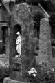
| 09/07/2005 06:04:08 PM |
Death & Lossby AlexSaberiComment: **Critique Club**
Revisiting this photo I am again impressed. I remember this one well and thought that it would place better than it did. I had stated during voting that it might "do better in B&W with higher contrast". Typically when you see cemetary shots, they are higher contrast and in black and white. Your image would probably have appealed more to the masses had you taken this route, but you chose a different take on the "norm" and here I think it works.
The colors of the gravestone give it an almost sepia tone, but the greens in the grass add an interesting element of color. I really like the muted colors and personally feel that they add to the overall feel of the image. IMO the tilted perspective on the gravestone adds to the feeling of Loss in the image. The composition is good, but may be improved a little by off centering the gravestone to the left just a tiny bit.
Personally the only thing I can find that I don't like about the image is the blown out sky. Maybe some creative burning of the "hot spots" would have helped, but honestly I think that had you have taken the exact same shot just a few minutes later with a little different cloud cover, it would have placed much better.
Overall I do like the image and I stand firmly by the well deserved 7 I gave you during the challenge. |
| Photographer found comment helpful. |
| 09/07/2005 01:51:40 PM |
Don't Lookby CaltropComment: **Critique Club**
Initial impression is that I agree with all of the comments you received during the challenge. The image is awfully busy, but don't be so hard on yourself. The capture itself is a good one! It's excellent stop motion and you captured the moment very well. Your timing on the shot was near perfect IMO. The biggest thing that takes away from the image is the cluttered background.
On further inspection, a few other details become obvious. The focus on your subject seems just a touch soft and his left foot is chopped off. This was probably due to the inherent drawbacks of trying to capture stop motion (and one of the reasons I don't even try). The expression on his face is priceless.
I agree with the other comments on using a shallower DOF to reduce the background clutter. My eye is also being drawn to the vibrant colors of the green sliding board in the background. A little selective desat and burning may have helped reduce that particular distraction. I think your cropping would have been dead on if you had a simple background, but with all of the clutter, cropping out more of the left side may help reduce some of the distraction in this case.
I also can't help but wonder if a B/W version with a little creative burning in the background might help also. Overall this is a great example of stop motion and a good image. I hope this helps and I look forward to seeing more of your work in the future.
As a side note I looked at your portfolio... You have some great images in there. Keep shooting!!! |
| Photographer found comment helpful. |
Home -
Challenges -
Community -
League -
Photos -
Cameras -
Lenses -
Learn -
Help -
Terms of Use -
Privacy -
Top ^
DPChallenge, and website content and design, Copyright © 2001-2026 Challenging Technologies, LLC.
All digital photo copyrights belong to the photographers and may not be used without permission.
Current Server Time: 06/11/2026 07:22:16 PM EDT.