| Image |
Comment |
| 09/20/2005 02:54:37 PM |
|
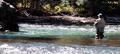
| 09/20/2005 02:53:11 PM |
Gone Fishingby vtruanComment: Ahhh... who wouldn't want this to be their destination? The focus seems a touch soft. |
 Photographer found comment helpful. Photographer found comment helpful. |
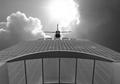
| 09/20/2005 02:52:04 PM |
Salvation?by rcrawfordComment: Great shot. I love the vibrant colors and the clarity of the image. Great use of the "rule of thirds". |
| Photographer found comment helpful. |
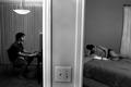
| 09/20/2005 02:50:53 PM |
Doors to Eruditionby DefyTimeComment: I understand what you're going for here, but the image alone shows a disturbing separation to me. The fact that you used a male and a female of approximately the same age could indicate a couple. The separation of the wall brings a general coldness to the image IMHO and taken without the title shows a "destination" quite different from what your intent was. The cropping also seems a little awkward and my focus keeps shifting to the light switch. I think the choice of black and white is a good one, but it further adds to the "cold" feeling I get from the image. I think that with a different title, the statement made by this image could have much more impact. |
| 09/19/2005 05:30:22 PM |
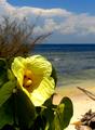
flower in the beachby Luifer_9d9Comment: **Critique Club**
First impression: Really great shot of a pretty flower.
Detailed analysis: The lighting on the flower is perfect. You've done a good job of capturing a very clean crisp image. I agree with the comments on size. A larger image would help the viewer see more detail in the photo.
Personally I like the shallow DOF. It puts the attention on the flower. The yellow coloration of the flower blends very well with the blues of the sky and water. The composition I feel is technically good also.
I feel what hurt you most on this particular image was the lack of relevance to the challenge. Although this was a pretty open challenge in the form of interpretation, if there is no obvious "branch", many people are likely to vote lower.
You stated that you took the photo without knowledge of the challenge and personally I think it's a great shot. There are branches in the background, but they do not make up a significant portion of the composition nor are they in focus. This is not a bad thing. The branches were not meant to be a main focus of the image when you took it. There has been talk in the past about good images that are "shoe-horned" into the challenge. Perhaps if you had known about the challenge, the same shot could have been recomposed to incorporate more of the branches that were available on the beach.
Overall Impression: A great image that doesn't necessarily meet the challenge expectations.
Good work. Keep shooting! |
| 09/19/2005 01:55:57 PM |
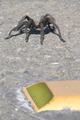
The Other Sideby GeneralEComment: I'm guessing the "destination" is the other side of the road? The lighting is a bit harsh and the reflector takes away from the image more than it adds (too blurry). Granted it adds interest to the image, otherwise you just have a picture of a spider on a road. I think this could be better with different cropping and/or composition to show more of the road in front of the spider. Maybe a lower viewpoint more on the level of the spider. |
| Photographer found comment helpful. |
| 09/19/2005 01:52:04 PM |
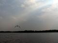
My Grandma and Grandpa used to bring me here..by tolovemoonComment: Great potential, but the colors seem a bit bland. The bird, horizon, and foreground are all out of focus and the bottom half of the image seems awfully dark. I really like the ray of sunlight shining through the clouds and it does help draw your eye to the bird, but with such an out of focus image, it kind of leaves the viewer hanging. Potentially a good image. |
| Photographer found comment helpful. |
| 09/19/2005 01:48:45 PM |
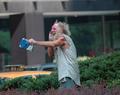
He Knows Where We're Going...!by CoolsComment: I'm missing the relevance of the destination here, but I'm going to assume that's just me and will not deduct points based on my inability to make the connection. The image as a whole says a lot but I think there are a few things that could be pointed out. The arm and book of the man are blurred and probably could've had been made sharper with a faster shutter speed. The cropping is too centered and I would like to see about 1/3 of the right side of the image cropped out. It's basically just dead space and IMHO does nothing to improve the image. I love the expression on your subject and think you've done a great job of capturing the moment. I think with the right post-processing, this image would do very well. |
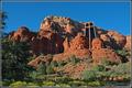
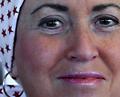
| 09/19/2005 01:43:15 PM |
The Winding Road To Cancer-Freeby lshlesComment: OK, it took me a second... I'm assuming the wrap is to cover the effects of chemotherapy? I like the statement you're trying to make, but feel the execution is somewhat lacking. The picture itself comes off more as a portrait and doesn't really say much in the way of a "destination". If I hadn't read your title I would be totally clueless. Maybe another version emphasizing the bandana would help or you could totally blow us away and lose the bandana completely to really get your point across. I understand the hesitation to do that (I've had several in my family go through chemotherapy), but the result would be VERY powerful. |
| Photographer found comment helpful. |
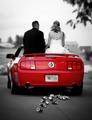
| 09/19/2005 01:37:54 PM |
With Passion in Our Heartsby SonifoComment: Nice selective desat. The image is very crisp and fits the challenge very well. The blurred license plate is distracting and I can't help but wonder if there was a better way to shoot this and not give away the license plate. |
| Photographer found comment helpful. |
Home -
Challenges -
Community -
League -
Photos -
Cameras -
Lenses -
Learn -
Help -
Terms of Use -
Privacy -
Top ^
DPChallenge, and website content and design, Copyright © 2001-2026 Challenging Technologies, LLC.
All digital photo copyrights belong to the photographers and may not be used without permission.
Current Server Time: 06/11/2026 10:24:45 PM EDT.