| Image |
Comment |
| 05/22/2007 01:36:09 PM |
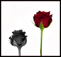
Love & Lossby TezComment: Interesting take on the challenge, the composition feels a little offish, but definitely a decent image. |
| 05/22/2007 01:35:08 PM |
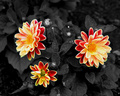
Trioby krafty1Comment: Very nice, the colors really pop and the grayscale has nice depth and texture. |
 Photographer found comment helpful. Photographer found comment helpful. |
| 05/22/2007 01:34:35 PM |
Cherry Blossomby daboardergirlComment: Potentially a good image, but IMHO the DOF is a bit shallow. The grayscale could use a little more depth with an ever so slight tweak in levels. |
| Photographer found comment helpful. |
| 05/22/2007 01:33:08 PM |
My profileby birkinComment: The edges on this look a little sloppy... It looks like you did a lot of selective blur which is not as effective as using a shallower DOF. |
| Photographer found comment helpful. |
| 04/27/2007 04:59:04 PM |
|
| Photographer found comment helpful. |
| 04/16/2007 02:44:18 PM |
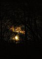
Moonlightby eamurdockComment: The commentors on this one have pretty much nailed a good initial impression of this image. It also depends on what you're going for, it does have a bit of a digital art feel to it. I would suggest a much longer exposure for this type of shot... your ISO is punched way the heck up which will introduce quite a bit of noise, but your shutter speed is pretty fast for a night exposure.
I would suggest using a tripod and exposures at least 30 seconds or longer for true nighttime photography... Not terrible for a first-time entry and I hope it doesn't discourage you from future entries. |
| Photographer found comment helpful. |
| 04/11/2007 12:30:10 PM |
UFOby sudhiComment: Not too blue at all... the composition seems a bit heavy on the bottom and the focus seems a tad soft. Perhaps a different angle (and no jet trail) would've helped a bit. |
| Photographer found comment helpful. |
| 04/02/2007 04:35:36 PM |
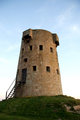
Towerby joekentComment: Potentially a decent shot. Some minor tweaking in PS could help add some drama. I would recommend adjusting the levels and playing a bit with the saturation levels. You could really punch up the colors and add much more visual interest to this. You may also want to consider playing with black and white with this image... It reminds me of one of my own images...
 |
| Photographer found comment helpful. |
| 02/02/2007 11:27:54 AM |
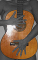
Play meby clixographerComment: The flash is very overpowering and the grain and lack of contrast also take away from the image as a whole. The crop is too tight and the selective desaturation does nothing for me. I'm sorry if this seems overly harsh, but it is my honest opinion. I would recommend not using an on camera flash for shots of this nature and experiment more with proper lighting techniques. The duality of the title is very nice but I'm not a fan of the image itself. |
| 02/02/2007 11:07:05 AM |
Stone Therapyby Dirt_DiverComment: I like the idea but there are a few dislikes. The contrast is too subdued for my taste and I'm not a fan of the "grainy" feel. The background and foreground seem to be dodged in and give your model a dark halo. It seems as if you are going for a "dreamy" feel on an image that looks more like a stock photography shot for a day spa. I think it's that conflict that doesn't do this image the justice it deserves. |
| Photographer found comment helpful. |
Home -
Challenges -
Community -
League -
Photos -
Cameras -
Lenses -
Learn -
Help -
Terms of Use -
Privacy -
Top ^
DPChallenge, and website content and design, Copyright © 2001-2026 Challenging Technologies, LLC.
All digital photo copyrights belong to the photographers and may not be used without permission.
Current Server Time: 06/10/2026 05:23:46 PM EDT.