| Image |
Comment |
| 05/07/2005 12:16:34 PM |
|
 Photographer found comment helpful. Photographer found comment helpful. |
| 05/07/2005 12:14:48 PM |
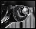
Snap-On® - We have a Problem !by BradComment: good idea and well executed. the spanner is a bit oo scratched, the scratches steal the attention away from the odd nut. On further thought the scratches are really strange, did you do them with a piece of sandpaper? In my mind the scratches should be in line with the usual movement of the spanner, i.e. curving across it not lengthwise on it.
DOF brilliant.
good luck. /8 |
| Photographer found comment helpful. |
| 05/02/2005 02:52:59 PM |
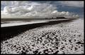
Down at the snowy black beachby GautiComment: Thanks Heather.
In th original the horizon was not 100% level, so I fixed that in C1 before starting to work in PS. I agree, slightly tilted horizon is very annoying, but if it is really tilted, like >15% then it can work.
The things in the BG, on the waterline are big rocks. There is a lighthouse on top of the biggest one (the one with the hole through). I have a few photos of that lighthouse:

and this gallery in my portfolio.
There is, of course, more texture in a full size version of this, esp in the black sand and snow.
When I shot this, I wasn't really paying attention to the clouds, I was trying to get the contrast between the white snow and black sand. It was only later, during post.prod. that I noticed the nice 3D effect in them.
|
| 04/25/2005 09:02:49 PM |
"Spring break"by cabaComment: I've seen this recently, but the other shot was better, there the schoolbus was further away and did not dominate the shot so much
If not for that, I'd like this a lot. good colours and good luck |
| Photographer found comment helpful. |
| 04/25/2005 08:57:36 PM |
|
| Photographer found comment helpful. |
| 04/25/2005 08:56:30 PM |
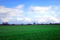
Greenfieldsby justinbrookComment: practising for minimalism? good shot, the horizon maybe a fraction lower, the green and blue go well together. |
| Photographer found comment helpful. |
| 04/25/2005 08:53:41 PM |
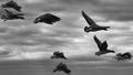
Flightby vince31874Comment: nice barnacles. good to have them all in more or less good focus. maybe a bit too crowded for my taste, less is more. or if they were all in the same rythm. well, can't be helped with wildlife.
good luck |
| 04/25/2005 04:47:06 PM |
White on Blueby taceComment: the green dildos are a big distraction. just the white against blue is enough. |
| Photographer found comment helpful. |
| 04/25/2005 04:45:04 PM |
|
| 04/25/2005 04:44:30 PM |
|
Home -
Challenges -
Community -
League -
Photos -
Cameras -
Lenses -
Learn -
Help -
Terms of Use -
Privacy -
Top ^
DPChallenge, and website content and design, Copyright © 2001-2026 Challenging Technologies, LLC.
All digital photo copyrights belong to the photographers and may not be used without permission.
Current Server Time: 06/18/2026 04:32:38 PM EDT.