| Image |
Comment |
| 01/30/2003 02:08:15 PM |
Royal Decayby ManicComment: Wow, all that architectural detail, and such a plain, simple little window. Sorry, though it's kind of interesting, it's not a real high impact image for me. |
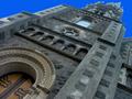
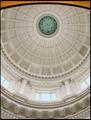
| 01/30/2003 02:05:58 PM |
Inspiredby PtmanComment: Incredible architectural detail here, but the odd angle of the building/composition really throws me off. I'm not crazy about the way the sky looks either. That's a very stark blue, and seems very at odds with the obviously old building. |
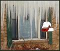
| 01/30/2003 02:03:50 PM |
Michigan Stalactitesby dodobirdComment: The icicles seem to be the subject here, and everything else is a distraction! The icicles are fabulous, but really do move the focus off the window for me. |
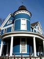
| 01/30/2003 02:02:00 PM |
The Blue Houseby boyte1Comment: Very cool house. I would loved to have seen it without the harsh shadows, but with such a beautiful, clear day... Nice clear shot, with great focus, I love all the detail on the house. I like the iron fence in the foreground as well. The windows do not seem to be the subject of the shot; the house seems to be the primary subject, but since there are windows in the shot, it does fit the challenge. |
| 01/30/2003 01:32:22 PM |
Tighter Than A ...by albright1Comment: An interesting shot with the repetition of pattern in both the bricks and the ironwork over the window. Pretty good lighting, and the composition isn't bad, though the photo does look a little crooked. |
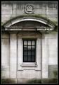
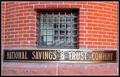
| 01/30/2003 01:30:00 PM |
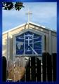
Window on Governmentby falveyComment: I'm on my second look at this, and have to tell you that I will be rating it higher. The composition is wonderful, the whole photo is sharp and clear, really bringing out the incredible architectural detail. The lighting is wonderful, but then I am assuming that the lighting was already done for you!! A plesure to look at, I hope you place very high with this. |
 Photographer found comment helpful. Photographer found comment helpful. |
| 01/30/2003 01:26:37 PM |
Souvenirby lionelmComment: Very interesting shutters, but the superimposed image would have been a lot more effective for me if they had been in a window and not over top of the shutters. |
| Photographer found comment helpful. |
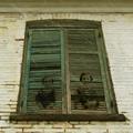
| 01/30/2003 01:24:56 PM |
Abandonedby RiderGalComment: An interesting photo, but not enough range of tone for me. It's all kind of neutral, and though there are a few areas of contrast, they are small, and for me, not enough to balance the photo well. |
| Photographer found comment helpful. |
| 01/30/2003 01:22:45 PM |
Heaven's Gate?by GeneralEComment: I would have loved to have seen the window in full light. I like that you included the branch at the top corner, and I do like your border. The fence in front really is distracting for me - I think I would have tried to crop right below the window. |
| Photographer found comment helpful. |
| 01/30/2003 01:16:21 PM |
House of David Dairy Barnby connieComment: I like the little roof over the door , and the snow on the ground balances that well. All of the black on the block wall and especially on the door looks like mildew, and really detracts from the photo for me. I can see the Christmas wreath and bow on the door, but the door has kind of a stone block look at the bottom which confuses me. |
| Photographer found comment helpful. |
Home -
Challenges -
Community -
League -
Photos -
Cameras -
Lenses -
Learn -
Help -
Terms of Use -
Privacy -
Top ^
DPChallenge, and website content and design, Copyright © 2001-2026 Challenging Technologies, LLC.
All digital photo copyrights belong to the photographers and may not be used without permission.
Current Server Time: 07/24/2026 10:18:20 AM EDT.