| Image |
Comment |
| 05/03/2003 11:23:39 PM |
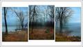
Three Views Around the Lakeby mariomelComment: Beautiful photos, and in this case I am glad that you did not try to go black and white. The color is so much more powerful. I like the misty look, and I like the overall effect of the lighting. |
 Photographer found comment helpful. Photographer found comment helpful. |
| 05/03/2003 11:21:53 PM |
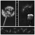
Breaking Free by FranziskaLangComment: I adore the photos in this triptych. The choice of black and white works very nicely, and I especially like your "theme". I am not totally crazy about the font that you chose, I think it detracts just slightly from the overall image by constantly drawing your eye away from the photos. I think that I would have preferred not to see any text at all, however, that does not keep this from being one of my top picks. |
| Photographer found comment helpful. |
| 04/22/2003 08:42:54 PM |
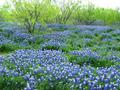
Bluebonnets and Mesquite Treesby goodtempoComment: This photo makes me want to paint it on my bedroom wall! This is stunning all the way around. The color is awesome, lighting is great and the composition works well for me. I would truly have loved to see more of a border - I think it would really have made this photo pop right out! |
| Photographer found comment helpful. |
| 04/22/2003 08:37:14 PM |
crossedby falveyComment: Love it, love it, love it. Composition, lighting, border all just grabbed me right away! Hope I see you on the home page! |
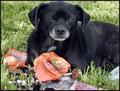
| 04/19/2003 11:37:43 PM |
Where's the Alka Selzerby sherryk471Comment: Cute little dog, hope he didn't eat all that! Good color and composition, but overall the shot is a little too busy for my taste. |
| Photographer found comment helpful. |
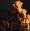
| 04/19/2003 11:36:44 PM |
The crumbliest, flakiest milk chocolate in the world...by pinbackComment: I love the idea, but it just doesn't come across in the photo, for me. For the most part, focus is good. I like the texture, the composition and the use of negative space. I think the chocolate needed just a bit more light on the subject, from the front, to make the shot have a little more impact. |
| Photographer found comment helpful. |
| 04/19/2003 11:33:37 PM |
Eye Candyby alanfreedComment: Definitely not what I was looking for in the candy challenge, although I figured someone would try it. Nice shot, but no cigar. |
| Photographer found comment helpful. |
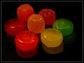
| 04/19/2003 11:32:40 PM |
Hard & Softby auroraComment: Nice colors, and I like the shiny look of the candy, but I think it needs more light on the candy - the colors seem dark and dulled out. |
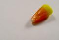
| 04/19/2003 11:31:50 PM |
Candy Cornby AnnidaComment: Good focus, and interesting composition. I like the concept, but would have preferred to see more light on the candy - possibly enough omni-directional light to get rid of most of the shadows; and boost the contrast a little to try to whiten up the background. |
| Photographer found comment helpful. |
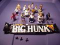
| 04/19/2003 11:29:49 PM |
This is one BIG HUNKby Bud JComment: Good color and focus, but what the heck are all those toys doing there?? I wouldn't let them theivin' boogers anywhere near MY candy! |
| Photographer found comment helpful. |
Home -
Challenges -
Community -
League -
Photos -
Cameras -
Lenses -
Learn -
Help -
Terms of Use -
Privacy -
Top ^
DPChallenge, and website content and design, Copyright © 2001-2026 Challenging Technologies, LLC.
All digital photo copyrights belong to the photographers and may not be used without permission.
Current Server Time: 07/25/2026 11:59:04 AM EDT.