| Image |
Comment |
| 12/18/2005 02:04:47 AM |
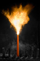
Big things come in small packagesby jsonComment: Fits challenge=5
Color/lighting=1
DOF/focus=1
Wow factor/uniqueness=1
Attractiveness=2
I would love to know what you used to make this candle go like this. Really a cool image. I like the selective coloring and layout. Good luck |
 Photographer found comment helpful. Photographer found comment helpful. |
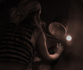
| 12/18/2005 01:31:44 AM |
Enlightenedby laindComment: Fits challenge=5
Color/lighting=0
DOF/focus=0
Wow factor/uniqueness=0
Attractiveness=0
very blurry, if that had been only in the light it probably would have been more accepted but the face and eyes themselves and too blurry to remain attractive. I like the gold and red coloring. |
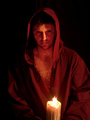
| 12/18/2005 01:30:06 AM |
Torrid Shadowsby JordanZComment: Fits challenge=5
Color/lighting=1
DOF/focus=1
Wow factor/uniqueness=1
Attractiveness=0
You are probably getting killed by the photograph "purest" who feel this is too much art to be photography but I like it. The candles texture is nicely enhanced and I like the hint of red in it. While the flame's color isn't the norm it still has a nice touch to it. Good luck |
| Photographer found comment helpful. |
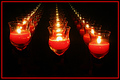
| 12/18/2005 01:27:46 AM |
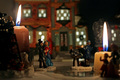
Nostalgic Studio Lightsby gr8daneComment: Fits challenge=5
Color/lighting=1
DOF/focus=1
Wow factor/uniqueness=0
Attractiveness=1
Nice image. You have enough lighting to keep the detail in the candles and not blow them out yet still dark enough to have a nice image. good luck |
| Photographer found comment helpful. |
| 12/18/2005 01:26:26 AM |
Yearning To Be.........by cheegirlComment: Fits challenge=5
Color/lighting=1
DOF/focus=1
Wow factor/uniqueness=1
Attractiveness=1
Very nice. The candle is a little over exposed but not really to the extreme. I had a difficult time at first seeing the balarina outfit (that is that right?) at first but then it made the image more interesting. I like the colors (and lack of) Good luck |
| Photographer found comment helpful. |
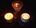
| 12/18/2005 01:23:42 AM |
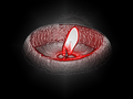
Tea Anyone?by shaverComment: Fits challenge=5
Color/lighting=0
DOF/focus=1
Wow factor/uniqueness=0
Attractiveness=0
Oh you had a potentially good image here but the two candles in the foreground are blown out because of the darker one in the back. I think it was because of the white inside of the cups that made it totally blow out. I would have liked to seen this with just the candle in the background. It appears to have a lot of neat detail in the glass and the shadows and light play nicely there. good luck. |
| Photographer found comment helpful. |
| 12/18/2005 01:21:14 AM |
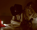
Inner Sanctumby RikkiComment: Fits challenge=5
Color/lighting=1
DOF/focus=1
Wow factor/uniqueness=1
Attractiveness=1
Nice job. The candle on the left appears to be falling in slightly but really not a big deal. The exposure worked well to make sure the flame isn't overexposed and still has the color tones and detail...good job. Your DOF is very nice and gets your attention without totally pulling it away from the candles. Good luck. |
| Photographer found comment helpful. |
| 12/18/2005 01:18:47 AM |
Scrubbin' the Deckby ShermyComment: Fits challenge=5
Color/lighting=0
DOF/focus=0
Wow factor/uniqueness=0
Attractiveness=1
I think the image would have benefitted from more candles and less exposure. In order to get more light you had to overexpose the candle and it loses its overall qualities such as the flame and texture. I like the monotone colors and your focus seems surprisingly sharp for this lighting. good luck. |
| 12/18/2005 01:16:10 AM |
In Your Eyesby JudiComment: Fits challenge=5
Color/lighting=1
DOF/focus=1
Wow factor/uniqueness=0
Attractiveness=0
The title and amount of light in the eyes you can actual see conflict with each other. I can see some refletion but really expected more. Nice use of the candle light and even kept it in the shot. Good coloring and focus. |
| Photographer found comment helpful. |
| 12/18/2005 01:14:05 AM |
Finiteby hdogg4uComment: Fits challenge=5
Color/lighting=1
DOF/focus=1
Wow factor/uniqueness=0
Attractiveness=0
You had me for a split second there but that border really kills the image. You have so much red in the image already I probably would suggested a white border to help keep the eye in the image. Instead the border draws it out to the edge where there really isn't anything to see. I like the setup and although the exposure is a little slow and your flames over exposed I do like the image. Good luck |
| Photographer found comment helpful. |
Home -
Challenges -
Community -
League -
Photos -
Cameras -
Lenses -
Learn -
Help -
Terms of Use -
Privacy -
Top ^
DPChallenge, and website content and design, Copyright © 2001-2026 Challenging Technologies, LLC.
All digital photo copyrights belong to the photographers and may not be used without permission.
Current Server Time: 07/18/2026 10:36:45 PM EDT.