| Image |
Comment |
| 09/01/2016 07:23:19 AM |
the alien artifactby HoghemaruComment: Hello from the critique club
An interesting image that might be interpreted to meet the challenge
This is a very interesting image, I like the overall feel of it but I’m not sure it meets the challenge brief fully. I can see from the viewpoint there is a grand majesty to it all that wouldn’t be out of place in an Olympic setting but the challenge brief does specify metallic surfaces, some of which you have, and you could argue you have metallic colours as opposed to a strict gold, silver, bronze interpretation so to a degree it works. I think the more I look at it and try to analyse it the more it is warming to me. I do like the originality of it and the grandness suggested by it. Overall it is a pleasing image, well done Fabio. |
 Photographer found comment helpful. Photographer found comment helpful. |
| 09/01/2016 07:14:41 AM |
Ike of Goldby anibob222Comment: Hello from the critique club
An interesting image that meets the challenge
The idea behind the image is good and your composition is also quite good but there are a few technical issues that could have given you a better result. The most obvious problem is depth of field, there isn’t enough of it. You are nearly wide open so therefore you are using a very shallow DOF, as you know the closer you are the shallower the DOF so the end result is no detail at all in your watch strap which by the sound of it you would like to show off such a valuable item! Having said that there is some nice bokeh on it but I still think more detail is needed. The silver of the coin is not coming through, the lighting is bringing out the detail nicely enough but there is a yellowy colour cast on it. In view of the challenge brief it is imperative that you try to represent the silver as a true silver. The bronze sort of works but not very convincingly, again more DOF is needed.
All in all Kelli, a good attempt that needs a little more refinement, keep at it you’re doing well. |
| 08/29/2016 08:11:12 AM |
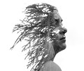
Mysteriousby clickodakComment: Hello from the critique club
A fascinating image that meets the challenge well
Well done Marcel in creating this truly original and creative double exposure that fulfils the challenge brief excellently. I like the way you have combined the two images and presented it in mono against a white background. I like that we are able to see the important detail of the lovely model, especially the wispy hair against the branch foliage. I like the way you have manipulated the image of the foliage to reflect the shape of her head. My only regret is that we don't see probably the most important feature of the whole image and that is her right eye. The eyes are the soul of any portrait. I really like what you have done here and the score and placing indicates that I am not the only one. Well done. |
| Photographer found comment helpful. |
| 08/26/2016 06:15:47 AM |
Taxi Noir by riotComment: Hello from the critique club
An appealing image that meets the challenge fully.
I recognised whose work this was as soon as I saw it! Well done in winning this challenge with this superb abstract its in a class of its own. You’ve made a lovely job with this unusual bokeh, even better than last time, though I do miss the lovely model. Everything about it is exquisite, the colours, the patterns and shapes, the composition, even the blown highlights are pure white shapes that add to the overall result. Certainly, in terms of the challenge brief, it doesn’t get any more abstract than this! Well done Eugene, thanks for your truly creative entry |
| Photographer found comment helpful. |
| 08/25/2016 09:01:00 AM |
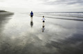
Wait for me Papa!!!!by Ja-9Comment: Hello from the critique club
An appealing image that meets the challenge fully.
Tailor-made for the challenge Janine, well found they are truly lovely reflections. What I like most about this are the dynamic capture of motion, a moment in time, the vastness of the beach but most of all the quality of light it is working really well, particularly on the two main characters, What I am not so keen on, however, is the extensive blown highlights which I assume you have used to give it all a the high key lift. Anyway, well done for your high score and placing. |
| Photographer found comment helpful. |
| 08/19/2016 06:06:11 AM |
301 West Creightonby dtremainComment: Hello from the critique club
An interesting image that meets the challenge
A lovely building enhanced by the SFX processing to give a more antiquated feel to the image as a whole. The lighting feels a little flat though I think this may be a result of the processing, there is some modelling on the lovely faceted tower. I think the vignetting is a bit too powerful it ought to be a bit more subtle it looks too washed out particularly down the right edge. Having said all that a competent entry that has been well received by the voters, congratulations on your HM and second highest placing David. |
| Photographer found comment helpful. |
| 08/19/2016 05:53:13 AM |
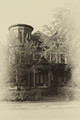
Josaphat-Gareau's Old Victorian Queen Anne Houseby clickodakComment: Hello from the critique club
An interesting image that meets the challenge
What a lovely building, an imposing architectural example with a Victorian influence. I like your composition, the beautiful round tower dominates which makes the rest of the angles much more interesting. What I am less keen on is the saturation of the blues, the sky is far too saturated, its overpowering the building itself which is quite some feat as red is normally so dominant in itself. There is also a blue cast through the whites, they should be a nice crisp white contrast and again with the yellow flowers they are veering towards greens. A decent attempt but the blues definitely needs subduing. |
| Photographer found comment helpful. |
| 08/17/2016 05:28:12 AM |
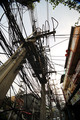
Pattaya Power by riotComment: Hello from the critique club
An interesting image that meets the challenge well
Congratulations on your red ribbon. It's great to see your ultra wide angle in action again Eugene and what a mess you've captured! Your composition enables us to appreciate what a mess this is, how on earth do they manage when things go wrong as I'm sure they must do? The composition consists almost entirely of diagonals which are always powerful and quite literally so here. The only minor distraction is the blue hue from the vignette at the top edges. Well done. |
| Photographer found comment helpful. |
| 08/17/2016 05:20:52 AM |
Color Runby quindeComment: Hello from the critique club
An appealing image that meets the challenge well
Congratulations on your well deserved blue, such a worthy winner. I really can't imagine how you could have fulfilled the challenge brief any better than you have here, it's an excellent image full of colourful mess with an all-appealing human element. The colourful fog that has been created by their actions really enhances the appeal of the image with the combined soft focus of your aperture really isolates the front girl well. The sheer pleasure on her face is a joy to behold, together with frozen action of her pony tail as she tries to avoid the onslaught. It all looks like a really great time is being had by all. Well done Carlos and thank you for brightening our lives up! |
| Photographer found comment helpful. |
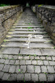
| 08/15/2016 05:24:26 AM |
The Steep Stepsby riotComment: Hello from the critique club
An appealing image that meets the challenge well
I like your image a lot, in fact, its probably the way I would have shot it myself. The thing that brings it alive is the inclusion of the figure at the top of the stairs, such an essential ingredient to complete the effect. I really like the foreground cobbles and the way the stairs lead us up to the figure. I am not so keen on the heavy vignetting, I think I might have preferred to see the original with less emphasis but all in all an excellent entry Eugene, thanks. |
| Photographer found comment helpful. |
Home -
Challenges -
Community -
League -
Photos -
Cameras -
Lenses -
Learn -
Help -
Terms of Use -
Privacy -
Top ^
DPChallenge, and website content and design, Copyright © 2001-2026 Challenging Technologies, LLC.
All digital photo copyrights belong to the photographers and may not be used without permission.
Current Server Time: 05/06/2026 09:44:13 PM EDT.