| Image |
Comment |
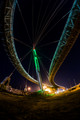
| 09/07/2016 07:06:19 AM |
under the bridgeby HoghemaruComment: Hello from the critique club
An interesting image that meets the challenge.
If this is your first fisheye, I look forward to many more from you! I do love the creativity of these lenses and here you've taken full advantage of that creativity, it works very well. The exposure is spot on, although there are inevitably blown highlights they contribute well to the end result. The composition takes full advantage of the inevitable distortions that if used intelligently, as you have, can really add impact to image. Your high score and placing are just reward for an excellent shot, well done Fabio |
 Photographer found comment helpful. Photographer found comment helpful. |
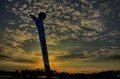
| 09/07/2016 06:59:07 AM |
Solar Paintby riotComment: Hello from the critique club
An interesting image that meets the challenge.
I like your viewpoint but I'm not so keen on the infrared but it certainly distinguishes the shot from the normal exposure. A mono presentation would have been my preference, I do like the trees structure together with the leafy branches. Although its a long exposure I feel its let down by the softness throughout, I would expect to see more sharpness in the trunks at least. |
| Photographer found comment helpful. |
| 09/07/2016 06:49:05 AM |
daegu stadiumby quindeComment: Hello from the critique club
An interesting image that meets the challenge.
I like your composition against the interesting sky it enhances the sculpture well. The sculpture could easily serve asa homage to Sisyphus. Unfortunately, everything is somewhat underexposed and rather dark, with a stop more exposure you could have given the shot more impact and appeal. You could try altering the exposure in PS and see if you still prefer this shot in which case fine. Thanks for your entry |
| Photographer found comment helpful. |
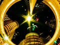
| 09/07/2016 06:37:35 AM |
Alien Abductionby PhocalComment: Hello from the critique club
An interesting image that meets the challenge.
A familiar landmark that has featured recently in another challenge, whilst this has its merits I have to say, of the two, I much prefer the other one. This is a great viewpoint that fits the challenge brief perfectly, so well done on that score. How on earth you have managed to hand hold a shot pointing upwards for 25 seconds and still get such sharp results is way beyond my understanding. I regularly take hand held long exposures by means of string attached to the bottom of the camera but there is no way I could go beyond a couple of seconds and get these sort of results. Unfortunately for me, the shot is badly let down by the OOF spots on the front of the lens and all the blown highlights especially the one in the centre that dominates everything to the detriment of the well exposed parts of the frame. A great idea Ronnie, with a little more care in execution it could be even better |
| Photographer found comment helpful. |
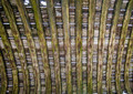
| 09/07/2016 06:25:55 AM |
Leaky Canoe, Raised Overheadby DrakeComment: Hello from the critique club
An interesting image that meets the challenge.
In respect of the challenge brief this was quite an appropriate find, well done, the canoe is certainly past its sailing days and of questionable value as a shelter. There are some lovely colours and textures from the aged wood and the pattern of the construction makes for quite a pleasing end result. This is one of those images that fits the challenge brief well but needs help through an informative title as you have done here. There's not really a lot more I can say, thanks for sharing it with us. |
| Photographer found comment helpful. |
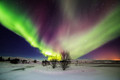
| 09/06/2016 12:51:58 PM |
Thingvellir National Parkby GudjonottoComment: Hello from the critique club
An appealing image that meets the challenge well.
Yet another wonderful aurora landscape that has us spellbound once more. This is even more appealing than usual with its lovely variety of colours and the all-embracing shape it must be wonderful to be in such a location when this is happening. However, lovely as this is I would love to see more whiteness in the snow foreground but overall it really is a lovely image well done again Otto. |
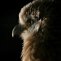
| 09/06/2016 12:45:44 PM |
Yellow-Headed Caracaraby riotComment: Hello from the critique club
An interesting image that meets the challenge well.
I agree Eugene, why not give your birds the full model treatment especially if the end result is as good as it is here! Not only is there some lovely feather detail but the tip of that beak is wonderfully emphasised through the judicious placing of the light. The highlight in the eye also adds to the atmosphere and all of this against that black backdrop it all works so well. We’re all really pleased you got the chance to submit this and we’re also pleased you came back, keep up the good work. |
| Photographer found comment helpful. |
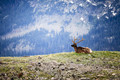
| 09/06/2016 12:38:11 PM |
R.M.N.P.by tryals15Comment: Hello from the critique club
An interesting image that meets the challenge well.
What a magnificent beast, you’ve done well to get close enough without disturbing him. Your composition is generally good but I have to agree with J9 that the a little more DOF would have helped with the background. Because it is so different from the foreground the softness is just a littl too much it actually feels somewhat ‘artificial’ as though its been photoshopped in, I am not in any way saying it has, but that is he impression. Anyway, its still a great shot, well done Trey. |
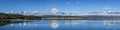
| 09/06/2016 12:30:23 PM |
First Snowby johnfrComment: Hello from the critique club
An interesting image that meets the challenge well.
An excellent panorama, and so it should be with all those images! You’ve really captured the majesty and grandeur of the scene in a convincing way, those rugged peaks poking through the low-lying clouds are a truly wonderful spectacle. And the reflections give us a double vision that is most welcome. Clearly a lot of time, thought and effort has gone into the making of this image, well done John and thanks for sharing it with us. |
| Photographer found comment helpful. |
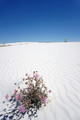
| 09/06/2016 12:24:28 PM |
The Otherworldliness of Alamagordoby tylskieComment: Hello from the critique club
An interesting image that meets the challenge well.
Welcome to DPC Erin and what a way to start! This is a great composition with the emphasis well and truly on the flower against the white sands and rich blue sky it works really well. I might have been tempted to put the flower on the lower right third hotspot but it still works here. Part of me wishes I could see all of the shadow and its a shame the sands are not undisturbed the feeling of total isolation would have been complete then. I like what you’ve done here and look forward to seeing more entried from you soon, well done Erin |
Home -
Challenges -
Community -
League -
Photos -
Cameras -
Lenses -
Learn -
Help -
Terms of Use -
Privacy -
Top ^
DPChallenge, and website content and design, Copyright © 2001-2026 Challenging Technologies, LLC.
All digital photo copyrights belong to the photographers and may not be used without permission.
Current Server Time: 05/06/2026 09:44:15 PM EDT.