| Image |
Comment |
| 09/30/2016 08:28:24 AM |
Birdmanby PangurbanComment: Hello from the critique club
An appealing image that meets the challenge well.
Congratulations on your high score and placing for this great capture. The elements that work are working really well, the man in full stride apparently unaware of the passenger he is carrying, I like it. I also like the motion of the bird flying towards him, and the pigeons at his feet, what a pigeon magnet this man is! I like the ladies humoured observation, what doesn't work for me is the man on the right with his phone I would have preferred to see it without him. What an amazing coincidence with you and beatabg capturing the same man! |
 Photographer found comment helpful. Photographer found comment helpful. |
| 09/30/2016 08:17:45 AM |
Danish Daysby tylskieComment: Hello from the critique club
An appealing image that meets the challenge well.
Hello Erin, hope your enjoying DPC? Well you certainly found an interesting character here didn't you, well spotted! In terms of the challenge it is clearly a street scene and what a hat she is certain to get noticed and get her message across dressed like that, good for her! Although the lighting is quite harsh and contrasty you have managed to retain good detail. Your choice of aperture has isolated her nicely from the soft focus background. Generally a good attempt keep at it Erin.
|
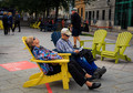
| 09/30/2016 08:10:28 AM |
I'll read you a story. Once upon a time....by clickodakComment: Hello from the critique club
An appealing image that meets the challenge well.
Your image fills the challenge brief with the hat and the candid street scene, I like your title and comments, indeed I think he must have been reading from a technical manual that just proved too much for her! I'm not sure the passing walker in the background adds more than he distracts I think your timing could have been improved in fact I think a closer image excluding most of the background distraction would probably have helped especially with your chosen title, the two empty chairs would add a further emphasis of his boring story. Nice attempt Marcel |
| Photographer found comment helpful. |
| 09/30/2016 08:03:07 AM |
Chillingby docjonnyComment: Hello from the critique club
An appealing image that meets the challenge well.
Good candid capture of a moment of 'chilled' solitude, he appears oblivious of your presence or the camera, true street photography with the challenge brief of a hat filled splendidly. The composition is generally good though I would have preferred a slightly different angle avoiding cropping his feet and excluding the soft focus foreground as you have already commented on yourself. I like the mono presentation with good tones and detail throughout. A good entry Jonathon and well received with your voters too, well done. |
| Photographer found comment helpful. |
| 09/29/2016 05:25:11 AM |
she is goneby HoghemaruComment: Hello from the critique club
An interesting image that meets the challenge
The emotion in your landscape comes mostly from the very clever use of title to convey a feeling that probably didn’t even exist but now does, well done for a very effective use of a title. As for the image itself the intense blue saturation really hurts my eyes and destroys any appeal for the landscape. I do like the composition and the placing of the silhouetted man and his interaction with the landscape. Can I suggest you try easing back on the blue saturation for a more natural look I think it would enhance what is potentially a good image.
Thanks for your entry Fabio. |
| Photographer found comment helpful. |
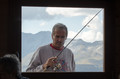
| 09/29/2016 05:15:41 AM |
_D7K0575by LionsitalyComment: Hello from the critique club
An interesting image that meets the challenge
My initial reaction to this image was somewhat negative but the more you explore it the more it grows on you in. The door acts as a perfect frame for the main subject and the landscape beyond and whilst it all feels a little soft for shooting through the glass, in a way this actually enhances it in a dreamlike way which suits the challenge brief perfectly. I have mixed feelings about the persons head in the lower left, its a shame she wasn’t looking into the frame that would have really enhanced it. Whilst I try to be positive about it I think it does detract and would have benefited from being excluded from the frame. A few things that really make the image for me are the perfect interaction of his rod with the window corner, the natural unposed candid nature of this frozen moment in time and the lighting of the landscape.
I think its a shame it didn’t do better in scoring but I can understand why because its an image that you need to spend some time with absorbing the content and mood fully, especially in terms of the challenge brief. It’s unfortunate for you but also your voters because I think they missed its hidden qualities. Thanks for your intriguing entry Marco. |
| 09/26/2016 11:55:10 AM |
Storm-Blasted Northern Shoresby riotComment: Hello from the critique club
An interesting image that meets the challenge
What a considerate bunch of mates you have, I’m not sure I could get away with throwing everybody out of the motor for an image! I have to say, I actually prefer this sort of shot over the long exposure misty scenes that have become so popular nowadays. Your scene is intensely blue rather to its detriment, I think you could say this is an example of an adherence to capture the scene as seen but resulting in a somewhat artificial end result that lacks credibility. Thanks for an interesting entry Eugene. |
| Photographer found comment helpful. |
| 09/26/2016 11:43:32 AM |
Paddling the boardsby docjonnyComment: Hello from the critique club
An appealing image that meets the challenge
Your image has a nice balance to it with the distant land and your two figures balancing each other fairly well. Although generally overexposed I think the high key effect works well for the background but not the foreground. You could seriously improve the image by burning in the foreground and making it darker and whilst I normally dislike blown highlights I would leave the rest as is because it actually works well here. Thanks for an interesting entry Jonathon. |
| Photographer found comment helpful. |
| 09/26/2016 11:34:37 AM |
Elements of Harmonyby PascalComment: Hello from the critique club
An appealing image that meets the challenge
Your apt title says it all. There is a lovely mystical quality to this dream-like image where slowly a beautiful mermaid will magically appear. I like the near-abstractness of it all where land merges into mist/sea/sky almost seamlessly with sufficient separation from the band of blue to make the clouds seem like a reflection of the water. Well done in achieving a higher score than you anticipated and for your HM Paschalis. |
| Photographer found comment helpful. |
| 09/26/2016 11:25:20 AM |
• h i g h • t i d e •by Ja-9Comment: Hello from the critique club
An appealing image that meets the challenge
There is a lovely feeling of space with the distant figures on an empty beach for a child full of life to run free who makes a very strong focal point to give the image scale and with his pose a dynamic quality. The waves complete that dynamism together with the lovely shapes the sea has carved out of the beach. Given the dynamics of the beach and sea against the much less interesting sky this is one where I would have used the reverse balance with the beach dominating. I like the near mono/pastel tones. Thanks for another lovely entry Janine |
| Photographer found comment helpful. |
Home -
Challenges -
Community -
League -
Photos -
Cameras -
Lenses -
Learn -
Help -
Terms of Use -
Privacy -
Top ^
DPChallenge, and website content and design, Copyright © 2001-2026 Challenging Technologies, LLC.
All digital photo copyrights belong to the photographers and may not be used without permission.
Current Server Time: 05/06/2026 06:02:19 PM EDT.