| Image |
Comment |
| 01/27/2017 12:45:23 PM |
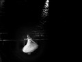
First danceby docjonnyComment: Hello from the critique club
An appealing image that contributes well to the challenge
How do you follow a critique like Posthumous' ? I'll do my best. This really is a delightful image Jonathon with the dancing girl the obvious focus lit beautifully by that diagonal shaft of light which lights her like a beacon amongst the dark shadows. For me the image appeals most for the motion blur of the child as she twirls, lost in her own private world of discovery, together with the lovely use of negative space and deep shadows. The mono presentation is a must it works so very well. This was a very well supported challenge with a lot of good entries and, though you have received a lot of appreciative reaction, all well justified, for me this ought to be on the front page, a great image Jonathan, well done. |
 Photographer found comment helpful. Photographer found comment helpful. |
| 01/27/2017 12:27:39 PM |
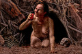
Spotted critterby snafflesComment: Hello from the critique club
An appealing image that contributes well to the challenge
First of all you've done an amazing job here Susan, a great idea. I feel for you it must have been a real pain to process. As far as the nudity is concerned you only had one negative reaction amongst your commenters I think everyone else, me included, appreciated it as a necessary way to approach this very creative idea, the pose works really well. Doesn't look like we're gonna be seeing anything of your poor boyfriend in future shots he didn't fare very well did he, gulp!
I sense your frustration it must have been disappointing to see it tumble like that especially after all that effort but please try not to let it get to you and continue to amaze us with your great ideas and images. |
| Photographer found comment helpful. |
| 01/27/2017 12:07:39 PM |
Sentinelby snafflesComment: Hello from the critique club
An appealing image that contributes well to the challenge
Me too, I like it, an interesting abstract that amongst the blurred zoom also has interesting sharper detail too. The diagonal of the trunk holds it all together in a dynamic way. There is good detail throughout with a nice bright feel to the exposure. |
| Photographer found comment helpful. |
| 01/23/2017 06:13:39 AM |
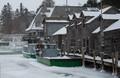
Cold and Icy....by DrakeComment: Hello from the critique club
An appealing image that contributes to the challenge
You're right Drake, although the lighting is flat there are some lovely textures in the wooden walls and slate tiles. The snow is nicely exposed as it should be, nice and white with detail. The composition is good and appropriate. The two boats don't look as they're gonna be going anywhere soon at least not without some ice breaking! Thanks for an interesting entry |
| Photographer found comment helpful. |
| 01/23/2017 06:07:50 AM |
Andalusian Duskby riotComment: Hello from the critique club
An appealing image that contributes well to the challenge
A well deserved score and place for this lovely image Eugene. The muted colours and subtle shading are excellent. The receding tones of the landscape against those gorgeous patterns in the scene it really is a most effective composition and well taken image, you've done the area proud, well done. |
| Photographer found comment helpful. |
| 01/23/2017 06:01:32 AM |
Dubai creek by twilightby docjonnyComment: Hello from the critique club
An appealing image that contributes to the challenge
A lovely colourful night cityscape Jonathon. The motion blur of the boat adds a lovely dynamic to the image giving it more impact and its position is appropriate. I would have expected it to score higher but I think the reason for it was camera shake. Although you have done well to secure the camera with your tripod perhaps there was some vibration from passing feet? There is not quite the biting sharpness there needs to be to contrast fully against the boat's motion but its not far off. |
| Photographer found comment helpful. |
| 01/23/2017 05:54:42 AM |
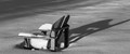
It is winterby clickodakComment: Hello from the critique club
An appealing image that contributes to the challenge
It certainly is winter! I'm with both your commenters on this one Marcel. Your composition is good, the choice of position for the chair with those lovely long shadows is most appropriate. Initially I was going to say you needed more exposure to get the snow a whiter white but it is already at its limits on the arms of the chair so that would not do, your exposure is fine. A good piece of seeing and doing, well done Marcel |
| Photographer found comment helpful. |
| 01/23/2017 05:49:14 AM |
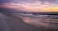
Turn Around ~ Look Behind Youby Ja-9Comment: Hello from the critique club
An appealing image that contributes to the challenge
Your title is very apt Janine, one should always keep an eye out for the scene behind you, glad you did. I like the muted colours of, not sure whether its sunset or sunrise but whatever its an equally pleasant scene. The fall of the tide is nice to reflect the glowing light in the wet sands it adds to the overall image. The rolling waves add a nice contrast. You're far too experience for sloping horizons, well done. Overall a lovely image |
| Photographer found comment helpful. |
| 01/20/2017 11:24:34 AM |
Dog eye contact with photographerby clickodakComment: Hello from the critique club
An appealing challenge that contributes well to the challenge
What a lovely dog. You have captured the fur detail well and your chosen aperture enables us to concentrate on the eye and its reflections which works well especially in relation to the challenge brief. Your composition works well with eye well placed on the most appropriate hotspot leaving room for the lovely soft focus detail too. A great shot Marcel, well done |
| Photographer found comment helpful. |
| 01/20/2017 11:18:35 AM |
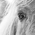
Love of my lifeby snafflesComment: Hello from the critique club
An appealing challenge that contributes well to the challenge
Great reflection Susan. The concept fulfils the challenge brief very well but unfortunately the eye somewhat lacks the essential sharpness of detail to give the image its full impact, I think the aperture needed to be a little smaller, the all important horse at the front of the eye is a tad on the soft side. There is also a little too much exposure with significant loss of detail on the left. Its a great image with a lot of potential and well worth repeating, well done Susan. |
| Photographer found comment helpful. |
Home -
Challenges -
Community -
League -
Photos -
Cameras -
Lenses -
Learn -
Help -
Terms of Use -
Privacy -
Top ^
DPChallenge, and website content and design, Copyright © 2001-2026 Challenging Technologies, LLC.
All digital photo copyrights belong to the photographers and may not be used without permission.
Current Server Time: 05/06/2026 11:49:44 AM EDT.