| Image |
Comment |
| 02/17/2017 05:50:08 AM |
Snowmobile ridersby clickodakComment: Hello from the critique club
An interesting image the fulfils the challenge brief
Well Marcel you’ve certainly captured the action here, it must have been an impressive show. This is a purely personal gripe but I would have preferred a slower shutter speed to show some motion blur. The composition could have been improved too the rider looks as though he is going to crash into the building. Sorry, I can’t be more positive about it but nice to see your commenters are certainly happy with it. |
 Photographer found comment helpful. Photographer found comment helpful. |
| 02/17/2017 05:44:14 AM |
Humans of Philadelphiaby jjstudiosphiladelphiaComment: Hello from the critique club
An interesting image the fulfils the challenge brief
Quite a straightforward portrait, nicely off-centre and his eyes looking at the camera help to engage the viewer. I find the bright lights in the background very distracting, they are competing with the person for attention. The overall softness and tone adds appeal to the overall effect. |
| Photographer found comment helpful. |
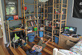
| 02/15/2017 06:01:21 AM |
Jack's Roomby Gordon_1Comment: Hello from the critique club
An appealing image that contributes well to the challenge
Well first of all not being a Kate Melua fan I am unable to comment with the same insight that one of your commenters has. So, that aside the image itself was never going to be easy to get completely right, the wide angle lens used from this height has really forced the angles into a tilt. I think you would have been better to get lower down and level the camera up so that you avoided these extremes. Doing so would also have brought more emphasis on to Jack himself, whereas at the moment he is competing with all the other stuff that is dominating the room. Hope this helps Gord? |
| Photographer found comment helpful. |
| 02/15/2017 05:53:47 AM |
Chase me - I’ll be yours forever for a day Chase me or I’ll slip awayby PompouspeteComment: Hello from the critique club
An appealing image that contributes well to the challenge
First of all, congratulations Peter on your first ribbon and a very successful result. It is, of course, thoroughly deserved, she is a lovely looking girl in a lovely setting photographed very competently with a lovely pose. I like your exposure having got nice bright whites without losing the detail, this in conjunction with the dark background really makes her stand out in a fitting and complimentary way. Further I would say that the subdued colours of the setting really help to pick out all the gorgeous splashes of colour, her bouquet, her red lips and most all her gorgeous hair it is all working to perfection, well done Peter. |
| Photographer found comment helpful. |
| 02/15/2017 05:45:12 AM |
Piece by Pieceby clickodakComment: Hello from the critique club
An appealing image that contributes well to the challenge
A very creative idea Marcel, well done. The concept is good and the execution is good too but I think a little more care in the preparation of the scene would have paid dividends. My eyes having taken in the heart shaped empty space are then immediately drawn to the blank space below the point of the heart and then to the left blank spaces and then to all the others. Because you are using the blank space as the feature for the heart you really needed to ensure that there were no other blank space anywhere amongst the jigsaw pieces, had you done so I think this would have scored and placed even higher but well done anyway its a very respectable result. |
| Photographer found comment helpful. |
| 02/15/2017 05:37:28 AM |
Just Like Heavenby jjstudiosphiladelphiaComment: Hello from the critique club
An appealing image that contributes well to the challenge
Well, not being a Kate Melua fan I assume that this is the title and lyrics of one of her songs? Anyway, the image is good, it is a touching pose well executed with the focus clearly on the couple in this intimate setting that conveys the excited anticipation and love the couple have for their soon to be offspring. I have this on my screen in a square format cropped just below the couple and just skimming the top of the floral arch, this crop improves it a lot. There is extraneous detail in the foreground and roof that is not contributing to the overall end result, try it for yourself, I hope you'll agree? |
| Photographer found comment helpful. |
| 02/13/2017 08:47:07 AM |
SURPRISEby gintayComment: Hello from the critique club
An interesting image that contributes to the challenge
This is certainly a colourful sunset cityscape you’ve captured Gin Tay. In terms of composition, I think you could have made it more interesting by excluding the buildings on the left, I would have cropped it to remove all the buildings from the left where the foreground building is. I would then have lowered the rest of the scene so that the interesting shapes and lights were much lower in the frame giving emphasis to the sunset sky. Hope this helps. |
| Photographer found comment helpful. |
| 02/13/2017 08:36:40 AM |
Pattaya Duskby riotComment: Hello from the critique club
An interesting image that contributes to the challenge
A lovely soothing tranquil scene. You have identified some of the problems as has one of your commenters too so yes you’re right its probably better not to have too much resolution here. What I’m most troubled with is the sloping sea! There is a definite lean to the left which is not helped by the right shoreline which feels as though its pushing the whole image. In terms of the challenge theme it would work better if there were specific conditions being portrayed, a look at the front page will perhaps convey my meaning better. As always Eugene, an interesting image but it doesn’t quite work as well as it could. |
| Photographer found comment helpful. |
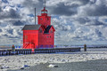
| 02/13/2017 08:25:59 AM |
Sunny with Cloudsby DrakeComment: Hello from the critique club
An interesting image that contributes to the challenge
What an interesting building Drake. You have captured a lovely skyscape dominated by the bright red building, it is an interesting scene but I have to agree with your commenters, the saturation is too much it has marred the scene. I also think your composition could be significantly improved. I’m looking at the scene with the image cropped at the start of the foreground shadows, this improves it significantly. Also if you were to crop it removing the mooring post on the structure it would move the building over to the left and again significantly improve the overall end result. |
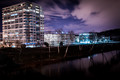
| 02/13/2017 08:16:57 AM |
A Cold Winter Nightby jjstudiosphiladelphiaComment: Hello from the critique club
An interesting image that contributes to the challenge
This is a very competent cityscape, a nice composition enhanced by the moving clouds in the sky. I like the foreground reflection of the trees but I think there is a good argument for removal of the bright lights reflected, it would be more pleasing without them. I like the silver birch bark and their shapes it makes the foreground more interesting. I’m not keen on the colour balance I would prefer it tweaked to something more natural looking. What your image does not do well is to convey the challenge theme of weather, your title is necessary to help us appreciate it is cold. As you will see from the front page most of the images there convey a particular aspect of the weather. |
| Photographer found comment helpful. |
Home -
Challenges -
Community -
League -
Photos -
Cameras -
Lenses -
Learn -
Help -
Terms of Use -
Privacy -
Top ^
DPChallenge, and website content and design, Copyright © 2001-2026 Challenging Technologies, LLC.
All digital photo copyrights belong to the photographers and may not be used without permission.
Current Server Time: 05/05/2026 10:50:32 AM EDT.