|
|
|
Showing 1571 - 1580 of ~3781 |
| Image |
Comment |
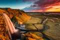
| 07/13/2015 12:29:51 PM | Fire in the clouds by GudjonottoComment: *Hello from Sid and the Critique Club*
Let me begin by congratulating you on your red ribbon, very well done.
You have chosen a tremendous vantage point and waited for an interesting sky to add impact to your image. Your composition is faultless, the range of tones complete and the landscape fascinatingly interesting.
I can understand why the waterfall is the colour it is, absorbing light as it does from the sunset but I do agree with one of the rare questioning comments that its colour is a little off-putting. Although its in the interests of the natural light to accurately reflect what you see before you I might have been tempted to keep it but to reduce its effect. I would probably have also given it a shorter exposure to bring some detail back into the waterfall. I do love the base of the waterfall and the rich blacks of the water fringed with the icy sprayed surrounding grasses.
There's not a lot else I would have done differently here. I know from own experience what fascinating colours there are in the natural landscape of Iceland, I would dearly love to return in the very near future, it would be great to meet up.
More of the same! Regards Sid |
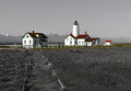
| 07/13/2015 11:45:04 AM | New Dungeness Light Stationby HUETHComment: *Hello from Sid and the Critique Club*
Your image has immediate impact with the buildings standing out from the rest of the desat image. In respect of the challenge it conforms with the desat elements.
I strongly agree with your commenter, your composition could have been greatly improved by moving the centre of interest on the upper third and reducing the amount of bland boring sky to just above the top of the lighthouse in preference for more of the foreground.
I also think you lost an opportunity to make more of the desat part by making much better use of the mono tones to given it even more impact through the use of a fuller tonal range and contrasts. A couple of other minor points, I think the yellows ought to have been subdued and timing wise it would be great to see the full coloured flag blowing in the wind.
I think your image works because the coloured areas include so much white they could still be part of the desat elements. I think desat works best when the coloured areas are kept to a minimum and although there is fair amount of the image retaining the original colour that is the effect we have here because the dominant colours are fairly minimal and they're broken up.
Happy shooting Sid |
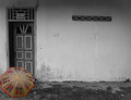
| 07/13/2015 11:26:07 AM | A Glimpse into Povertyby headlesspidermanComment: *Hello from Sid and the Critique Club*
There is an air of mystery in your image but your intent is not obvious to me. In respect of the challenge any desat will enable you to meet the challenge so it has achieved that.
You have made a conscious decision to compose your image in the way you have which is sort of effective but I think this is a case where the rule of thirds may have been better certainly for the brolly. I'm all for breaking the 'rules' but it has to be done effectively and I'm not sure it is here.
You have chosen well with the brolly it adds interest in its own right but even more so with the desat background. The grill in the wall breaks up the expanse nicely, without it the wall would be very bland and uninteresting.
If there was some human element it would greatly improve the image and give it the impact it lacks. I have to be honest and say that I don't understand your title in relation to the image. Titles are very important to give your viewer more of a clue as to your motivation or intention behind the original image.
I also don't understand your sole commenter, he appears to approve of your image yet only scores it with a 1. Having never yet come across any image that deserves such a low score I just can't understand why he has done this.
Happy shooting Sid |
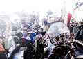
| 07/12/2015 04:25:29 PM | Do Not Ride Toward The Light ...by Dr.ConfuserComment: I would be happy to draw and comment on this through the critique club if given it, so I will comment on it anyway, hope you don't mind.
The foreground bike is obviously the one you have selected for the thirds with its windshield nicely placed on the hotspot. There is deliberate over exposure hence the title, most of us will avoid it like the plague but it is very effective here in helping to emphasise the foreground. You also have some blocking in the shadows which again might be deliberate in blending two extremes together?
I commend you for having the courage of your convictions, the image has a special appeal to you and you correctly anticipated a low score but stood by your choice, well done. |
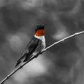
| 07/12/2015 03:42:38 PM | I am MAN!by PhocalComment: *Hello from Sid and the Critique Club*
The quality of your shot adds impact to the end result.
Like you, I am no fan at all of desat but that is the challenge you were presented with so in that respect any desat would meet the challenge.
I see one of your commenters has suggested leaving the whole bird in its natural colours which would probably be the natural approach, especially as they are such a beautiful bird. I sense that you have decided to try and do something different with your selection. Reds are a naturally vibrant colour anyway but when isolated, as here, in a mono image it has an overwhelming impact. Also, the beak is getting a little bit lost into the background I think it could benefit from the background being dodged to make it stand out more.
I like the birds pose and the diagonal of the twig on which it is perched. The choice of aperture has isolated it nicely from the background though I think the brighter patch below the bird would probably have benefited from some burning in to help it blend more with the rest of the background but that is a minor criticism.
I assume from your title the red throat signifies that it is a male bird?
Happy shooting Sid |
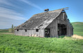
| 07/12/2015 03:12:35 PM | Age Desaturatesby Dr.ConfuserComment: *Hello from Sid and the Critique Club*
An appropriate choice of subject for selective desat which obviously meets the challenge well.
I think there are a couple of ways in which the image could have been improved, the main one being the composition itself, the main thing is its just too central. It would have been better to have placed it on one of the thirds, most probably the left third.
Also it is too dominant, if you had shot the barn from further away you could have included more of the landscape and placed it on one of the left hotspots, dependant on whether you were to emphasise the sky or the landscape. Because of the nature of the challenge anything that is desaturated will stand out and therefore become more dominant, this is already the main feature of the image before desat and now overpowers what is left of the landscape to its detriment. You have some lovely greens and blues these ought to have been given a lot more emphasis through your composition.
There does seem to be some inaccuracy with your desat in that there appear to be traces of the original colours in the wood at the bottom left wall and also at the top on the edges of the roof. There is also evidence of sensor dust in the sky.
Happy shooting Sid |
| 07/12/2015 02:36:20 PM | Touch of colorby marvinComment: *Hello from Sid and the Critique Club*
I like the girls pose, especially the paint covered hands but I'm afraid the image is let down by a few issues.
As has already been pointed out the desat of the neck, and for me, the hair and eyes too, is the biggest single issue that lets your image down, it would have been a lot better to leave all of these features naturally coloured together with her hands.
There is a significant inaccuracy with your selections throughout which shows that your daughter was wearing a bright yellow/green top? I think a bit of feathering may have helped here, there are thin but distinct lines of yellow around her fingers which are most obvious towards the ends of her fingers.
The activity was, I hope, fun for her it would have helped to have got a more smiley face which would have made the image even more appealing. The background is rather distracting, the pictures on the left in particular. Its a shame that you have cropped off a small portion of her little finger.
I think generally there needs to be more attention to detail, both in-camera and post-processing, its all the little things that cumulatively add up to significantly mar the overall impact the image could have made.
Happy shooting Sid |
| 07/12/2015 02:09:08 PM | Waiting for the Lightby Dr.ConfuserComment: *Hello from Sid and the Critique Club*
This is a good example of how important the title is to an image.
I like your composition, making full use of the available frame by placing your main subject at the bottom you have managed to show us most of the landscape they are waiting to photograph. This does of course meet the challenge of procrastination well.
I can understand why you've chosen a large aperture to draw the viewers attention to your two relatives leaving the landscape in soft focus. However, the lack of detail somehow feels a little unsettling because to me, it feels as though this lack of detail is due to the ISO which given your camera is probably not the case.
With regard to your daughter and son-in-law I wish I could see both their faces and some interaction between them but they and the camera just don't feel as much a part of the whole scene as they should. I think a little touch that would have helped would have been to have the scene displayed on the cameras monitor too. The reds of their clothes really helps them stand out against the predominantly green landscape.
A fairly irrelevant observation is the voting pattern, the first time I've ever seen an image with such regularity, its a shame it didn't score higher and receive more comments. I find myself wanting to like it more than I actually do but also struggling to offer more constructive comments than I have, sorry.
Happy shooting Sid |  Photographer found comment helpful. Photographer found comment helpful. |
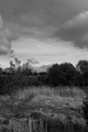
| 07/10/2015 04:32:26 PM | Thy Landscapes Shall Have Color And They Shall Be Wider Than They Are Tallby posthumousComment: *Hello from the Critique Club*
...and they shall not go anywhere near the rule of thirds or have any strong focal point!
I like your tongue-in-cheek title and approach to the challenge which is determined to break all the rules as we know them and too often slavishly follow. I'm all for breaking the rules whenever I can but in doing so we want to show that there is good reason for doing so with the end result.
Without the title, I would look at your image and fail to lock on to a focal point, the sapling on the left and the roof probably have the greatest potential but are unfortunately too insignificant. The horizon is very central too and the lighting fails to enhance any particular features within the scene.
Personally I have no problem with mono, I absolutely love it, but mono is always best done in post-processing where you can enhance those features that will benefit the image as a whole rather than let the camera's, neutral and often rather boring, mono facility decide what tones lie where. In post-processing that sky could have really been enhanced very well to bring out more of a 'storm brewing' feel to it, there is some lovely contrast potential there that the camera has simply ignored.
If the bird you cloned out was very small and insignificant then it was probably best to remove it but had it been large enough then perhaps it could have given us a focal point to lock on to?
In terms of composition, I think if you had made the reeds a foreground feature by moving closer to them and lowered the foreground so that you could emphasise that quite gorgeous sky with the upper two thirds of the frame you would have significantly improved the end result. But given your title all this is probably irrelevant because I think you have deliberately chosen to go against all the 'rules'. Anyway I'm sure you had lots of fun and thats what it should all be about – keep at it. | | Photographer found comment helpful. |
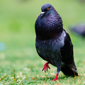
| 07/10/2015 03:59:39 PM | Thou Shalt Dance For Thy Mateby PhocalComment: *Hello from the Critique Club*
First impressions, what a magnificent bird!
I love the low level viewpoint and the shallow but appropriate DOF which isolates your subject nicely. That gorgeous orange eye is nice and sharp but what really hits me is the iridescence of his plumage, its beautiful. Its also lovely that your timing is such that it is not static it shows him in movement. The scarlet of his feet are a striking counterpoint to the predominant greens.
The only thing I feel mars the image somewhat is the distracting OOF blob on the right hand edge of the frame. Given your title it would have really made the image a winner if you could have included in the soft focus background the lady whom he was trying to woo.
Pigeons are so common they are often neglected so it is refreshing to see one featured and such a good job as you have made here. Its also good to see that you went out with the express intention of such a shot, in which case you should be well pleased with the result. I think it was worthy of a higher score but I'm pleased to see there were no sub-four scores.
|
|
Showing 1571 - 1580 of ~3781 |
Home -
Challenges -
Community -
League -
Photos -
Cameras -
Lenses -
Learn -
Help -
Terms of Use -
Privacy -
Top ^
DPChallenge, and website content and design, Copyright © 2001-2026 Challenging Technologies, LLC.
All digital photo copyrights belong to the photographers and may not be used without permission.
Current Server Time: 05/08/2026 08:49:11 AM EDT.
|