|
|
|
Showing 1551 - 1560 of ~3781 |
| Image |
Comment |
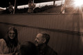
| 07/17/2015 01:07:24 PM | g h o s t • t o w e rby Ja-9Comment: *Hello from Sid and the Critique Club*
First impressions are of a fairly unconventional approach that subtly meets the challenge.
What I like most about this is the sense of mystery that remains once I have climbed those steps to, what? Whatever lies on top or inside the structure and thats where the mystery remains, so it is intriguing and any image that can do that to me will always appeal to me.
However, having said that about the composition I am not at all keen on the processing which has left most of the image looking fake, plastic and unappealing with significant areas of overexposure. I am aware that I appear to be in the minority here with some very positive reaction from your commenters which just goes to show how subjective this wonderful hobby of ours can be where it can elicit such diametrically opposed reactions which is part of what makes photography so exciting and challenging. Keep intriguing me, Sid. |  Photographer found comment helpful. Photographer found comment helpful. |
| 07/17/2015 12:50:43 PM | Chopin's Piano Sonata No. 1 in C minor, Op. 4: iv, Prestoby posthumousComment: *Hello from Sid and the Critique Club*
My first impressions are of a poorly executed image that does not the challenge
I'm now looking at your image and really trying to appreciate it and fit it to the challenge, perhaps because I am not familiar with the music and am not, as you suggest, able to play it while I look I still cannot alter my first impressions. Unfortunately, I cannot find anything here that appeals to me so I don't want to rub salt into the wound by detailing everything about it I don't like but its basicly everything, I'm afraid I have to agree with your first commenter.
So, what am I missing about this that holds such appeal to your three other commenters? It now intrigues enormously because I don't know what I don't know. What are these people able to see in it that I am completely blind to? I wish I knew. I would be very grateful to hear anything you or your commenters or anyone else can enlighten me with in order to help me more fully understand and appreciate this image. Please Sid. | | Photographer found comment helpful. |
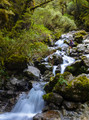
| 07/16/2015 05:05:55 PM | Cascading Linesby CodeSharkComment: *Hello from Sid and the Critique Club*
First impressions are of a good image that meets the challenge but lacks quality.
You have selected an appealing location with a lovely waterfall and attempted to make it more dynamic by using a slow shutter speed to emphasise the movement in the water. In terms of the challenge you have included your model so we have a good focal point that the leading lines of the water leads us to, she also tells us something about the size of this waterfall, she gives it scale. I like your composition it works well.
The biggest thing that mars this image is the general softness throughout. You have obviously used a tripod but either there has been some camera movement during the long exposure or f22 is the smallest aperture your lens has. If it is the latter, which I think it is, we have a reduction in image quality due to diffraction by using the smallest aperture its a shame because you have a potentially good image here. I always try and avoid using the smallest aperture for this very reason.
There is also some overexposure in the brightest parts of the water, you have lost detail as a result which, the water being such an important part of the image, also lowers its impact.
I hope my thoughts help a little, keep at it… Sid |
| 07/16/2015 01:50:01 PM | Lines in cloudsby GudjonottoComment: *Hello from Sid and the Critique Club*
A strong image with very bold colours that arguably meets the challenge but not in a strong way.
Given my boating background it always upsets me to see a boat in this state, however, that aside it forms a strong foreground which is perhaps part of the problem for this particular challenge. I would like that foreground to form the leading lines that take me into the rest of the image. I'm not sure that your leading lines of the sky lead me into the image because of this strong foreground that needs no leading into. I'm probably not explaining myself very well, I hope you understand what I am trying to say.
An unfortunate problem with the boat is the large metal structure in the immediate foreground it is blocking the way into the image beyond so, in effect, acting against the leading lines objective. The very long exposure has certainly 'flattened' the water and enabled your leading lines in the sky but you also have some overexposure which is less desirable but wisely placed on the edge of the image.
I think the image has impact and I would like to like it more but I don't think it works that well particularly for the challenge brief, sorry. Sid |
| 07/16/2015 01:29:50 PM | AIR1by HUETHComment: *Hello from Sid and the Critique Club*
First impressions are of a good shot that meets the challenge well and appears to have been appreciated with a reasonable score from the voters
I like your viewpoint taking this flags pole structure to provide interest and lead you into the lovely sky background. You have chosen well to photograph it on such a day where the clouds add interest, it looks like you may have used a polariser filter? There are certainly nice contrasts between the clouds and the rich blue of the sky.
Having the main pole come in from the bottom right hand corner creates a strong diagonal which in itself makes the image stronger and more dynamic. Where I think you missed a good opportunity was to use a much slower shutter speed to create even more dynamic feel with the blurring of the flags in the wind. Given your exif you may well have needed a neutral density filter to slow things down, this would have also helped you to meet the challenge brief even better giving a real feeling of the air driving through the image and also your objective 'The waving flags depicting the movement of air.'
The sky's the limit… Sid |
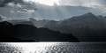
| 07/16/2015 01:05:40 PM | No pollution - fresh air - peacefulby josaaComment: *Hello from Sid and the Critique Club*
My first impressions are of a lovely landscape that meets the challenge but with a lot of overexposure
Air is quite a difficult concept to portray but I think you have been successful with this delightful landscape and, to help the viewer, in your title too. It looks like mono but I see traces of colour in it so I assume it has not been converted to mono but either way it is still very effective. I like the composition and the range of tones throughout
The one thing that really lets this image down is the extensive over-exposure in both the sea and the sky. Unfortunately once you have overexposure the detail is gone for good there is nothing you can do to get it back so its best avoided with some minus exposure compensation. I think you would have been better to combine at least a couple of exposures together one for the highlights and the other for the shadows and you would have got a better end result.
Is that a boat on the water? Its position next to the background landscape makes it difficult to determine. If it is a boat I think it would have worked really well to have paced it in the overexposed part of the water, by either waiting if it was in motion or through choice of your position, where it would have been clearly defined as a silhouette.
It looks a beautiful location, I look forward to more lovely landscapes from you. Sid | | Photographer found comment helpful. |
| 07/16/2015 12:46:26 PM | Jealous of my neighbors greenhouse by josaaComment: *Hello from Sid and the Critique Club*
My first impressions are of quite a good image with potential for improvement that unfortunately does not meet the challenge.
It does not meet the challenge because there are no lawns which is undoubtedly why it failed to score better, though all those 1s and 2s are clearly undeserved. I like the action of him watering his plants but with that gorgeous lens of yours I feel you have missed an opportunity to make the best of this. The DOF extends 1/3 in front and 2/3 behind your focus point so, with that in mind, I would say you have focussed on the man. As with any portrait the eyes must be sharp so whilst your focus point is good the aperture is too small thus making too much distracting detail in the background.
I see one your commenters suggests using an even smaller aperture to increase the DOF to the flowers. From your title it could be argued that the flowers are the most important aspect in which case focussing on the flowers with a much bigger aperture may have thrown the man into soft focus in which case you could adjust the aperture to get enough detail in him but no more thereby reducing the background clutter with emphasis where it matters.
I do agree with one of your commenters that a reflector would have helped illuminate the mans face better. I also feel the composition would benefit from being decentralised, you could crop the left side of the image completely right up to the watering can. This would place your subject on the third and get rid of unwanted background clutter. I hope this helps in the meantime continue to enjoy your neighbours harvest! Sid |
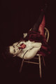
| 07/16/2015 06:14:46 AM | Shhhhhhhhby simplerlifeComment: *Hello from Sid and the Critique Club*
I'm sorry you haven't received any comments, hopefully this critique will help
I feel for your model this pose and the hard chair on which she is balanced looks very uncomfortable and because of that it makes me too feel uncomfortable. I'm all for originality but I think a more natural pose would have worked better perhaps sat on it facing the back with her legs either side. This pose is also making her shoulder massive by comparison to her lovely face.
I like the dark background and the way your model merges into it though I would have preferred it if the white dots on her shoes had been subdued or removed they spoil the effect somewhat. I like her red gloved hand and her action with her finger but the tip is a little too close to her nose. I like the reds throughout they work well but again, with that pose everything is dominated by the shoulder and for me loses its impact.
The lighting generally works apart from the chair legs which again hamper the effect of everything merging into the background. I think some sympathetic processing on the skin would also have helped overall.
I hope my comments don't come over too negative they are meant to be an honest appraisal of my reaction to the image, keep at it… Sid |
| 07/15/2015 05:44:48 PM | Broken lawnby soniapinoComment: *Hello from Sid and the Critique Club*
My first impressions are that this not a lawn and does not meet the challenge brief.
This prompted me to google the definition of the word lawn and I was surprised to see that it is usually a plot of land that is mowed and cultivated so the key word here is usually but not always. So, with that in mind I have to broaden my outlook especially reading your location and description.
I do like your composition and I do like the colours, I also like that you have included the child for additional interest and impact, it works for me. I don't have a problem with the foreground tree I think it also helps direct attention towards the child.
Its funny isn't it, how the two comments you have received are both so opposite to each other in respect of the lighting. My own feelings on the lighting are mixed, the direct overhead lighting does nothing for the main subject which should be the 'lawn', but the bushes behind have some effective shadows that help break the background up.
What I don't like is the white area behind and to the right of the boy, I find it very distracting, also the brown area to the left of the boys head is equally distracting. I like that there is so much greenery in respect of the challenge brief and I also like the boys colours that help break it up. It looks as though it was appreciated by the voters with a reasonable score and no sub fours, so well done and happy shooting. Sid |
| 07/15/2015 02:18:42 PM | e x p a n s i v e by Ja-9Comment: *Hello from Sid and the Critique Club*
First of all, many congratulations on your blue ribbon.
What an impressive location, the avenue of trees are quite amazing. For a shot that is dominated by those trees and the path it says a lot about the overall impact of the shot that it has won this challenge brief of lawns.
I see you have received a comment about it being a rather too central composition but this is one of those situations where this is really the only viable composition, I don't even think a lower viewpoint or reducing the tree canopy would have worked, that would have placed far too much emphasis on the path itself which is obviously a complete no no here. Regarding the path, I see you wish you had put more detail and emphasis on the path, personally, I think the exact opposite especially in relation to the challenge theme I would prefer it even more subdued to reduce its competition with the lawns.
I have to say I'm not keen on the pink that pervades throughout the image, apart from the most obvious areas of the path and the pillars of the house it also seems to be present in the tree trunks too which just gives the image a rather unnatural look. The inclusion of the people, even as minute as they are, adds a welcome human element to the image.
Anyway, once more well done, keep 'em coming! Sid | | Photographer found comment helpful. |
|
Showing 1551 - 1560 of ~3781 |
Home -
Challenges -
Community -
League -
Photos -
Cameras -
Lenses -
Learn -
Help -
Terms of Use -
Privacy -
Top ^
DPChallenge, and website content and design, Copyright © 2001-2026 Challenging Technologies, LLC.
All digital photo copyrights belong to the photographers and may not be used without permission.
Current Server Time: 05/08/2026 04:36:35 AM EDT.
|