|
|
|
Showing 1541 - 1550 of ~3781 |
| Image |
Comment |
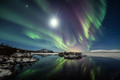
| 07/19/2015 06:29:15 AM | Reflection by GudjonottoComment: *Hello from Sid and the Critique Club*
Congratulations on your yellow/red ribbon. First impressions, gorgeous!
I'm always very envious of you Icelanders and the wonderful photographic opportunities your tremendous landscape offers. It also takes talented individuals to be able to bring out those wonderful qualities to best effect, undoubtedly you are one of those individuals.
Your deliberate choice of viewpoint with the mirror-like reflections of the Aurora Borealis (AB) works really well in doubling our perception and pleasure from this unique natural phenomenon. You have obviously used a small aperture though I'm unsure just how small, instead of a starburst effect we are getting spiky flares from the brightest light sources which is probably the only very minor criticism I could make of the whole result.
Your exposure gives a lovely degree of movement in the AB itself without too much elongation of the stars themselves. The colours are marvellous. I'm assuming the most prominent specks on the water do not appear to tie up with the upper sky and are therefore debris on the water's surface these would probably have been best to clone out.
I've just noticed you got a two!!! Words fail me.
My one visit to Iceland was virtually AB free but everything else there made up for it, I hope to repeat a return trip there before too long. Anyway, thank you for a gorgeous image and the hopes it evokes in me, Sid |
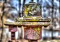
| 07/19/2015 06:02:37 AM | Once Connected To A Water Turbineby DrakeComment: *Hello from Sid and the Critique Club*
First impressions, your shot has impact and meets the challenge well.
We have your title to help us understand what this once was, so that helps us appreciate it more from the outset. I like your composition with the soft focus repetition of another similar structure in the background. There is part of me that would like to have altered the composition to move the front one further to the right and avoid cutting off part of the distant one but this is something I would have tried purely out of interest to compare results.
Your choice of aperture has certainly isolated the subject from the background but that background is where I'm having some problems, its shapes and areas of overexposure are distracting me to the extent that is competing with the turbines themselves. Looking at the lower half I'm thinking this is water reflections? Given your lens, again I would have liked to try with both maximum aperture to hopefully have just colours without any detail or a smaller aperture to bring out enough detail to avoid the distracting confusion I have at the moment.
The colours and detail in the front turbine are key aspects of this image and it works well but I feel is tending towards being over-processed but that is just a personal thing. As previously implied I feel its position is a little too central and would benefit from positioning further to the right.
Well done its a respectable score, your image has been very well appreciated by your commenters, thanks for submitting, Sid |
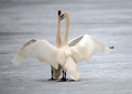
| 07/19/2015 05:37:22 AM | The Danceby DrakeComment: *Hello from Sid and the Critique Club*
First impressions are of a magic wildlife moment well captured.
This, I assume is part of their mating or courtship ritual, I don't know how long they remain like this I have never observed it myself but you have captured the moment well. It is very effective in conveying a feeling of oneness and intimacy between the two birds, it also shows their wings and plumage off to full effect. We tend to think of swans as just being white but your image shows off the other subtle colours in their plumage well.
By using a large aperture you have easily isolated the birds from any distracting background but this is where I might have done something a little different. They are standing on ice but because of the lack of detail in the background it is impossible to determine that it is not a complete ice sheet. I think a slightly smaller aperture to bring out a little more detail would have worked well, it would still isolate them but show more of their habitat.
The only thing that mars your image a little is the brown blob to the right of the swans wingtip, this is screaming out get rid of me please! Your exposure is quite well controlled with good detail in the feathers but I feel it tending slightly to overexposure on the leading edge of the birds wings on the right of the image.
Overall a good submission with a respectable score so well done and good luck with your future entries, Sid |  Photographer found comment helpful. Photographer found comment helpful. |
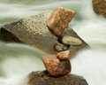
| 07/19/2015 05:14:30 AM | Rock Stacking by MddoaneComment: *Hello from Sid and the Critique Club*
I'm sorry you haven't had any comments, I'll try and make up for it here. First impressions are of an interesting feat captured in an interesting way.
This practice is something very familiar to me, I used to live in a location where there was a 'professional' rock balancer who used to earn a living from rock balancing, displaying to the public and selling images to tourists, so keep it at you never know…!
As regards the image, your long exposure has made the shot a lot more interesting with the motion blur of the water. It would have been much more effective to be able to see the rocks against the water as opposed to the lovely flowing water but then again its the boulders position that gives the flowing water its interesting and lovely flow. If you could have got yourself in a position where there are no background distractions I think it would give it a lot more impact.
In terms of the settings, I always try to avoid using the smallest aperture for better image quality, so if you are using the smallest aperture it would probably be better to use a denser neutral density filter. The exposure is well controlled with good detail throughout. The dry areas of the stones reveal how active the water around them is so in itself it gives it a bit more interest too.
Thank you for submitting and good luck with your future entries, Sid |
| 07/18/2015 05:43:55 PM | Oh, to be three again.....by Ja-9Comment: *Hello from Sid and the Critique Club*
First impressions, a delightful and very appealing portrait, very well handled within the rules of the challenge and justifiably rewarded with a top ten placing.
Its all in the eyes! They're really nice and sharp and vibrant they're directly engaging with you. It's also in the smile and the natural expression. It's in the pose, looking over his shoulder.
The lighting is very well handled and I'm assuming its all natural with perhaps a little fill-in?
To try and be constructively objective I find the brighter areas either side of him quite distracting and I feel there is a bit too much empty space above his head. These are minor criticisms but I think they would have improved the image. I'm aware that you had to construct this within the restrictive minimal editing rules and may not have had too much control over the bright areas but the area above his head you could have reframed in-camera.
To be able to produce this sort of quality portrait straight out of the camera proves that you have great control over your technical handling of the camera, very well done, Sid. | | Photographer found comment helpful. |
| 07/18/2015 12:44:44 PM | The Subwayby romilComment: *Hello from Sid and the Critique Club*
First impressions are of a lovely lady who jumps out from the brightly lit surroundings to meet the challenge well.
Its very brave of you to choose to photograph your wife in such a situation especially with minimal editing rules applied, as you say, kudos to your wife but to you also, well done. You're a very lucky man, she's lovely and has a natural pleasing smile. From the position you have chosen she is fairly uniformly illuminated so no glaring problems with shadows and highlights, though it might have been nicer if her eyes were a little better lit.
In terms of the very soft background, I don't know if it would have been possible to eliminate them but the thing that bothers me most are the two bright lights above her head, followed closely by the bright patch to her right and the general overexposure. It would also have improved it if your timing had been such that the person, again to her right, could have been hidden. He is the main distraction but the 'midget' on her left shoulder doesn't help either. You could probably have used a lower ISO but I don't see any noise issues here anyway so its a throwaway observation really.
Whilst it is a good attempt and I feel it deserves a better score, some of the issues I have mentioned may help explain why it didn't but thanks for submitting and good luck with your future entries, Sid |
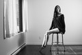
| 07/18/2015 06:20:15 AM | Terra B&Wby MarioPierreComment: *Hello from Sid and the Critique Club*
First impressions are of a lovely elegant model photographed in a way that meets the challenge but leaves me with some issues.
I am a keen advocate of natural light and prefer it in the majority of situations so from that perspective I like it. I am very impressed with the number of very constructive comments you have received which must be very satisfying in itself for you.
Lets start with the model and the lighting from the top. If this were just a head shot I would like the way it is lit, I find it very appealing. I do not like the bright light on her shoulder especially in relation to the whole image. I love the way her hair falls down her front, and I like the folds in her top. I do not like the way her legs are brighter than the rest of her, especially the shins and then the feet are effectively chopped off and darkened with a sharp shadow. Her pose looks a little uncomfortable and unnatural.
I'm sorry but I find the whole of the set completely unflattering to your model and the image's objectives. In detail, the skirting board, as already pointed out by one of your commenters. The socket in close proximity. The curtains and window and the distracting partial sign seen through it. The stool and its shadows and the bright highlights on the chrome. Her shadow from the fill light.
Your choice of aperture seems inappropriate for this specific image. As you are probably at or near the wide angle end of your lens you will have sufficient DOF at maximum aperture, you have nothing behind the model you want in sharp focus. Maximum aperture would have certainly made the outside sign less obtrusive and perhaps made the window and frame softer.
I think a lot of the suggestions you have already received are very constructive and well worth reflecting upon. Thank you for submitting and good luck for the future, Sid | | Photographer found comment helpful. |
| 07/18/2015 05:45:35 AM | Self Portrait: Warts And Allby smardazComment: *Hello from Sid and the Critique Club*
Wot no warts! First impressions, a very competent self portrait that meets the challenge well, presumably within the minimal editing rules.
Thank you for providing the lighting details, the setup is very effective, the focus is nice and sharp with good DOF and the pose is nice and relaxed. The minimal editing rule set is very strict but it does make it a great test of your camera skills, so very well done from that perspective. There are two, presumably deleted image spaces, below 'advanced editing versions' but even without those to view I remain impressed with your original.
There is nothing I can add in respect of your technical setup, it is very well chosen and, as already stated, very effective, well done.
As you say, the sensor dust does unfortunately let it down and cannot be removed within this rule set. I know from my own recent experience with a rushed last minute submission full of sensor dust much worse than yours, just how badly it goes down with the voters here which will fully explain its lower than deserved score. Without the dust your image would undoubtedly have placed much higher, certainly in the top ten, probably even the top five. We have both learned a lesson the hard way, good luck with your future submissions, Sid | | Photographer found comment helpful. |
| 07/17/2015 01:56:36 PM | ubikeby posthumousComment: *Hello from Sid and the Critique Club*
First impressions are of an appealing subject reasonably well captured that I hope fits the challenge.
As a keen cycling enthusiast I am always attracted to bikes particularly action shots. Your panning action has captured the cyclist nice and sharp and introduced a little motion into the background. This is where the problem lies for me, because of the high shutter speed there is not enough motion blur in the background it looks more like camera shake, thereby significantly reducing the appeal of the shot.
The other big problem is that you have a dark clothed rider caught in the dark shadow of a tree and with the shadow unfortunately falling right across his face, probably the most important part of the image, the part where we can identify with the moment he is experiencing through his facial expression. Also the composition, I'm not sure why you feel the portrait orientation works better than landscape but I am all for a non-standard approach as long as it works. Because of the size of the rider and the amount of space he has left to ride into it probably just about works.
'I hope it fits the challenge', I am unable to judge this as I don't know what Ubique's philosophy is but I do like his comment, perhaps I am missing an important clue to that in his comment? I have followed the challenge description which has a link to a forum thread where I was hoping to learn more about his philosophy and try to work out whether this does fit the challenge, with 3760 comments to review I'm afraid life is just far too short, sorry. | | Photographer found comment helpful. |
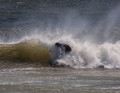
| 07/17/2015 01:29:39 PM | Face washby nygoldComment: *Hello from Sid and the Critique Club*
First impressions are of a challenging moment reasonably well executed that does not meet the challenge. I'm sorry you haven't received any comments, I will do my best to make up for it.
Any action shot has its challenges and may not always turn out as you expect, often worse sometimes better, I'm not sure how you feel it turned out for you but for me it has stopped the action but all the important elements are missing. The main missing elements are the board and the face, without the board he could quite literally be falling from the sky into the water and not be on a board at all. Without the facial expression we are missing the excitement of the moment he is hopefully experiencing making it more difficult for us to engage with the image.
You have done well to capture the moment but the shutter speed is so high that it has stopped all the droplets of water which I know a lot of people like, I, unfortunately, am not one of those, I much prefer to have some motion blur to help me experience the moment of frenzied activity more fully. The composition is too central and would have benefited from a more effective rule of thirds hotspot approach, perhaps the upper right third, you could, of course, crop the image to achieve this if you agree with my idea.
Even with your title which should help, I still cannot see how this can be interpreted as April Fool, I must be missing something and welcome your explanation to help me understand more fully. Thank you for your submission, Sid. | | Photographer found comment helpful. |
|
Showing 1541 - 1550 of ~3781 |
Home -
Challenges -
Community -
League -
Photos -
Cameras -
Lenses -
Learn -
Help -
Terms of Use -
Privacy -
Top ^
DPChallenge, and website content and design, Copyright © 2001-2026 Challenging Technologies, LLC.
All digital photo copyrights belong to the photographers and may not be used without permission.
Current Server Time: 05/08/2026 04:36:50 AM EDT.
|