|
|
|
Showing 1511 - 1520 of ~3781 |
| Image |
Comment |
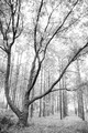
| 07/27/2015 08:51:14 AM | A Little Crooked with Your Straight?by Ja-9Comment: *Hello from Sid and the Critique Club*
An interesting image that may have challenged voters interpretation in respect of the challenge brief.
Although I like your interpretation, 'Skewed horizons, twisted perspectives' was the essence of the challenge, in that respect your image does not meet the challenge. However, I can see that you have chosen to make the viewers work a little harder than the immediately obvious with your juxtaposition of the prominent foreground tree that got last along the way in its straight growth to the sky as shown by all the rest of the trees. Personally, I like images that get the grey matter working.
I am assuming your overexposure was deliberate? It gives the image a sort of ephemeral feel with the resultant loss of detail concentrating the mind more on the straight trunks themselves so in that respect it works. Being a minimal editing challenge you weren't able to use perspective control which would have been good to straighten all the trunks perfectly and then tilt them. Given those restrictions I think I would have deliberately tilted in camera to more clearly fulfil the challenge brief and thereby, hopefully, attract a better score, but it was still respectably received.
Well done for your interesting take on the subject, Sid |  Photographer found comment helpful. Photographer found comment helpful. |
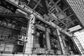
| 07/27/2015 08:28:12 AM | Escher's Cityby romilComment: *Hello from Sid and the Critique Club*
Congratulations on your high placing for this excellent image that fits the challenge very well.
A fascinating image with so much detail to get absorbed in. A great title that immediately translates the image into the sort of work you associate with Escher, it works very well.
Technically it is very well executed with good DOF and detail throughout. I suppose it could be argued that the ISO is too high given your fast shutter speed, in fact I think with all the people it would have been a great opportunity to use a deliberately slow shutter speed to blur the motion of moving people which would have added another dimension to it.
I like your conversion to mono with a nice range of tones throughout, it is far more preferable to the colour version, it grabs our attention much more effectively. Your exposure is very well handled with good detail throughout.
An excellent entry thoroughly deserving of its high score, well done, Sid | | Photographer found comment helpful. |
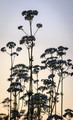
| 07/27/2015 08:15:26 AM | On Many Levelsby Dr.ConfuserComment: *Hello from Sid and the Critique Club*
An excellent entry fully deserving of the appreciative score and comments that meets the challenge very well.
I'm sorry the image caused you so much hassle but it was well worth all the effort. It's difficult to conceive of a more suitable entry especially at the angle you have chosen too. It makes for fascinating viewing with so much detail to absorb.
Technically it has been very well executed with good DOF and sharpness throughout. What would have been a horrible bland and boring sky is working to your advantage in its uniformity.
The only thing that has been confusing me is the distant horizon through the bridge supports, I assumed it was the ocean but there appears to be a significant dip which looked most odd but when I look at the same horizon outside the bridge the small section there looks lower so I assume its not water but land which would answer my original confusion.
You've done an excellent job well done, Sid | | Photographer found comment helpful. |
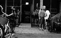
| 07/25/2015 06:29:11 AM | into youby posthumousComment: *Hello from Sid and the Critique Club*
A candid capture that meets the challenge well.
You have captured a moment that most of us nosy people have been intrigued by at some point in our shared curiosity of people watching. The essence of your image is the mystery of the moment, as you say, are they arguing or loving? It is this very uncertainty that makes your image so appealing we can only see his face which gives nothing away except intensity of emotion. The ladies stance could be either defensive or flirting, it looks as though she may be smiling but we can't be sure and so the mystery, fortunately, remains.
Although you have done some correction to straighten it out it still feels in need of further straightening it leans a little to the right. The scene as a whole is quite distracting but the main moment is so intense and captivating it overpowers any other distractions. Having said that, I think the notice above the doorway would benefit from some dodging to subdue it.
Well observed and captured, Sid | | Photographer found comment helpful. |
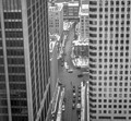
| 07/25/2015 05:30:47 AM | Downtown street before daily trafficby clickodakComment: *Hello from Sid and the Critique Club*
A literal translation of the challenge theme that meets the challenge
It makes a change to be looking down on the street instead of from the normal street level looking up at the tall buildings so it makes for an interesting perspective. Your composition is good with the two blocks framing the street which is closed by the building at the top of the frame.
I'm sorry to say that the one thing that really lets it down is camera shake, there is softness throughout what ought to have been a very crisp and sharp image. I also think you missed a great opportunity to transform it into a much more dynamic image with your camera well supported and a slower shutter speed, probably about 1/2s. You could have made a feature of the motion of the traffic and people and emphasised how the city is always on the move against the permanently static buildings.
With a little more thought and attention to detail you would have improved the end result significantly, all part of the learning process, good luck with your future submissions, Sid | | Photographer found comment helpful. |
| 07/25/2015 05:16:47 AM | The Competition by romilComment: *Hello from Sid and the Critique Club*
Congratulations on your well deserved ribbon for an excellent image that meets the challenge very well.
What a pleasure it is to be given this wonderful image, I'm sure as soon as you saw this on your monitor you thought, YES! I'm gonna love this image anyway because I love mono and I love the inclusion of people to add interest so this ticks all my boxes straight away. The execution is perfect, the exposure and the timing are both spot on.
You have a lot of enthusiastic comments and a detailed one from 'SwordandScales', whom I largely agree with he has said all the things that I feel about the image myself. Obviously, as he has not elaborated on the technical aspects, I don't know but I imagine he may be talking about having a deeper DOF to perhaps see those behind a little more clearly, particularly the man with his clenched fist to his mouth. I can see there is an argument for that but I think I prefer it just the way it is, the emphasis is well and truly on the player deep in thought about his next move. Perhaps it may be the tiny hotspots of overexposure on the faces of some of them, particularly the clenched fist character, and the background but it is so minor and preferable to what would have been a tendency towards underexposure.
I love your composition with the board and protagonists in the region of the lower right hotspot giving the rest of the frame to the onlookers who are all equally immersed in the play. You feel that this is the highlight of their day, it feels the very reason for their existence such is the intensity of it all, brilliant.
A superb study that you have every right to be proud of, well done, Sid | | Photographer found comment helpful. |
| 07/24/2015 07:01:58 AM | address unknownby posthumousComment: *Hello from Sid and the Critique Club*
An appealing image that meets the challenge well.
The lovely soft focus and pastel shades work really well together here to produce an image that has an air of mystery about it. Your composition adds impact to the end result together with the subtle shift in tones from the dark base to the lighter top makes a great end result.
There's nothing I would alter here it is a lovely end result that has been well appreciated by your commenters with whom I concur, Sid. | | Photographer found comment helpful. |
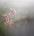
| 07/24/2015 06:04:36 AM | Sunset on the Anthriscus sylvestrisby clickodakComment: *Hello from Sid and the Critique Club*
A reasonable attempt that meets the challenge
I am a great fan of contre-jour lighting which as you observed can bring out details previously unnoticed it can however, present you with exposure problems. The camera meter has done the best it can and averaged out everything so what you end up with is something in between two camps neither of which gives you the best result.
I would have used some minus exposure compensation (-1 EC) probably 1 stop this would have created silhouettes of the flower heads which being such distinct shapes would work well, it would also saturate the background sky which given your title would probably be nearer to what you intended. Alternatively, +1 EC would have exposed the flowers themselves at the expense of a washed out sky which is, in my opinion, the less effective option.
There is not much going on in terms of composition, there is no strong focal point and too much going on in the lower half of the frame. Simplicity would have been much more effective, if you were to crop with the main flower to the left of the frame excluding everything up to it down to the top half of the flower to its lower right you would have a much simpler more effective composition that would have a lot more impact.
You might try the suggested crop together with lower exposure to a silhouette? Sid | | Photographer found comment helpful. |
| 07/24/2015 05:38:20 AM | Au Natural by Ja-9Comment: *Hello from Sid and the Critique Club*
A well executed image that meets the challenge well
The main thing that hits me about this image is its stark simplicity both of composition and colour, I find both very appealing. There are so many boldly coloured flowers in nature it is instinct to choose one, I like your choice in boldly going against this tendency so what you end up with is effectively hues of more or less, just two colours, it works well.
I think your exposure is just a little on the high side, a little less exposure would have given more detail in the whites and saturated the greens more too, probably just a third or half a stop is all we're talking about. The soft focus flower in the background is a little close to the edge of the frame, I think moving everything just a little to the right would have improved the overall end result too.
I'm not sure about your commenters suggestion to flip it horizontally but it led me to thinking hmm… what about vertically? It might be worth a try just to see if it alters its impact.
Anyway, an excellent image, thank you for submitting, Sid | | Photographer found comment helpful. |
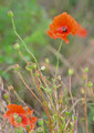
| 07/24/2015 05:19:32 AM | In Flanders Fields....by PangurbanComment: *Hello from Sid and the Critique Club*
A competent image that meets the challenge
Your choice of flower is a wise one, they are universally popular and together with your title they have poignant associations that we all recognise. I see from your comments you had difficulties with light and movement which is not surprising, they are a really delicate flower that are easily blown wildly in even the gentlest breeze.
As far as light is concerned I agree with your commenter, I think you would have benefited greatly from -1EC (-1 stop exposure compensation), this would have avoided the overexposure you have on the seed head in the middle of the frame. It would also have given some rich saturation to the colours which with the poppy's bold red would have served you well.
You might consider a square crop? I suggest this because that solitary poppy petal at the bottom is pulling me away from the main flower and then I find the lower half rather distracting and busy by comparison. Simple is always the most effective if you have just the top half the composition is very much simplified. If the seed head wasn't overexposed I would suggest cropping it there but as it is it would need to be excluded. Also the OOF flower right behind the main flower is a little distracting if you had moved position slightly to hide it behind the main flower or completely separate it would have worked better for you.
A very good attempt, thank you for your submission and good luck with your future entries, Sid | | Photographer found comment helpful. |
|
Showing 1511 - 1520 of ~3781 |
Home -
Challenges -
Community -
League -
Photos -
Cameras -
Lenses -
Learn -
Help -
Terms of Use -
Privacy -
Top ^
DPChallenge, and website content and design, Copyright © 2001-2026 Challenging Technologies, LLC.
All digital photo copyrights belong to the photographers and may not be used without permission.
Current Server Time: 05/08/2026 04:36:55 AM EDT.
|