|
|
|
Showing 1501 - 1510 of ~3781 |
| Image |
Comment |
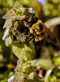
| 07/29/2015 01:41:22 PM | bee9phby coronamvComment: *Hello from Sid and the Critique Club*
Generally a decent close up that meets the challenge.
You have got good clear focus on the bee itself but it has a curious mix of sharp and not so sharp detail, for example the wings are good but the thorax is smudgy, yet given the sharpness of the top of the eyes they are on the same focal plane so should be equally sharp. There are some good bold colours throughout the image as a whole and the exposure is good and controlled. The composition is good, not exactly rule of thirds but using a diagonal and not too central, quite effective.
Looking at your processing details I am trying to answer why there is the lack of detail in areas and wondering if the crop is just a little too much? I also have a problem with the halo round the leading edge of the right wing.
You provided a title when you didn't need to but I have to show my ignorance because I don't understand it anyway! So, its title time from me, the best I can do is;
cross pollinator
Thanks for your submission, Sid |
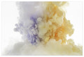
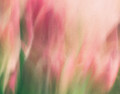
| 07/29/2015 06:33:33 AM | Liquid Explosionby pearlseyesComment: *Hello from Sid and the Critique Club*
An interesting image that meets the challenge well.
This is a very dynamic image that you can feel evolving in front of you, it is easy to imagine how the shapes will transform into new shapes. One of your commenters has mentioned a lava lamp, he's right, it is very reminiscent of them, they're always quite fascinating and mesmerising which is why this image works so well.
The exposure is very good you have chosen well in positioning the tank where you did it gives a lovely soft even light that illuminates in a nice high key sort of way. The colours are all very appealing and work well together. The more I look at it the more I'm starting to wish that the droplets on the left of the image weren't there, they're not a big problem but I just find the uniformity of the rest of the image more appealing.
I assume from your comment about the aperture you wish you had used a smaller aperture? I know what you mean it would probably have been nice to have more sharply defined edges to the shapes but then again the way this softly blends into the light background is also appealing, I think it works ok.
Thank you for an interesting submission, Sid |  Photographer found comment helpful. Photographer found comment helpful. |
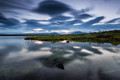
| 07/29/2015 06:17:59 AM | The lakeby GudjonottoComment: *Hello from Sid and the Critique Club*
A pleasing landscape that meets the challenge
You have some interesting cloud shapes as a result of the long exposure which are quite appealing but unfortunately the foreground object coincides with its reflection. It is normally a good idea to include some foreground interest, such as you have, but what we have is a result that somehow just seems to lack the punch that makes you want to keep coming back to it. I tend to agree with your commenter Rabidcoydog.
As the challenge theme was liquid I think it would have worked a lot better if you had excluded a lot of the sky, nice as it is, got rid of the foreground object and concentrated on the reflections instead. Exposure-wise it is good apart from the two hotspots on the water.
Having said all that it has scored well and been appreciated here so well done, Sid |
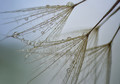
| 07/29/2015 05:59:08 AM | p e a r l s by Ja-9Comment: *Hello from Sid and the Critique Club*
Congratulations on your result, well deserved, meets the challenge well.
A gorgeous image, it captures the delicacy of the plant very well, it is also very effective in its simplicity, the drops, of course, are essential for the challenge but cliched as they maybe they are still an appealing addition.
I like the composition and repetition in the soft focus background. The exposure suits the subject well. You have received some good critique amongst your comments most of which I agree with. I wish you hadn't included the outtake because I am torn between the two, I like the symmetry of the outtake but I prefer the near mono of your entry but they are both excellent images.
Although I am familiar with focus stacking I have never used it myself. The DOF must have been very shallow if this is the result of 6 images but it is very well executed and perfect for the subject.
Thanks for another lovely entry, your images are a pleasure to critique, Sid | | Photographer found comment helpful. |
| 07/28/2015 06:08:31 PM | • f l u i d •by Ja-9Comment: *Hello from Sid and the Critique Club*
An interesting image that meets the challenge
Please don't be so hard on yourself! You certainly weren't alone in misunderstanding the idea of the challenge.
I like your image it has intriguing qualities about it that encourage you to question what, how and why. I like the subtle pastel colours and abstract nature, unfortunately, I am confused and distracted by the curious wispy black marks, especially in conjunction with the title you have so generously provided, I just cannot tie it together. I assume it is an added texture? I feel the image would have had a lot more impact without it.
Given the soft nature and the long shutter speed I assume there was deliberate camera movement during the exposure? It has produced a very appealing effect (without the overlay!)
So, what am I gonna do for a title? Being so abstract it poses a problem, I think the best I can do is;
ephemeral flames
Thank you for submitting an appealing and interesting image, Sid | | Photographer found comment helpful. |
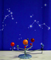
| 07/28/2015 05:50:30 PM | Solar System 1by headlesspidermanComment: *Hello from Sid and the Critique Club*
An image with room for improvement that meets the challenge.
Being the fun challenge it is it leaves plenty of scope to submit anything you want without having to rack your brains for a title – but you did! Never mind, you still got a lot of good responses.
The image itself is excessively noisy, this may have been deliberate intent on your part?
There are significant halos, this may have been deliberate intent on your part?
There are significant fringes, this may have been deliberate intent on your part?
The background should be uniform and extend below the stand.
The two blue ridges are very distracting and the lighting reflections on the base are also very distracting.
I'm not really sure how much of this resulting image was your intention or perhaps the result of a lack of experience? If you would like me to try and make further constructive critique perhaps you could provide me with the answers to my questions.
So, a title?
Interplanetary, most extraordinary
Thanks for submitting, Sid |
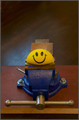
| 07/28/2015 05:26:37 PM | You Name It!by codfish709Comment: *Hello from Sid and the Critique Club*
A competent image that meets the challenge
What a fun challenge this was, free reign for anything you want without having to rack your brains for a title which has generated tremendous response from the viewers, win, win! A fun image that is generally well executed with an appealing simplicity, however that same simplicity is a little marred by the bar at the 10 o'clock position that is catching the light in a distracting sort of way. The other problem for me is the staple, I just don't understand it, I can't see any logical reason for it.
I think a square crop would have suited it better it would have removed the space above that makes no contribution to the image as a whole. Your lighting is illuminating the ball nicely but spilling over to give an unevenly lit background.
Ok, so time for a title?
Let me be your squeeze
Well done for submitting a good and original concept, Sid. | | Photographer found comment helpful. |
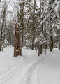
| 07/27/2015 10:55:25 AM | You Name It........by clickodakComment: *Hello from Sid and the Critique Club*
A well executed image that meets the challenge.
A fun challenge that gives you complete free reign without even having to think of a title. Wouldn’t it be nice if all challenges generated this amount of response from the viewers! Haven't you generated a lot of responses and despite that your own suggestion wasn't used.
I very much like the fact that you probably had to use +EC to get that snow looking the way it should do – white! Well done. Too often the whites of snow come out a horrible murky grey through too little thought and effort. I like the focal point of the foreground stump of a tree, I rather wish the orange sign wasn't there in such lovely natural surroundings. I like the way the snow trails lead us into the forest.
So, I reckon you want a tile from me? What about
eeny, meeny, miny, mo…
Sid | | Photographer found comment helpful. |
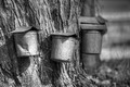
| 07/27/2015 09:23:21 AM | "You Name It"by DrakeComment: *Hello from Sid and the Critique Club*
A reasonable image that meets the challenge.
What a fun challenge this was, a very relaxed, easy to fulfil theme. So, thank you for introducing me to this process, something I have never seen before, does one tree really fill all those buckets?
In terms of the image itself your chosen wide open aperture has nicely softened background detail down so that we can concentrate on the tree itself. I find the lighting harsh and very contrasty I think it would have been better for you to have shot it in better light. The crop is a little inaccurate, with part of another bucket appearing right on the edge of the frame, and therefore distracting. Also your position includes a soft focus background shape clinging to the bucket, it would have been better to hide this behind the bucket.
You've received lots of novel suggestions for a title so in keeping with the rest of your commenters I really cannot let the side down can I, how about;
' birds air raid shelters'.
Well done, Sid | | Photographer found comment helpful. |
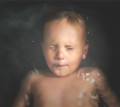
| 07/27/2015 09:06:33 AM | BIG FISHby Ja-9Comment: *Hello from Sid and the Critique Club*
A good interpretation that meets the challenge fully.
A clever and different way of fulfilling the challenge, your subject was obviously very co-operative in holding his breath and a static position while the surface returned to calmness so full marks to him. His expression borders on serenity, very womblike, but instead the cramping of his lips introduces an element of tension too.
Unlike your commenter, I find the white ripples very distracting and detrimental to the overall effect. I presume these are the result of the use of flash? It would have been good to see the result without flash. I like the dark background which for me enhances the result.
A respectable score and appreciative comments so all in all a good result, well done, Sid | | Photographer found comment helpful. |
|
Showing 1501 - 1510 of ~3781 |
Home -
Challenges -
Community -
League -
Photos -
Cameras -
Lenses -
Learn -
Help -
Terms of Use -
Privacy -
Top ^
DPChallenge, and website content and design, Copyright © 2001-2026 Challenging Technologies, LLC.
All digital photo copyrights belong to the photographers and may not be used without permission.
Current Server Time: 05/08/2026 02:20:05 AM EDT.
|