|
|
|
Showing 1461 - 1470 of ~3781 |
| Image |
Comment |
| 08/08/2015 07:42:20 AM | s e a • s p r i t eby Ja-9Comment: *Hello from Sid and the Critique Club*
A simple image given extra quality.
As soon as this started to appear on my screen I actually uttered an ooh… it has instant appeal for me. As your commenters have stated it has a dreamy quality to it.
Your slow shutter speed and deliberate(?) movement during exposure has created a much more unique image that has an extra appeal all of its own. The vogue is so often for very long exposures turning the sea into a flat lake which, although it has its merits, has been way overdone of late, this is much more preferable. I like your composition with the child well off centre and looking in towards the rest of the frame, it works well.
There's not really anything I can add, it works for me, thanks, Sid |  Photographer found comment helpful. Photographer found comment helpful. |
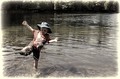
| 08/08/2015 07:31:35 AM | Before the fall...by RyanWComment: *Hello from Sid and the Critique Club*
A great shot for the family album.
A moment stopping action shot which together with your title suggests the brief calm before the subsequent splash and possible tears. I like that it is a candid moment where your son is completely oblivious to the camera.
I like the composition with your son positioned on the front third with plenty of background water and trees to convey where he is. I have to agree with posthumous I would definitely get rid of the frame edges, for me, its ruining the end result. The other big problem is the blown highlight on his arm it definitely needs pegging back some.
All in all a very pleasing shot that with the suggested alterations would be even stronger, thanks, Sid | | Photographer found comment helpful. |
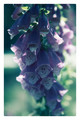
| 08/08/2015 07:21:26 AM | A Lady's Gloveby ArnaMarieComment: *Hello from Sid and the Critique Club*
An appealing flower study.
A fairly straightforward flower shot that includes all of the plant detail but the lighting is such that it has created some strong contrasts causing some problems with shade and highlights. I like that you have resisted the urge to saturate as is often the case and opted for a more subtle approach, for me that works well. You have already questioned the frame yourself, from me, an emphatic no, I would have preferred it without.
Your focus is towards the top of the plant with a shallow DOF that sees the lower half fading into soft focus which is fine and works well, however, because of the shadow problem the focussed top half is least visible as opposed to the lower half.
I see you have asked for some PS feedback, for myself I always try to minimise the post processing so I am far from being an in-depth user but I will try and give you my workflow for the image. I hope you shot in RAW? The bulk of my adjustments would be in ACR (Adobe Camera Raw). I would look carefully at the histogram and start off with the auto adjustment which is sometimes sufficient on its own but if not I would tweak the sliders until I got a good even distribution of the histogram. As part of that process I would imagine I would have used some fill light to bring detail into the top half and I would have probably used recovery slider to reduce the blown highlights.
In PS my emphasis is always on getting the very best quality as opposed to fancy this that and the other filters or whatever, the danger is that you get carried away and far removed from the essential qualities within the image. I may have used hue and saturation to lightly subdue the colours a little and I may have used curves to make sure the most important parts of the image are being rendered at their best. I rarely sharpen I would prefer an unsharpened image to an over-sharpened one every day, halos are so unsightly and often ruin some otherwise brilliant images. So there we are, like I said my post processing is always minimal.
I hope this helps, thank you for your submission Arna Marie (what a lovely name), good luck, Sid | | Photographer found comment helpful. |
| 08/08/2015 06:53:16 AM | Retrospectionby romilComment: *Hello from Sid and the Critique Club*
An interesting candid.
Your title suggests that he is having a 'condor' moment midway through his meal and is deep in thought, to me I feel he is engaged in a conversation with the person whose hand appears in the bottom right hand corner. Because of that I feel a sense of frustration that the frame wasn't lower and further to the right to include much more of this person. Whether or not that is the case I do think it would have greatly improved your image. As one of your commenters has said we have a lot of empty space, cluttered background and a yellow notice drawing our attention away from where I really want to be. There is a strong argument for a crop excluding the girl with the man on the left of the frame but perhaps there were other things in the missing space that prevented you from framing it in this way?
Your exposure is good and the DOF is sufficient for background detail without it distracting (I'm talking about a crop just above his head), and as mentioned by your commenter nice muted colours. With the present crop the other problem I have is the bright rim of the dish which is again distracting but with the suggested crop would have been another element in the story.
Thanks for another interesting contribution Romil, Sid | | Photographer found comment helpful. |
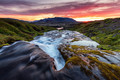
| 08/08/2015 06:35:42 AM | In the middle of the creekby GudjonottoComment: *Hello from Sid and the Critique Club*
A very well executed landscape of considerable appeal.
This is a joy to view, such a glorious landscape. With the wide angle end of your lens you have chosen a middle of the range aperture that has fulfilled your need for a large depth of field by careful choice of your focus point about a third of the way in. The quality that has resulted tells, you have sharpness right into the foreground corner and acceptable sharpness in the distant mountain. Your slow shutter speed has enabled you to convey just the right amount of movement in the water to make us really feel as though we are there in the midst of it.
The only minor criticism is the blown highlights around the sun but that is inevitable without HDR which, in my opinion, rarely gives such pleasing results as we have here. What I am very surprised about is that it didn't score higher, you have two tens, and that you received no comments during the challenge, disappointing but your image remains in all its strength.
Another very pleasurable image Otto, thanks, Sid |
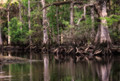
| 08/07/2015 01:03:58 PM | • n i r v a n a •by Ja-9Comment: *Hello from Sid and the Critique Club*
A nature study without a strong focal point.
This is the Orton effect again isn't it? The end result looks very similar to your image I recently critiqued for the challenge 'the Orton effect', most of my introductory remarks equally apply to this image.
I find it difficult to rest my eyes on any particular aspect of the image I am wandering around and not seeing anything that holds my attention. There is an imbalance between the right and the left, everything of any interest is to be found on the right. The general tone of the trees just doesn't look natural there seems to be a colour cast throughout.
I do like reflections and I think this may have worked better if you had concentrated on the right and more water using portrait orientation, it would probably have made it more interesting.
I'm sorry this one is just not doing it for me, Sid | | Photographer found comment helpful. |
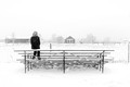
| 08/07/2015 10:21:48 AM | Reflectionby KenComment: *Hello from Sid and the Critique Club*
Congratulations on your high placing for a lovely study.
The feeling of contemplation of your lone subject in this snowbound landscape comes across very strongly which from your title is exactly your intention I presume? I like the high key effect which is broken up by the dark clothing of your model. I like the general simplicity from the foreground stand to the background structures and trees which although fairly complex is reduced to simplicity by the lighting and uniform nature of the sky.
Your exposure is spot on, you have presumably used some +EC in camera or corrected post in PS but you have captured the essence of the snow with your wonderful whites without blowing out the highlights so although you are close to the limit you have detail throughout, well done. I can see what Madman2k means about the post on the right its sort of acting as a full stop, given the nature of the image I want to continue with my imagination beyond this point, I think I agree it would probably help to crop it out.
I'm pleased for you that it was so well received here, well done, Sid | | Photographer found comment helpful. |
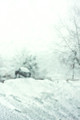
| 08/07/2015 09:59:30 AM | finding homeby posthumousComment: *Hello from Sid and the Critique Club*
A very intriguing abstract that suggests hidden meaning
I have to agree with your commenter Neat, your image and title suggests being lost in a blizzard and finding the sanctuary of a shelter which would be a most welcome feeling to anyone in such distressing circumstances. So, although it is abstract and difficult to define exactly what we are looking at that is what gives it the mystery and meaning that makes it work.
I am normally very hot on blown highlights but in the context of your image that is what gives me the suggested meaning I am getting from it, so therefore, it is essential here. I like the toning, its working well too. I am quite a fan of deliberate OOF, it is very useful to give an alternative presentation to the normal pin sharp that we all seem to desire so much. It is the fringing of the fine lines that is so intriguing and works well with the OOFness (try finding that on google!).
I like that you have the courage of your convictions with your photography, you know your images are unlikely to be appreciated by enough people for them to score highly but you have your own distinctive vision and you are not afraid to share it with others, thank you, Sid. | | Photographer found comment helpful. |
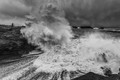
| 08/07/2015 07:06:08 AM | In line of fireby GudjonottoComment: *Hello from Sid and the Critique Club*
A great action shot.
Perfect timing, well done. I must admit that in pursuit of the shot I have put myself in equally precarious situations. Your choice of a slower shutter speed has enabled us to really experience the drama of the situation, the breaking wave has just the right amount of motion blur to help us fell the sheer power of it.
I see several of your commenters have picked up on the sharpening halos to the left, I can only agree with them, its a real shame, it mars an otherwise excellent image. There's not a lot you can do about the lighting but it would have been good if we could have got more definition of the wave against the sky. Its good to have some foreground included but the small amount we have here is not really adding anything and would probably be best cropped out. The exposure is good with plenty of detail throughout.
Another great shot Gudjon, well done, Sid |
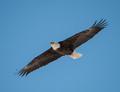
| 08/07/2015 06:51:28 AM | Soaring Bald Eagleby DrakeComment: *Hello from Sid and the Critique Club*
An appealing wildlife study.
I am naturally attracted to wildlife studies particularly action shots so towards that end the subject is appealing. It is a very competent shot with good focus but the lack of sharpness one of your commenters talk about may be due to cropping? Its a good exposure with plenty of detail throughout the birds plumage. I like the diagonal that the bird is placed on it adds a dynamic to the image.
Having identified what works for me I also need to give my honest opinion what doesn't work so well for me, the dominant blue of the sky overpowers the bird it would benefit from some desat. The bird is too large and too central, I would prefer to see him smaller and probably towards the lower right flying in to some empty space. The shutter speed is too high it feels far too static there is no sense of motion that you would get from a slower shutter speed with a little blur in the wingtips. I could easily imagine this hanging in a museum against a blue ceiling it would look very similar.
I would have expected your image to have scored better than it did but thanks for your submission and good luck for your future entries, Sid | | Photographer found comment helpful. |
|
Showing 1461 - 1470 of ~3781 |
Home -
Challenges -
Community -
League -
Photos -
Cameras -
Lenses -
Learn -
Help -
Terms of Use -
Privacy -
Top ^
DPChallenge, and website content and design, Copyright © 2001-2026 Challenging Technologies, LLC.
All digital photo copyrights belong to the photographers and may not be used without permission.
Current Server Time: 05/08/2026 06:16:59 AM EDT.
|