|
|
|
Showing 1431 - 1440 of ~3781 |
| Image |
Comment |
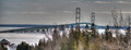
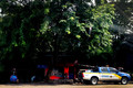
| 08/13/2015 06:44:26 AM | Bridge To The "Trolls"by DrakeComment: *Hello from Sid and the Critique Club*
A pleasing record shot of an attractive bridge
This is the second shot of yours of this bridge I have had the pleasure of commenting on, from the outset I have to say I prefer the other, the lighting is much better. You have an interesting sky as an effective backdrop which is nice but the foreground is the main problem here, it interferes rather than enhances the image. It's a real shame you weren't able to get into a more elevated position whereby you could include the foreground without it impeding upon the bridge itself.
The bridge is a very attractive example of practical engineering and thus will always make an attractive image which is why it needs enhancing in some way to make it stand out from the crowd. You achieved that with your other image through the quality of the light, with this one however, I'm afraid you haven't managed it as well.I hope the water's not like that all year round!
Thanks for your submission, Sid |
| 08/12/2015 03:15:27 PM | 6.1by DrakeComment: *Hello from Sid and the Critique Club*
An appealing image that meets the challenge
Your image is all about light, the quality of the light on the bridge here is excellent making it stand out from the background. It's a shame that bother towers aren't lit top to bottom in the same way as the foreground one. I like the way the spars, at least in the foreground, are well defined again through the lovely light. The plain sky and woodland acts a good neutral background to the bridge but the snow's shadow does rather nullify the effect of the lovely light. If you could selectively increase the exposure for the foreground snow I think this would lift the whole image.
I don't agree with your commenters that the image is flat but I think the foreground snow is influencing their judgment. I like your composition it fits the subject well, the frozen waters are an essential ingredient of the whole image and the frozens 'mountains' form an interesting detail of the foreground. All in all a pleasing result.
Your estimated score was quite an accurate assessment, I hope you were pleased, Sid |
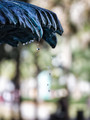
| 08/12/2015 02:58:01 PM | "It is life, I think, to watch the water." ~ Nicholas Sparksby Ja-9Comment: *Hello from Sid and the Critique Club*
A competent image that meets the challenge
Your fast shutter speed has enabled you to capture the water drops very effectively and thus meet the challenge. I like your portrait orientation to leave plenty of room for the drops to fall into. I also like the row of soft focus drops in the background against the one sharply focused drop in the foreground.
I find the background distracting especially all the colours, I think this would have worked much better in mono. I think there is also scope keeping the same aspect ratio for a crop removing some from the right and the bottom so that you have more of a feel that there are still more drops just beyond the frame.
It's a shame you didn't get any comments during the challenge and also that it didn't score higher, I think it deserved better, Sid. |  Photographer found comment helpful. Photographer found comment helpful. |
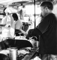
| 08/12/2015 02:47:17 PM | Corn Kingby Ja-9Comment: *Hello from Sid and the Critique Club*
A record shot that meets the challenge.
The image is a quite straightforward shot of a tradesman at his labours which, of course, meets the challenge brief. It is a very challenging exposure in the bright sunlit conditions in which you were in, so I assume in order to get sufficeint exposure to the most important part of the image, the man, you have used +EC? It has worked for the man at the expense of the rest of the background which is totally blown and, for me, detrimental to the end result.
This is obviously not a situation where you can combine exposures but if this was your only vantage point I might have tried to expose for the scene as a whole with a lower and more acceptable level of overexposure and selectively increased the exposure for the man in PS. I know the shadows hold less usable data and reveal noise more readily but there is also scope here for a lower ISO and wider aperture given the background scene.
Hope you enjoyed the cob?!? Sid | | Photographer found comment helpful. |
| 08/12/2015 11:33:18 AM | Dumplings In 4 Simple Stepsby romilComment: *Hello from Sid and the Critique Club*
A well executed image that fulfils the challenge through the title.
I know I'm in the minority here but lovely as the image is, on its own it does not convey simple to me. It relies upon the viewer also taking your title into account but then in my mind the title is also an integral part of the image at least here on DPC it is so with that proviso it does meet the challenge. It's good that you have chosen to do it the way you have because if everybody entered the type of image I visualise for the challenge then there probably wouldn't be as much variety as your image has contributed.
You have received a lot of warm comments that identify the light as the key quality that gives your image that extra quality that is so lovely to see. I had a problem with the person on the extreme right but he is cleverly balanced against the hands on the left of the frame and this makes it all work well together. I like your DOF and focus point we have just the right amount of detail through the image as a whole. All in all a very effective and pleasing result in spite of my reservations.
Well done for going with your instincts, Sid | | Photographer found comment helpful. |
| 08/12/2015 11:14:41 AM | a simple flowerby PloucComment: *Hello from Sid and the Critique Club*
An interesting macro that would meet the challenge with some adjustment.
Flowers can actually be quite complex in their structure and not ideally suited to the theme of simplicity. However, with your shallow DOF you have managed to reduce that complexity to just the stamens against a colourful backdrop. The only thing that spoils that effect is the sharply focused edge of the petal on the right hand edge of the frame, this most definitely needs cropping out especially in view of the challenge theme, it adds a complex and distracting element that spoils the overall effect.
I really like the transition between the background colours and the way the stamens softly appear from its depths it works really well. I sort of wish there was more DOF to get the stamen heads better defined but that would be at the expense of that gorgeous backdrop which works so well as it is it would be a shame to alter it. I love the curves and the flowing feel of the stamens I think we have to leave it as it is.
Sorry you didn't get any comments during the challenge, I hope this makes up for it, Sid. |
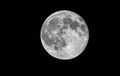
| 08/12/2015 10:58:35 AM | Simple Blue Moonby tolovemoonComment: *Hello from Sid and the Critique Club*
A straightforward moon shot that fits the challenge.
It's really a very open brief so your shot of the moon is simplicity itself, though it would require some careful consideration beforehand. I'm really surprised how much light you had it must have been a really bright moon, so bright you may even have got away without a tripod though I assume you did use one.
The detail in the moon is quite extraordinary and you have every right to be well pleased with the result, apart from all the other detail I love the craters on the right hand edge. Your mono processing is good with lovely rich blacks as a backdrop. There's nothing really to fault or to add, well done. It's a shame you didn't get any comments during the challenge but I hope this makes up for it.
Thank you for your submission, Sid. | | Photographer found comment helpful. |
| 08/11/2015 03:19:34 PM | Tire Pump Tradesmenby tegarahadinataComment: *Hello from Sid and the Critique Club*
A poorly executed image that meets the challenge.
Can I begin by echoing your commenter Deve and welcome you to DPC. One thing about DPC as you have found with this entry, is that they are not very tolerant of technical flaws such as poor focus, camera shake etc., and this is reflected by your own comments and in your low score.
You say you were in motion as you were taking the image? If that is the case, I strongly advise you to stop and take your time over your next opportunity! Unless you were speeding by even at 1/500s you should have got a sharper result than this, but it may be the equivalent of camera shake but I think the problem is more likely to be poor focus. Either way the end result is far from perfect. You also have some flare in the right of the frame which I can't logically account for unless you were shooting through a window?
Having said everything I have which all sounds rather negative I do like your composition with the main subject at the bottom of the frame. The lighting is such that it emphasises the tradesmans vehicle with his company name on so towards that end it adds to the challenge theme.
I'm sorry you have got off to a lowly start but I hope you will have learnt from your efforts how important the technicalities are in getting a quality image. I wish you well with all your future entries, Sid |
| 08/11/2015 10:17:27 AM | We started dying before the snow, and like the snow, we continued to fall.by posthumousComment: *Hello from Sid and the Critique Club*
An intriguing image needing the title too to fulfil the challenge brief.
Given the nature of the challenge the title is as much a part of the viewers interpretation and therefore the end result as the image itself. I like the high contrast mono treatment you have given the image, I like the gritty irregular surface of both the road and the snow it works well together. I like the diagonal of the composition.
I can see the relevance of the snow in your image but I am struggling to see how the road marking contributes. My interpretation, which may well be wrong, is that it signifies divergence or splitting up and that in doing so the loss of our collective strength and so we will fall? Or is it that the road marking is showing signs of decay and was starting to fail before the snows came and they will soon cover it completely? Your comment about a Google shoehorn doesn't help me, I don't understand it. However, like ubique I was intrigued by the title and had to check it out on Amazon, it looks absolutely my sort of book so thanks for the lead! Perhaps you will read the book too?
Thank you for yet another stimulating entry, Sid | | Photographer found comment helpful. |
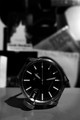
| 08/11/2015 09:55:59 AM | Thinking of all I had lost in the course of my life: times gone for ever, friends who'd disappeared.by tegarahadinataComment: *Hello from Sid and the Critique Club*
An image with potential whose title fits the challenge.
Given the nature of the challenge the title is as much a part of the viewers interpretation and therefore the end result as the image itself, taking both into account here I feel you have not made the most of the opportunity. I may be wrong but it just doesn't feel as though much thought or effort has gone into it.
I assume your crooked placement of the clock is deliberate though I'm not sure what if any relevance it has to the effect you were after. So, we have a crooked clock against an out of focus background of what? Clutter? Again I can't make the background contribute to the end result. The clock itself is poorly lit with harsh shadows some of which are obscuring parts of the face. I like that its in mono but thats a purely personal thing.
I think to give your title more meaning that I would have put the clock round to its correct position against a sufficiently focused background of an empty bed with ruffled pillows signifying the friend who has disappeared or something along those lines.
Sorry I couldn't be more positive but thanks for your submission, Sid |
|
Showing 1431 - 1440 of ~3781 |
Home -
Challenges -
Community -
League -
Photos -
Cameras -
Lenses -
Learn -
Help -
Terms of Use -
Privacy -
Top ^
DPChallenge, and website content and design, Copyright © 2001-2026 Challenging Technologies, LLC.
All digital photo copyrights belong to the photographers and may not be used without permission.
Current Server Time: 05/07/2026 09:06:11 PM EDT.
|