|
|
|
Showing 1391 - 1400 of ~3781 |
| Image |
Comment |
| 08/21/2015 07:07:54 AM | Home Work Balconyby clickodakComment: *Hello from Sid and the Critique Club*
A good still life that fits the challenge well.
An interesting take on the challenge and an interesting composition. I like the focus on the spirit level bubble together with the hammer on the same focal plane at the other end of the image, it works well. I like the way the spirit level recedes into the background, though the background itself does have some distracting elements.
The exposure is good throughout I like the natural light and the way it is lighting the hammer in particular. I find the red within the spirit level aperture frustrating because I think it may well be a drill, in which case it adds to the story the image is telling but it is too out of focus to distinguish what it is, because of that it now becomes a distraction. As it stands an increase in DOF would also bring more of the distant background into sharper focus and therefore more distracting still so I think it would be better to place the drill, if thats what it is, in a more prominent position in the foreground.
Thanks for an interesting and worthy submission, Sid |  Photographer found comment helpful. Photographer found comment helpful. |
| 08/20/2015 02:07:32 PM | Sunset in Tanzaniaby tigerluongComment: *Hello from Sid and the Critique Club*
A very appealing sunset assumed to meet the challenge.
What a grab shot! In itself it is a very appealing shot of a lovely location in a good composition. I like both the left and right of the image and the position of the sun.
Like your commenter I have a problem with the sudden transitions they feel unnatural to the overall detriment of the image. You would undoubtedly have had little detail in the shadows and to get it back it looks as though you have pushed the curves beyond normal limits. I am having problems reconciling the feint red trees I am seeing between the silhouetted trees on the right, this may be down to selection problems.
Is that really the colour of the sky? You are in a part of the world I have never experienced and this may well be the case but those, like me, who haven't seen skies of such intensity are bound to ask the same question and unfortunately it may well affect their reaction to it, lovely as it is.
Thank you for submitting an appealing image, Sid | | Photographer found comment helpful. |
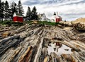
| 08/20/2015 01:49:54 PM | r e f l e c t i n g • p o o lby Ja-9Comment: *Hello from Sid and the Critique Club*
An interesting shot assumed to meet the challenge.
A great composition of an interesting location. Well done for looking for the puddle and reflection to add that extra interest to your image and placing it in one of the hotspots to complete your composition. The colours and patterns of the rocks are what make the image stand out and you have made these a major element of your image to good effect.
For some inexplicable reason I have problems with the buildings, they feel like cutouts that have been added after, I know they haven't but that's how they feel, particularly the nearest red building. It's a shame because it is an appealing image but the feeling is so strong it is detracting from my overall appreciation of it. I can only assume its down to the processing, it feels as though its somehow lost its natural look.
I'm pleased for you that most people here appreciated and enjoyed it, scoring well in a highly contested challenge, well done Janine, Sid | | Photographer found comment helpful. |
| 08/20/2015 10:22:26 AM | Hot Magmaby GUTomekComment: *Hello from Sid and the Critique Club*
A unique shot assumed to meet the challenge.
There can't be many of these shots made last year! A fascinating view of something that most of us never have and probably never will see in our lifetimes. The amazing patterns that the flow has cooled into are quite compelling. I like the splash of red of the hot magma against the drab grey of the rest of the image, I also like your placement of it on one of the thirds hotspots it works well.
The only thing I would like to comment on is that the corners are a little soft. This is presumably your maximum aperture, if so, I think stopping down to f8 would have given you sharper detail throughout even at the same ISO setting.
A very good and interesting submission which did well for you in probably the toughest challenge of the year, well done, Sid |
| 08/20/2015 10:09:51 AM | The Sparkby DigiFotoBuddyComment: *Hello from Sid and the Critique Club*
A very striking portrait that is assumed to meet the challenge
A good and striking portrait such as you have captured here is all about the eyes, the confident eye contact that has that sparkle in it, and it's here in abundance. I also like your diagonal composition as opposed to a normal straight on portrait it has created a much more dynamic feel to the image as a whole.
I wish the background was more uniform without the bright area immediately next to his face, perhaps it might be an idea to dodge it a little just to reduce its impact. Other than that there is nothing further that I would alter about it.
Thanks for a great submission in a very challenging challenge, Sid | | Photographer found comment helpful. |
| 08/20/2015 09:58:25 AM | Etherealby ilkaComment: *Hello from Sid and the Critique Club*
A very competent image that is assumed to meet the challenge-w
This is a very well executed image that has a lot of appeal. You have very effectively countered the biggest challenge you were faced with, that of reflections off the glass, by using the rubber hood you have completely overcome it and produced something of quality. An apt title sums up what I like about the image, the incandescent hues against the translucency with the black background all work together very effectively.
Even though you are at presumably maximum aperture you have still got a good DOF here that captures all of the body detail well. I like your commenters remarks and concur with them fully. I think because we are more used to seeing a jellyfish in a top down posture we are thrown by the angle here, not that it doesn't work but perhaps a rotation may have secured an even better score.
In an another appropriate challenge this would have placed very highly indeed but in this challenge you are up against a lot of high quality entries but you still did well, thanks for a great entry, Sid |
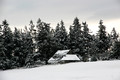
| 08/19/2015 10:24:10 AM | FIRST SNOWby HUETHComment: *Hello from Sid and the Critique Club*
A landscape assumed to fulfil the challenge brief
Given your description I would say you have achieved your goal with the chosen scene. There are, however, a few things I would like to talk about in order to help you try and improve upon your end result.
First of all your image is smaller than it needs to be which would inevitably go against you with the voters here so always try and make the most of your image through the challenge dimensions allowed.
Your image has all of the qualities you were seeking, isolation, solitude and loneliness being ways of expressing the same thing this location does seem to fulfil that objective. Decay is also represented with the roof of the building, and all of this against the purity of the snow which is unfortunately greyer than pure white snow needs to be. As your camera meter is always designed to give an average result for the average scene (18% grey) it will inevitably underexpose the snow and need brightening up in post processing. The problem here is that you will need to select just the snow as you already have over-exposure in the sky so you cannot simply give more exposure throughout.
Your composition could be improved, the building is very central, it would have a lot more impact of you had used the rule of thirds for placement of the building. The whole scene feels as if could benefit from more contrast it is a little lacking at the moment. There is vignetting which may be deliberate but I think it would be better without.
Thank you for your submission, I hope my comments help, Sid |
| 08/19/2015 09:21:28 AM | The Lady At Mirror Lakeby TommyMoe21Comment: *Hello from Sid and the Critique Club*
A pleasing landscape that is assumed to meet the challenge
A lovely location that has been enhanced by your thoughtful inclusion of your wife in the scene. Her inclusion gives us a good strong focal point and also gives us a sense of scale of the grandeur of the location. I like the skies a lot.
Your composition and exposure are generally good, the reflections are a welcome addition. Technically your settings are good, nice low ISO and I assume a good tripod for support. You have achieved a huge DOF through your choice of a small aperture though if this actually the smallest aperture I would generally avoid it in the interests of best image quality.
Like your commenter I am not keen on HDR treatment, the colours are a little too saturated for me, I prefer more subtlety and a more natural looking result though having said that your image is a lot better than many I have seen using this technique.
Thanks for your submission, Sid | | Photographer found comment helpful. |
| 08/19/2015 09:07:24 AM | dpi29297by MaharetComment: *Hello from Sid and the Critique Club*
An excellent figure study assumed to meet the challenge.
This is a very capable study worthy of all the aching limbs and effort involved! I like your composition and her pose, the windy evening gives it another dynamic, the exposure is good through most of the image. I also like the shape and colours in the shawl she is holding and the way it is blown by the wind.
There are two issues that needed a bit more attention to detail, one is the slight cropping of the shawl, there is a lot of base that could easily have been sacrificed to get all of the shawl in frame. The other is the sloping sea!
This is generally good submission that was up against the toughest competition, well done, Sid |
| 08/19/2015 07:31:41 AM | A Taste of Bokehby WonderDudeComment: *Hello from Sid and the Critique Club*
A fairly pleasing flower study that meets the open brief of the challenge.
A simple shot of a simple subject taken with a simple lens in a satisfying way for you. It is satisfying when you can use simple and lovely old lenses in conjunction with a digital camera and it will hopefully lead the way for lots more similar experimentation for you.
With regard to the image itself I like the composition leading in from the top left the way it does and as your commenter observed, some lovely contrasting colours too. What I am not so keen on is the distracting over-exposed square behind the flowers, unfortunately it overpowers in a negative sort of way. The other issue is the sharpness overall which given your high shutter speed is obviously not camera shake so therefore must be down to the lens itself. It doesn't exhibit as softness per se but more a resolving issue, there is apparent sharpness but it just doesn't seem to make the flowers stand out the way they should.
Thanks for your submission, enjoy your use of manual lenses, its very rewarding, Sid | | Photographer found comment helpful. |
|
Showing 1391 - 1400 of ~3781 |
Home -
Challenges -
Community -
League -
Photos -
Cameras -
Lenses -
Learn -
Help -
Terms of Use -
Privacy -
Top ^
DPChallenge, and website content and design, Copyright © 2001-2026 Challenging Technologies, LLC.
All digital photo copyrights belong to the photographers and may not be used without permission.
Current Server Time: 05/07/2026 09:06:13 PM EDT.
|