|
|
|
Showing 1381 - 1390 of ~3781 |
| Image |
Comment |
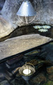
| 08/22/2015 08:32:53 AM | Light reflectionby clickodakComment: *Hello from Sid and the Critique Club*
An interesting take that meets the challenge well.
You have come up with an interesting concept to fulfil the challenge, your chosen scene adds further appeal. Your chosen aperture has created a shallow DOF and your focus is softly on the reflection which actually works quite well.
I do find the lamp itself which is in sharp focus rather bright and overpowering it dominates over the much more appealing lower half of the shot. I think a crop excluding the lamp would improve the shot a lot. I've just noticed one of your commenters remarks which seems to concur with what I have just said.
Thanks Marcel for an interesting approach to the challenge, Sid |  Photographer found comment helpful. Photographer found comment helpful. |
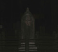
| 08/22/2015 08:21:46 AM | face on the stone1by Fourth_EyeComment: *Hello from Sid and the Critique Club*
An interesting take that meets the challenge well.
Well, I feel your image deserved a lot higher score than you received but at the same time I can fully understand why it didn't, most people here will see pure black and move on, they will not search as fully for the ghost as they need to. It is for that reason that I like your submission, I like any image that involves a little more effort.
As regards the 'face' are you saying that you waited in front of a blank tombstone for an hour and the moon shone through revealing this apparition? Because the face is the most important element I think a closer crop excluding the confusing base would have been better. We have your technical details but given the very dark exposure I assume you were in manual exposure mode?
Now, how much credence do I place in your description? Its certainly an interesting anecdote, thanks, Sid. |
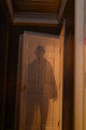
| 08/22/2015 08:08:52 AM | Back from the 40'sby mrjssimsComment: *Hello from Sid and the Critique Club*
A reasonable attempt that meets the challenge well.
You've achieved the desired effect on your subject but he just feels rather static and uninteresting. The lighting is uneven with the right of your 'ghost' much lighter than the left with a clear dividing line just right of centre top to bottom.
I'm not sure if you intended to have a ghost of the door too but the double exposure on the door for me spoils the effect in a way that is detrimental to the end result as a whole. Also spoiling the image is the lean to the right, it would benefit from straightening. A crop excluding all of the right up to the darker doorway would also help. I don't want to appear too negative, your commenters and voters have obviously appreciated it more than I but my suggestions are the things that I would have done to improve it.
Thanks for your submission, Sid | | Photographer found comment helpful. |
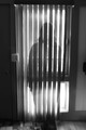
| 08/21/2015 11:35:04 AM | Blind Ghost by CameliaMComment: *Hello from Sid and the Critique Club*
An interesting image that meets the challenge well.
I have to echo the thoughts of one of your commenters and commend you for a well thought out plan, the end result is a ghostly image that works very well. I love her well defined shape on the blinds against the missing sections of her in between the light filled gaps. Good old mom!
You have overexposure from the external daylight but this is inevitable given the shooting situation. I think a tighter crop may have improved the end result, I don't think you need the full doorway at all, or even the full standing figure, a crop that just has the essential upper body cropped to just above her head and no doorway would work better for you. You do have a slight lean to the right which could be corrected as part of a crop if you decided to try it.
Thanks for an interesting take on the challenge, Sid |
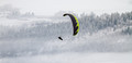
| 08/21/2015 10:01:30 AM | Free flightby wiesenerComment: *Hello from Sid and the Critique Club*
An interesting image presumed to meet the challenge.
An interesting moment taken against a cold looking winter landscape. The composition fails in as much as the strong focal point of the paraglider is just far too central. I don't know if you have cropped from a larger original but just taking what we have here I would suggest that a far stronger composition would be to move towards a more traditional aspect ratio with the figure in the top right flying in towards the rest of the image. You could remove all that white from the top and crop to just above him, I think it would make for a better result.
Thank you for your submission, Sid |
| 08/21/2015 09:51:45 AM | Safe Travels by mlhannahComment: *Hello from Sid and the Critique Club*
A portrait with a difference assumed to meet the challenge.
I do like an original approach to any photography and this fits the bill in that respect. I like the hat, the exposure is good and your choice of aperture has enabled detail in the facial features as well as the goggles. As a straightforward portrait in natural light it does the job.
This, I'm afraid, is where I part company with your commenters, because I do not like the goggles and as they are such an integral part of the image unfortunately it does not work for me. In most portraits the most important element are the eyes, as they say, the soul is held there so the fact that we cannot see his eyes at all means it does not work for me at all. Perhaps I am completely missing the point, if it is intended as a fun image I wish it were a little more obvious. Given your additional information about the sandstorm I doubt it is intended as a fun image the sand on his face confirms that but how many of your viewers would have realised this is in doubt.
Thanks for your submission, Sid |
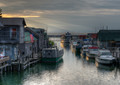
| 08/21/2015 08:31:01 AM | Leland Sunsetby DrakeComment: *Hello from Sid and the Critique Club*
A pleasing scene assumed to meet the challenge.
This tranquil scene is all about the quality of light, the gentle rays leading us from bright sunlight to the inner portion of the scene and the illuminated hulls reflected in the water, the very things that obviously attracted you in the first place. It's a shame the boat on the left is such an ugly beast.
Apart from the gentler brighter light the scene is generally low key and fairly monotone, verging towards black and white with subtle colouring. The only parts of the image that break that quality are the American flag on the left and, this is where I have the only problem with the image, the person on the left. He is so extremely positioned right on the edge of the frame that he would be better cropped out. If your original has more scene to the left then he should be included as his presence definitely adds but not in this extreme position. If he were to be added with space around him then he also ought to be dodged to subdue his colouring more in keeping with the rest of the image.
Thank you for an interesting submission, Sid |
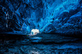
| 08/21/2015 07:56:48 AM | Inside the ice caveby GudjonottoComment: *Hello from Sid and the Critique Club*
An amazing natural scene assumed to meet the challenge.
What an enormous ice cave this is and our perception of it is hugely enhanced by the essential addition of the person to give it all a sense of scale, it then becomes something quite staggeringly phenomenal. If I hadn't had the wonderful experience of Iceland and its amazing colours I would be bound to question that it really was this blue, but with the benefit of that experience I can easily imagine that this is how it really is.
I am amazed at how much light there is in there, you have been able to stop the lens down for a larger DOF and at ISO 100 you are still only ½ a second. If you have used any artificial light then you've done a masterful job of it because it looks 100% natural to me, so well done if you have. It's really quite captivating all the amazing folds and shapes and textures there are in the icy surroundings, I hope to see this or similar one day soon.
Thank you for an amazing image Otto, Sid |
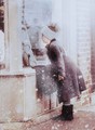
| 08/21/2015 07:45:03 AM | Window shoppingby PikkelComment: *Hello from Sid and the Critique Club*
A natural portrait, assumed to meet the challenge.
Your portrait has a lot of appeal, in particular for the natural moment you have captured of the girl looking longly at the tempting goods on display. It also conveys a desire to be out of the cold environment and in the warmth of the shop. Her clenched hands add to this feeling too.
Your exposure is on the plus side which also helps convey the whites and therefore the coldness of the scene and the falling snowflakes are the final essential ingredient that makes it all work well together. I like that we are able to see the girls reflection in the glass together with detail inside.
The top right feels as though you have added a white gradient to the upper part of the image, you may well not have done but it does feel a little unnatural in comparison with the rest of the image, perhaps it is just the snowfall.
Anyway, well done for such a high placing in this tough challenge a well deserved result, Sid |
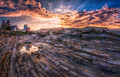
| 08/21/2015 07:24:48 AM | Guiding Lightsby NeilComment: *Hello from Sid and the Critique Club*
Congratulations on your top ten placing for your landscape that is assumed to meet the challenge.
Your lens has really emphasised the rocky foreground so that the unique nature of the rocks becomes a major part of the image. I like your use of the puddle to reflect the buildings too, it works well. The suns rays are also a nice element that adds to the overall result.
I know I am in a minority here but I am not keen on the HDR processing, I prefer a more natural looking exposure. I am pleased for you that it has been well received and has done so well especially given the competitive nature of the challenge, well done, Sid | | Photographer found comment helpful. |
|
Showing 1381 - 1390 of ~3781 |
Home -
Challenges -
Community -
League -
Photos -
Cameras -
Lenses -
Learn -
Help -
Terms of Use -
Privacy -
Top ^
DPChallenge, and website content and design, Copyright © 2001-2026 Challenging Technologies, LLC.
All digital photo copyrights belong to the photographers and may not be used without permission.
Current Server Time: 05/07/2026 09:06:42 PM EDT.
|