|
|
|
Showing 1311 - 1320 of ~3781 |
| Image |
Comment |
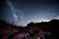
| 09/04/2015 06:12:32 AM | Valley of Fireby Dr.ConfuserComment: *Hello from Sid and the Critique Club*
Congratulations on your high score and placing with your entry assumed to meet the challenge.
What a star filled sky, I don't think I've ever seen so many stars! This is a very well executed image, the exposure is long enough to get a good image and not too long that the stars themselves are too elongated. The detail is very good throughout the image including the foreground which adds a perfect level of interest to the night scene. The composition is good with the Milky Way itself positioned nicely on the left third.
There is a nice rim of light above the right distant landscape with a few interesting clouds to boot. Perhaps the only thing I am not so keen on is the white appearance of the nearest bushes in relation to the rest of the scene. I assume this has been illuminated by yourself during the exposure? On closer inspection is it due to the cold? There does appear to be a lighter hue to the tops of all the bushes leading into the scene. Even so, I think it would benefit from a little toning down, apart from that an excellent job, well done.
Thanks for your great entry, Sid |  Photographer found comment helpful. Photographer found comment helpful. |
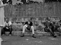
| 09/04/2015 05:59:14 AM | lateral movementby mitalapoComment: *Hello from Sid and the Critique Club*
An interesting street scene that is assumed to meet the challenge.
I always take in the title to hopefully gain more insight of the photographers intention and motivation for creating the image in the first place, so I see you want to emphasise the ladies movement within the frame. Towards that end her extreme cropping adds a huge element of intrigue, is the lady as beautiful as we think and hope she is? What is her role in relation to the others? There is movement in her leg which adds weight to the title.
Looking at the lads attention the lady has gained, the three seem quite mesmerised by her but alas, not the bloke on the left who is absorbed in his phone, another alternative title may be – 'win some, lose some' ? I quite like your extreme cropping particularly of the lady and even to a lesser extent the bloke on the right but because the cropping is so critical I don't like the whatever it is, either a bag or a block, in the foreground next to the ladies foot. In some respects I think another possibility with this shot would be a second later when the first bloke is covered by her and just the three looking at her longingly, that would probably have had more impact. I do like your low and seemingly inconspicuous viewpoint.
Sorry you didn't receive any comments during the challenge, I hope this makes up for it, Sid | | Photographer found comment helpful. |
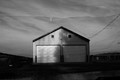
| 09/03/2015 08:48:46 AM | we will remember themby sidpixelComment: Yet another of my own images allocated to me, please if anyone else would like to critique my entry I would be most grateful. Thank you. |
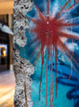
| 09/03/2015 08:36:01 AM | Berlin Wallby clickodakComment: *Hello from Sid and the Critique Club*
An interesting image that fulfils the challenge perfectly.
There can be no mistake that this most certainly is a huge lump of concrete, but not just any old concrete, it is a very important part of recent history. It is brought alive by the colourful graffiti and your title during the challenge and post challenge with your very helpful comments.
I know one of your commenters likes the inclusion of the background, I am not so keen, or rather I love the irregular left edge of the concrete and this should be preserved by the inclusion of a minimal background, I think where the brown structure becomes black would have been the ideal amount to include and I would have dodged or cloned the part of the canopy that would intrude to make it more uniform. The bright lights of bokeh in the window are very distracting and spoil the overall result especially as we are excluding some more of the lovely graffiti on the right. The positioning of your red sunburst is good.
Nicely done, thanks for your submission and apologies for the delayed critique, as they say, 'better late than never', or at least I hope it is, Sid | | Photographer found comment helpful. |
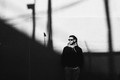
| 09/03/2015 08:23:47 AM | Shadowsby hstegComment: *Hello from Sid and the Critique Club*
An intriguing image that meets the challenge.
The theme of the challenge is met by the wall your friend is leaning against and that's where the intrigue lies, it seems to consist of two different textures with the lower half giving a fascinating grainy appearance, unless this is your own partial processing? I love the stark high contrasts you have here and the shadows themselves are also quite interesting, they add another element to the scene.
Assuming the sloping shadow continues upwards as implied I think I may have been tempted to move everything further over to the right revealing more of the slope and excluding the pole shadow on the right and lowered it to just above his hanging out shirt for just his torso. I think this would have improved the composition and therefore its impact and hopefully have scored higher.
I do love the effect of the lower half of the wall. Nicely done, thanks for your submission and apologies for the delayed critique, as they say, 'better late than never', or at least I hope it is, Sid | | Photographer found comment helpful. |
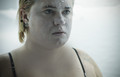
| 09/03/2015 06:17:10 AM | Frostbite caused by extreme cold.by boocowskiComment: *Hello from Sid and the Critique Club*
A pleasing portrait that contributes to the open challenge.
Brr… you look cold! You have got nice sharp focus on the eyes and although your eyes are a lovely blue they add to the sense of cold! You must have been cold, you have captured the snowflakes on your skin before they had chance to melt!
Your expressionless face sort of adds to the overall coolness you are trying to create but perhaps more of a grimace would have helped inject a bit more emphasis of the freezing conditions you wanted to convey. The background helps convey the snowy surroundings without being blown there is still a little detail there, well done.
Nicely done, thanks for your submission and apologies for the delayed critique, as they say, 'better late than never', or at least I hope it is, Sid |
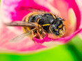
| 09/03/2015 06:08:32 AM | Happy to be alive in December!by oskarComment: *Hello from Sid and the Critique Club*
A well executed macro that needs the title to fulfil the challenge brief.
It's a great macro you've captured here with plenty of interesting detail and good sharp focus where its needed, on the eye. The surrounding flower and crop isolate it in an attractive beneficial way. There is great detail in the bee and its hairy body it makes for lots of interesting detail to take in.
In terms of the challenge the image relies totally upon the title, I wouldn't know how you begin to recognise happiness in a bee! And we also depend upon your title to even know that it is alive! So, although it is a great macro I would imagine these are the reasons why it didn't score better during the challenge.
Nicely done, thanks for your submission and apologies for the delayed critique, as they say, 'better late than never', or at least I hope it is, Sid |
| 09/03/2015 05:59:42 AM | Christmas Parrotby chrispyphotosComment: *Hello from Sid and the Critique Club*
An amusing image that fits the challenge well.
You have captured the parrot well with good sharp focus where it matters, on the eye, well done. It's good also that you have captured some action of him eating his meal, I like the falling debris. The cloudy sky acts as a good natural backdrop and of course his Santa hat adds the final amusing touch that enables it to fulfil the challenge brief fully.
It's a shame you didn't use a smaller aperture, that is the one way this image could have been significantly improved. Just one or two at most stops would have got the whole beak and foot nice and clearly defined and given it a lot more impact. F5.6 would certainly have got you there, you would have been able to get the breast sharper too and you would still have had a shutter speed of 1/800, plenty.
Your inclusion of the hat is so convincingly done you could easily believe it was actually on his head? Anyway, nicely done, thanks for your submission and apologies for the delayed critique, as they say, 'better late than never', or at least I hope it is, Sid |
| 09/02/2015 01:58:15 PM | where the sky endsby posthumousComment: *Hello from Sid and the Critique Club*
An uninspiring image that has made a contribution to the open challenge.
In the words of Ubique I am obviously a lesser photographer because it fails to 'attract and inspire me' and I fail to see any connection with Gursky. The chicken wire adds a certain something I'll admit and it actually detracts from or sort of obscures the tilt, but since you felt compelled to comment on it its such a tilt that is to a certain degree broke. It's not immediately obvious but once evident then its so slight that it detracts, for me tilts rarely work where they are not an obvious intention that adds another element to the image, this does not.
It's inevitable that not all one's images are going to appeal to everybody and I have seen and had the pleasure of commenting on several appealing images from you but I'm sorry this one just does not do it for me, but its only my 'lesser' side revealing itself. I'm pleased for you that at least your fan club appreciate it.
Thanks for your submission and apologies for the delayed critique, as they say, 'better late than never', or at least I hope it is, Sid | | Photographer found comment helpful. |
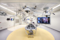
| 09/02/2015 01:41:09 PM | Resistance Was Futileby Dr.ConfuserComment: *Hello from Sid and the Critique Club*
An interesting image that has made a significant contribution to the open challenge.
A fascinating but intimidating image that, as has been remarked, is well titled, you certainly feel relieved not to be the 'victim' here! Our viewpoint here enables us to see everything here easily, your exposure is good and there is good detail throughout. I like the generally high key atmosphere that in itself suggests a clinically sterile environment but at the same time it is dominated by the relatively smaller panel to the right with its own fascinating imagery. It all looks very 'state of the art'.
There's not really anything I can add, nicely done, thanks for your submission and apologies for the delayed critique, as they say, 'better late than never', or at least I hope it is, Sid |
|
Showing 1311 - 1320 of ~3781 |
Home -
Challenges -
Community -
League -
Photos -
Cameras -
Lenses -
Learn -
Help -
Terms of Use -
Privacy -
Top ^
DPChallenge, and website content and design, Copyright © 2001-2026 Challenging Technologies, LLC.
All digital photo copyrights belong to the photographers and may not be used without permission.
Current Server Time: 05/07/2026 04:39:14 PM EDT.
|