|
|
|
Showing 1291 - 1300 of ~3781 |
| Image |
Comment |
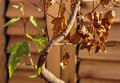
| 09/07/2015 06:08:28 AM | Every Ending contains a new Beginning (I. Ching)by clickodakComment: *Hello from Sid and the Critique Club*
An appealing image that meets the challenge.
I like your interpretation and title, it works well, you have achieved your goal, certainly for me anyway. The branch you have found here is a very interesting shape with all of the dead leaves to the right and the one thriving shoot to the left, you have composed it well with a close crop that is just about right for the subject.
I find the OOF dead leaf in the foreground a little distracting but not in a major way, in any case I think as long as you have all of the living side in good sharp focus the right matters less. I think a little less DOF could have improved it further reducing the background detail as long as the living side can be kept sharp. A plain cloth or card would have been good here. The lighting is perhaps a little on the harsh side but you have controlled the exposure quite well.
Nicely done Marcel, thanks for your submission, Sid |  Photographer found comment helpful. Photographer found comment helpful. |
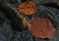
| 09/06/2015 07:36:24 AM | No Flies On Meby PangurbanComment: *Hello from Sid and the Critique Club*
An unusual interpretation that partially meets the challenge.
In terms of the image itself the fly is anything but camouflaged but I can see your interpretation is a clever take on the challenge theme that has fortunately been recognised by a lot of your voters too. The image itself is rather appealing with the submerged leaves forming a lovely counterpoint to the fly sitting on the plant's woody stump with the river flowing all around. You have to be commended for spotting this and interpreting the theme in the way you have, I'm pleased for you that it was appreciated here too, well done.
Anyway, thanks for your submission and apologies for the delayed critique, as they say, 'better late than never', or at least I hope it is, Sid. Please feel free to reciprocate on any of my images, I would welcome your feedback… | | Photographer found comment helpful. |
| 09/06/2015 07:20:13 AM | No body todayby clickodakComment: *Hello from Sid and the Critique Club*
An original take the fulfils the challenge theme.
Well spotted for the challenge theme, I agree with one of your commenters, I like the shadows too and just wish they had been stronger. As regards the composition, I like that you have it on a slant the way you have but I think you missed an opportunity to make more from it. I would have composed it so that the ends of the wood weren't visible thereby creating the illusion that this was an endlessly long array of coathooks. I would also have made more of the diagonal and the shadows by a closer position to the wood and the hooks that exaggerates their perspective.
Just one point that would probably be considered pedantic but to me rather important, your title if read the way it is written suggests that there have been no dead bodies hung up to dry today!
Anyway, thanks for your submission and apologies for the delayed critique, as they say, 'better late than never', or at least I hope it is, Sid. Please feel free to reciprocate on any of my images, I would welcome your feedback… | | Photographer found comment helpful. |
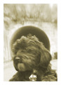
| 09/06/2015 07:11:16 AM | Santa Sofiaby posthumousComment: *Hello from Sid and the Critique Club*
An amusing image that fulfils the challenge brief.
I get to comment on your image a second time! And, I was wrong you didn't get any comments about softness or low contrast, fair enough. Well, my vote and my comments are still my opinion post challenge with the addition that the white border adds nothing and I think a square crop would have been better. I do still like the black halo, its wicked!
Anyway, thanks for your submission and apologies for the delayed critique, as they say, 'better late than never', or at least I hope it is, Sid. Please feel free to reciprocate on any of my images, I would welcome your feedback… | | Photographer found comment helpful. |
| 09/06/2015 07:01:59 AM | Exposition Everestby Ja-9Comment: *Hello from Sid and the Critique Club*
An interesting image that meets the challenge.
Your image is more of a normal interpretation of the challenge theme that judging by your commenters seems to have been lacking in most of the other entries. It is well executed with your model's hand positioned in the correct place to 'hold' the mountain in his hand, however, I think it would have worked better if you could have extended the DOF from his hand to the mountain and got that sharper. It would also have been a lot more convincing if he could have been looking to the mountain instead of the camera and having him out of focus would not have been a problem then. Instead of holding the mountain he could have had it between his fingers as though placing it into position within the landscape.
The image itself is a little too highly exposed although within acceptable limits it has enabled you to get a better exposure on the man himself but the mountain itself, the most important element in the image, has significant areas of blown highlights.
Anyway, thanks for your submission and apologies for the delayed critique, as they say, 'better late than never', or at least I hope it is, Sid. Please feel free to reciprocate on any of my images, I would welcome your feedback… | | Photographer found comment helpful. |
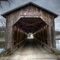
| 09/06/2015 06:45:10 AM | Fallasburg Bridge Perspectiveby DrakeComment: *Hello from Sid and the Critique Club*
An appealing image that fails to meet the challenge.
The bridge itself is an attractive and interesting example of a covered bridge, however, it does not fulfil the challenge theme of forced perspective, to do that you would have needed to include something perhaps a figure that appears to be a part of the scene but in actual fact is not in the perceived position. For example see my entry “c'mon you old sea dog”.
As for the shot itself it is competently executed but lacks the sort of impact that makes it stand out, it is a straightforward record shot documentary in nature. Anyway, thanks for your submission and apologies for the delayed critique, as they say, 'better late than never', or at least I hope it is, Sid. Please feel free to reciprocate on any of my images, I would welcome your feedback… |
| 09/06/2015 06:33:05 AM | c'mon you old sea dogby sidpixelComment: Another allocation of my own image, if anyone else would like to leave their thoughts it would be most welcome, thanks... |
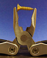
| 09/06/2015 06:31:11 AM | Jawsby gminkComment: *Hello from Sid and the Critique Club*
A good macro that meets the challenge well.
The original image is a good macro and most definitely inanimate, a great idea. However, the processing has let it down badly, it has left it looking unnatural and below par. There is a lot of noise which at ISO 1600 with a modern camera is surprising unless this is a compact camera, which having just googled it I see it isn't. The end result is a loss of detail where it matters all those edges and the striations of the metal should be pin sharp and they are not but in a noisy sort of way.
Your exposure is just a little too much, there are areas of the image where the exposure is blown, for example the edges of the handles at the lower half of the frame and the tips of the jaws and the screw itself, all important areas. Some loss of detail may also be explained with the very small aperture you have used. I know the DOF can be exceedingly shallow but assuming this is your smallest aperture I would always use a stop less ie., f24 as you will get loss of detail through diffraction with the smallest apertures of your lens.
I think it is for these reasons that this excellent idea did not fare better with the voters. Thanks for your submission and apologies for the delayed critique, as they say, 'better late than never', or at least I hope it is, Sid.
Please feel free to reciprocate on any of my images, I would welcome your feedback… |
| 09/05/2015 11:49:06 AM | Mute Macroby mhlambiComment: *Hello from Sid and the Critique Club*
An unusual image that meets the challenge brief.
A fairly interesting image in the way it isolates the word mute from the rest of the machinery through the shallow DOF but I find the dusty surface very distracting in a detrimental sort of way, its taking away from the subject which is not an amazingly absorbing subject in the first place. I do like the way the DOF is working here and the OOF elements, if anything an even wider aperture would have made more of the G8 less distinctive and isolated the mute word more effectively.
The subject is most obviously inanimate and therefore succeeds in terms of the challenge, there's not a lot really I can add except to say, thanks for your submission and apologies for the delayed critique, as they say, 'better late than never', or at least I hope it is, Sid |
| 09/05/2015 11:36:44 AM | The Shape of Musicby ericpiComment: I love your silhouette here, its an excellent composition and lighting effect, well done |
|
Showing 1291 - 1300 of ~3781 |
Home -
Challenges -
Community -
League -
Photos -
Cameras -
Lenses -
Learn -
Help -
Terms of Use -
Privacy -
Top ^
DPChallenge, and website content and design, Copyright © 2001-2026 Challenging Technologies, LLC.
All digital photo copyrights belong to the photographers and may not be used without permission.
Current Server Time: 05/07/2026 04:38:55 PM EDT.
|