|
|
|
Showing 1271 - 1280 of ~3781 |
| Image |
Comment |
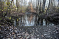
| 09/10/2015 06:31:11 AM | Looked simple on autumnby clickodakComment: *Hello from Sid and the Critique Club*
A grab shot that does not meet the challenge.
This feels as it sounds like an impromptu shot that has not had sufficient thought or preparation beforehand, although I think I understand your emotion behind it it does not suggest simplicity at all. There is too much that is competing for attention which is quite the opposite of what I should be getting if this were truly simplistic.
A much more simplistic approach would have been to focus on just one or two elements as opposed to the bridge, water, reflections, trees, leaves and sky that we have here, there is just far too much.
I'm sorry Marcel but this was definitely not one of your better ones, Sid |  Photographer found comment helpful. Photographer found comment helpful. |
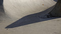
| 09/10/2015 06:22:21 AM | Desertedby gminkComment: *Hello from Sid and the Critique Club*
An interesting image that meets the challenge.
I think you've nailed the composition well here. The shapes and the shadows work well to form an interesting abstract of a common feature. I like the length and shape of the shadow and I like the diagonal that is formed by it. The shape of the structure is revealed by the foreground shadow and the way the light varies across the floor.
For the purpose of the challenge, although its only a minor point. I would definitely have removed the dead leaves preferably before shooting or, if necessary, through cloning, their removal would give the image more impact it truly would be more simplistic.
Thank you for your submission, apologies for the delay in critique, Sid |
| 09/10/2015 06:13:28 AM | ~Y E L L O W~by KMcCComment: *Hello from Sid and the Critique Club*
A very appealing image that meets the challenge well.
The beautiful bold colours here are very appealing and striking against the OOF sky background which is all very simplified in keeping with the challenge brief. However, I am somewhat confused by what I am seeing here, the OOF flower in the foreground is throwing the composition as a whole off balance it would have been better to exclude it or use a smaller aperture to get it into focus. It throws me because it is in front of the right hand flower which is all clearly in focus yet none of this is. It doesn't appear to be close enough to have such an effect. The flower on the left appears to be at least on the same focal plain yet all of it is in clear focus, its all very confusing.
I think an even more effective composition would have been to just have the left and the right flower without anything else at all. I particularly like everything about these two flowers. On their own these two alone would have had much more impact, I love the viewpoint of both of them. The two in the middle spoil the overall effect.
Thank you for your submission, apologies for the delay in critique, Sid | | Photographer found comment helpful. |
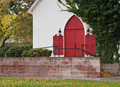
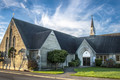
| 09/10/2015 05:58:51 AM | Church with red doorby gminkComment: *Hello from Sid and the Critique Club*
An appealing image that vaguely meets the challenge.
I feel a little undecided about this one whether I like it or not. There are elements of the composition I like, the shape of the red door with the ivy growing round it against the modern brick wall in front which I am not so keen on, I find the railings ugly and distracting. In fact, as it is, it only the shape of the door that gives a faint implication that this is a church at all, don't get me wrong, that is not a criticism, I quite like it for that.
I am wondering what a composition raised above the level of the railings including the roof which presumably has a cross or some sort of adornment would have looked like. I think in terms of the challenge, it would have come across much more clearly that it is a church. The red of the doors is very appealing and adds a lot to the image.
Apologies for the delay in this critique, thanks for your entry, Sid |
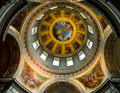
| 09/09/2015 12:52:36 PM | Eglise du Dome Church at the Hotel des Invalides by Ja-9Comment: *Hello from Sid and the Critique Club*
Congratulations on your ribbon for this appealing image that fulfils the challenge brief.
Its certainly a beautiful structure, not hard to imagine why it appears to have inspired so many in their subsequent designs, I would imagine it must be quite something to see at first hand. Its hard to conceive of the amount of effort that has gone into making something as awesome as this. This is the sort of image that cries out pure symmetry but I'm quite glad that you decided against that, I quite like the end result, though it does mean that we don't get to see enough of the two paintings on this side of the structure. If you had decided to go for total symmetry a square crop would have been a perfect option.
This would have been a difficult exposure but I think you made a good job of it, I can live with the overexposure of the windows in favour of sufficient light in the shadows without resorting to HDR. Anyway, you obviously did right for the voters here, well done Janine. | | Photographer found comment helpful. |
| 09/09/2015 12:34:00 PM | Let Us Go Into the House of the Lord....by Catherine_BComment: *Hello from Sid and the Critique Club*
A record shot that meets the challenge.
This is a straightforward documentary style image that records the existence of the building and little else really. Although the light on the end wall is nice you haven't made the best of the opportunity with the bulk of the image in fairly dull shade. I think moving your position a little further left to include all of the end wall and shadows without any cropping of the wall and cropping the right of the image to the downpipe and excluding it would have made for a better composition overall. This would have placed the 'tower' further to the right and improved the composition whilst making a feature of the end wall.
Like one of your commenters I am perplexed by the texture of the brickwork it just doesn't look natural at all, it can't be down to noise reduction given your low ISO perhaps that is the way it is. If that is so then it is even more reason to reduce its share of the image and concentrate on the end wall which is far more appealing with those lovely windows too. I have to say that the rest of the building by comparison is really quite boring.
Thanks for your submission and apologies for the delayed critique, as they say, 'better late than never', or at least I hope it is, Sid | | Photographer found comment helpful. |
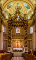
| 09/09/2015 06:28:38 AM | Mary, Queen of the World Cathedralby clickodakComment: *Hello from Sid and the Critique Club*
An impressive image that meets the challenge fully.
This is certainly a very colourful image of an elaborately adorned location of worship that undoubtedly fulfils the challenge. For this sort of image to work at its very best it needs absolutely perfect symmetry and although you have got very close to that goal it is not quite there. You are just a fraction too far over to the right, although its very marginal it is noticeable to anyone who would look closely enough, but fortunately that is probably not the case for the majority of your viewers here. I can't quite be sure but there also feels a very slight tilt to the right.
You have done well to control the exposure the way you have, its good. I think your aperture is probably smaller than you actually needed, assuming you are at the 24mm end you would have a larger DOF anyway and I think you may have managed with f8, certainly f11 which have given you about 1s+ shutter speed which would have sharpened your moving person much better and made him less distracting. You do, of course, have plenty of scope with your ISO too which even at 400 would have eliminated any movement completely.
Nicely done, thanks for your submission and apologies for the delayed critique, as they say, 'better late than never', or at least I hope it is, Sid | | Photographer found comment helpful. |
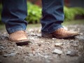
| 09/09/2015 06:08:50 AM | Dress shoes of the Southby WonderDudeComment: *Hello from Sid and the Critique Club*
An unusual image that struggles to meet the challenge.
Its a nice idea and I like the ground level viewpoint, its always effective to get a different perspective but those shoes are far too clean to fulfil the challenge brief. They may be dirty to you but they're near pristine to me, yes, you're right my standards are low! In actual fact what I initially thought may be marks on closer inspection appear to be part of the shoe's pattern.
The other problem here is the focus, it is too far forward, its just the shoes we should be interested in here but there is too much dirt in focus. I'm beginning to wonder if that was your intention but I have to go by the title which implies that the shoes are the most important element. The DOF is too shallow, we only have the tip of one shoe in focus, so given the title we ought to have say, f2.8 and a focus point on or near the tip of the shoe for a more effective result.
Thank you fro your submission, Sid | | Photographer found comment helpful. |
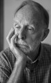
| 09/09/2015 05:55:23 AM | Lost in thoughtby clickodakComment: *Hello from Sid and the Critique Club*
An interesting image that meets the challenge indirectly.
I quite like the fact that you have approached the challenge from a not so obvious perspective with the hand as a secondary inclusion. However, from the point of view of the challenge this is probably not as effective as giving the hand more a prominent role. As I was initially looking at this I was ruminating my thoughts and I instinctively adopted a posture with my fingers in front of my mouth and the back of my hand and probably a frown would have been prominent in any image that might have been taken of me. I think such a pose would have conveyed your intentions much better. The gentleman here, to be honest, looks as though he's about to doze off!
The DOF is very shallow here to the extent that you don't have both eyes in focus which is not always necessary but here you are wanting to get into the mans head and two doorways are better than one. The composition is just about ok but feeling just a little on the tight side, the darker stripe in the left background doesn't add to the image and should therefore have been excluded, a plain wall would have been better. The window lighting is good with a nice variation from bright to dark without any excess and retaining good detail.
Your commenter got the message! Thank you for a competent entry Marcel. | | Photographer found comment helpful. |
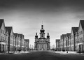
| 09/08/2015 02:29:57 PM | Spiritual Symmetry by ColeyComment: *Hello from Sid and the Critique Club*
Congratulations on winning with this image hat fits the challenge well.
Your title sums it up well, such symmetry! I find the whole scene so disturbingly unreal it looks more like an architects model. A normal sort of street with modern houses either side and then plonked at the end of the street between them such an unlikely church in such an unlikely setting. Nowhere, any signs of life, at all, it all seems so spookily unreal to me, its really weird.
Anyway, as for the execution, you've certainly nailed the symmetry perfectly, well done. It's so perfect I have had to double check that its not a mirrored image, its not, the differences are very subtle indeed. You seem to have an extraordinary DOF for maximum aperture though you will have been at the 17mm end for sure. The dark sky at the top balances well with the darkness of the rod at the bottom.
Anyway, well done. It's a shame you seem to inactive again, I hope you return soon, Sid | | Photographer found comment helpful. |
|
Showing 1271 - 1280 of ~3781 |
Home -
Challenges -
Community -
League -
Photos -
Cameras -
Lenses -
Learn -
Help -
Terms of Use -
Privacy -
Top ^
DPChallenge, and website content and design, Copyright © 2001-2026 Challenging Technologies, LLC.
All digital photo copyrights belong to the photographers and may not be used without permission.
Current Server Time: 05/07/2026 03:39:59 PM EDT.
|