|
|
|
Showing 1261 - 1270 of ~3781 |
| Image |
Comment |
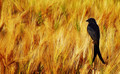
| 09/12/2015 06:09:57 AM | Black Drongoby artistChanComment: *Hello from Sid and the Critique Club*
An appealing image that is assumed to meet the challenge.
I get the pleasure to once more comment upon your image. I like it first time round and I still do, this is a great composition with the bird off-centre looking into the rest of the gorgeous golden frame, and what a beautiful bird it is too. The lighting is perfect it has enabled you to give good definition and form to the bird whilst at the same time bringing out the textures of backdrop crop. Your commenters seem to be understandably very appreciative but I'm not sure what one of them means about any technical imperfections I'm not sure how this could be improved.
Thank you for giving us such a delectable treat, I scored it an 8 and would eagerly do so again, it is so good I'm going to have to fave it. It's a real shame you don't appear to be active I hope you return soon, Sid |  Photographer found comment helpful. Photographer found comment helpful. |
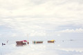
| 09/12/2015 05:57:26 AM | The Calmingby zandergeraldComment: *Hello from Sid and the Critique Club*
A very pleasing scene assumed to meet the challenge.
I get the pleasure to comment on your image once more! What a beautiful image, everything about it is wonderful, I like your composition but the most striking thing is the peace and serenity it invokes. The reflections are simply gorgeous, the high key effect is excellent although if I am to try and fault it in any way at all perhaps the exposure is verging just a little too close to overexposure in part of the foreground sky but it really is minimal, I think in view of the overall effect and impact it is totally acceptable.
I think what makes it work so well is that you have a total domination of high key whites and pastel blues and then that little bit of three different quite bright colours in the paintwork of the boats that gives it just enough hint of disruption to really bring it all together. It really is so stunning an image, I'm gonna have to fave it.
Thank you for giving us such a treat to enjoy, it's a real shame you don't appear to be active, I hope you rectify that very soon, Sid |
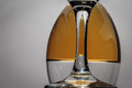
| 09/11/2015 05:57:24 PM | Upside Downby clickodakComment: *Hello from Sid and the Critique Club*
An interesting image that meets the challenge well.
I like your originality here Marcel, there's no doubting its conformity to the challenge brief, well done. Glass is a wonderful medium to work with but it does not come without its significant problems, mostly reflections and that unfortunately is where great attention to detail is needed and is a little lacking in your image. In particular the specular highlights from your lighting that form distinctive white blobs of blown highlights are the worst followed closely by those of yourself and your camera. It is not easy to get this right and some post processing is often inevitably required to perfect the end result. Another fundamental that lets your image down is that there is distinct tilt to the right.
Anyway, I commend you for a brave and original attempt, Sid | | Photographer found comment helpful. |
| 09/11/2015 05:06:31 PM | Far, Far Awayby texdonComment: *Hello from Sid and the Critique Club*
An interesting shot that is assumed to meet the challenge.
In its own right without the benefit of your informative comments the image is a quite convincing setup that conveys the feeling of being on another planet in a realistic sort of way. You must have spent quite some time setting all this up but it was worth all your effort. Your composition is good, I like the reds and the yellows the figure and the shadows, the attention to detail with the footsteps, in fact I like it all except the border which is so unnecessary and to be honest adds nothing to the end result.
Thanks for your entry and apologies for the late critique, Sid |
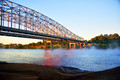
| 09/11/2015 02:18:57 PM | DSC_1386by jdale18Comment: *Hello from Sid and the Critique Club*
An interesting image that is assumed to meet the challenge
An interesting structure that has added interest through the lighting from the golden hour of dawn. The mist rising from the water also adds atmosphere to the shot. I assue this is a rail bridge, it would have been nice to be able to include a train traversing it but there's not a lot you can do to alter that is there. Its a shame the foreground lacks any real impact to the image and as such may have been excluded without detriment to the end result, its probably the only real change I would have made to the composition.
Thanks for an interesting submission, Sid |
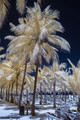
| 09/11/2015 11:55:35 AM | IR Relaxationby frateComment: *Hello from Sid and the Critique Club*
An excellent image that is assumed to meet the challenge.
Infra red is usually interesting but doesn't always work well with everything but it is here. Those lovely rich blues of the sky are amazing and working well against that bleached beach and the colours of the palms, its all wonderful. As for the composition, I disagree with your commenter, I think you have hit it spot on here, I much prefer it in this format. For me the only thing that really lets this down is that ugly light on the tree, I think it would be most beneficial to attack that with the cloning tool.
Apologies for the late critique but thanks for a great entry, Sid |
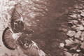
| 09/11/2015 11:47:01 AM | hear the grating roarby posthumousComment: *Hello from Sid and the Critique Club*
An excellent image assumed to meet the challenge.
I'm glad this didn't remain hidden! A great action shot, nice viewpoint and nice hint of motion and lovely muted tones throughout, definitely one of your best to date. It's a shame you have had to crop a little off the wing but its not major but the rest of the composition is working really well. There is nice sharpness on the back of the pigeon, it would have been nice to have the same sharpness on the head but again its only marginally soft and perfectly acceptable.
A great image that ought to have fared better than it did, can't say I understand the title though, if its crucial to the image' appreciation then this might explain why it didn't do better, Sid. | | Photographer found comment helpful. |
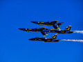
| 09/10/2015 12:39:58 PM | Upside Rightby PhocalComment: *Hello from Sid and the Critique Club*
An intriguing image that meets the challenge well.
Well there's no doubting your image certainly fulfils the challenge brief! That looks like some difficult manoeuvre, its difficult to tell their exact position in relation to each other from this angle but I assume the inverted ones are above those flying normally? Anyway, there is nothing you can do to separate them but you have captured it well. The exposure is good.
One of your commenters has remarked about the blue sky but you need space for them to fly into and you also need to see where they've come from. I suppose you could have subdued the intensity of the sky but we have just three colours here blue, yellow and white all of which are working well together so I don't think there's even a need for that. The only other thing you could have done would have been to photograph them on the diagonal which I think could have worked well but if you wanted to document them accurately as you have here then it is not an option.
Anyway, thanks for your contribution and apologies for the delayed critique, Sid | | Photographer found comment helpful. |
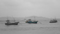
| 09/10/2015 06:52:50 AM | Fishing Boatsby juliandanielComment: *Hello from Sid and the Critique Club*
An interesting image that contributes to the open nature of this challenge.
I get to comment once more on your image! The fishing boats are interesting especially if they are not a familiar type to the viewer as indeed they are not to me. The composition itself lacks impact, everything is placed quite centrally without much thought to the rule of thirds or any other aid that would have given it more impact.
I am rarely enthused by selective desat and this is no exception, apart from the question why at all but why just one boat why not all three? I think this would have been far better to leave all three in mono and concentrate on getting the best out of the mono tones within the image. I like the background detail but the sky is so boring and so much of it you could have taken most of it out and replaced it with foreground water for a much more interesting result.
Thanks for your submission, apologies for the delayed critique, Sid |
| 09/10/2015 06:41:05 AM | Down then upby gminkComment: *Hello from Sid and the Critique Club*
An interesting approach that fails to meet the challenge.
I like your thinking and creative attempt to come at the challenge in an original way but I don't think you have managed to pull it off. The subject does not suggest upside down at all, it is what it is, simply water falling and forced back up again, that is not upside down.
I see you have gone to your smallest aperture and lowest ISO to get the slowest shutter speed possible which has all worked quite well, you have plenty of motion blur in the main flow and motion detail of individual drops from their upwards trajectory.
I like your image but unfortunately the wrong image for the wrong challenge, Sid |
|
Showing 1261 - 1270 of ~3781 |
Home -
Challenges -
Community -
League -
Photos -
Cameras -
Lenses -
Learn -
Help -
Terms of Use -
Privacy -
Top ^
DPChallenge, and website content and design, Copyright © 2001-2026 Challenging Technologies, LLC.
All digital photo copyrights belong to the photographers and may not be used without permission.
Current Server Time: 05/07/2026 04:39:17 PM EDT.
|