|
|
|
Showing 1251 - 1260 of ~3781 |
| Image |
Comment |
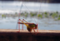
| 09/13/2015 01:26:01 PM | Colorful Mississippi Insectby ladydawgfanComment: *Hello from Sid and the Critique Club*
An appealing image that is assumed to meet the challenge.
Wow, what long antennae! In a way I wish I could see the end of them bu then in another it intrigues as to just how long they are? The pose is unusual and interesting, I like the backlighting the way it is illuminating the insects amazing legs.
I think you could have sacrificed a little off the bottom in favour of those antennae but there are several distracting elements in the background that I think ought to be corrected in post processing. The main one being the plant stalk that competes directly with the antenna its a real shame. Then there are bokeh elements that look lore like dust spots in the upper left, they probably aren't that but again their removal would really help the overall result. But the one that (excuse the pun) bugs me most is the iris flare between his legs and the water highlight just in front of him, again these would both benefit from some attention.
A good image that has further potential, apologies for the delay, Sid |  Photographer found comment helpful. Photographer found comment helpful. |
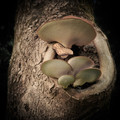
| 09/13/2015 01:14:57 PM | And it will tremble, Ever so nicely, Notice, How it sparkles, Down thereby ArnaMarieComment: *Hello from Sid and the Critique Club*
An appealing image that is assumed to meet the challenge.
Fungus photos abound always have an appeal but your's is a step above the norm with the lovely detail and texture you have managed to capture. Shooting at full aperture you have got a good DOF but I think perhaps f4 or similar would have got you just that little bit more to get the smaller fungi below the top larger one in sharp focus too. It may also have got the ring of bark surrounding the fungi sharp too but I think this would be perfectly acceptable.
I like the dark background it works well but the detail on the left is very slightly intrusive and would be best cloned out to match the rest of the background which makes the main subject stand out well. I do like the texture and detail you have captured on the fungus it is perfect, well done.
Thank you for a great submission, apologies for the long delay, Sid | | Photographer found comment helpful. |
| 09/13/2015 06:19:04 AM | Grand Haven, October Galeby DrakeComment: *Hello from Sid and the Critique Club*
An appealing image that is assumed to meet the challenge.
I get the opportunity to comment again. It is a very invigorating scene with the wild seas crashing around the man made structures you can feel their fury. The two reds dominate the image in a pleasing way working well together with the scene and your composition makes them an integral part of the whole. As I said before I think there is a lot more potential in post processing to bring out more from that sky to add to the drama of the scene, it needs the contrast increasing to add a sense of broodiness and foreboding.
All in all a lovely image, apologies for the delay, Sid |
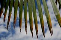
| 09/13/2015 06:10:18 AM | under the Palm tree on a Balmy Day with a blonde and a beerby kiwinickComment: *Hello from Sid and the Critique Club*
A fairly interesting image that partially meets the challenge-w
In the true sense of the challenge this can be construed as upside down or not at all simply being the leaves hanging down and photographed against the backdrop of the sky in a normal shot. Perhaps you have inverted the shot to make it upsaide down which again is only meeting the challenge post processing. Anyway, the image itself has a little interest in the shape overall and the ends of the decaying leaves but it doesn't hold the interest for very long. You really ought to have excluded the aerial or whatever it is in the lower left it is distracting and detrimental to the end result.
Thank you for your submission, apologies for the delay, Sid |
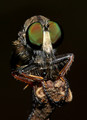
| 09/13/2015 06:01:26 AM | What Big Eyes You Haveby stuartjonathangrayComment: *Hello from Sid and the Critique Club*
An interesting image assumed to meet the challenge.
What an excellent macro, they are really quite scary but fascinating at these sort of magnifications. The flash you have used has good and bad points in your exposure, I'm not keen where it has illuminated the legs to some small parts of bright highlights but I do like the way it has picked out the individual facets of the eyes it really is showing them up well. The iridescence of the eyes is looking good too. It is filling the frame well with the supporting branch rising from the bottom its all working well together.
Thank you for an interesting submission, sorry for the delay in critique, Sid | | Photographer found comment helpful. |
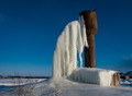
| 09/13/2015 05:51:39 AM | Small leak. Long winterby olbolComment: *Hello from Sid and the Critique Club*
An interesting image assumed to meet the challenge.
It's making me feel cold just looking at it! The leak and freezing cold has made a spectacular sight for sure, I like your composition, we have everything of interest nicely placed off-centre with a feel for the surrounding desolation of the location. The clear blue sky adds an appealing backdrop to the scene, the white of the icicle contrasts well with it. For a nice clean image I think it would have been preferable to have cloned out the wire from the tower.
Thanks for your submission, apologies for the delay of the critique, Sid. |
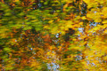
| 09/12/2015 06:53:43 AM | static dynamicby posthumousComment: *Hello from Sid and the Critique Club*
An interesting image that vaguely meets the challenge.
I like the motion blur of the leaves but I think the challenge itself required more than simply inverting an image, this does not live up to the creative aspect of the challenge. I do like the autumnal colours they are very appealing. There's not really a lot I can say other than that.
Thanks for your submission, Sid | | Photographer found comment helpful. |
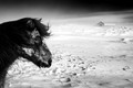
| 09/12/2015 06:46:02 AM | Back to the windby boguloComment: *Hello from Sid and the Critique Club*
A very appealing image that is assumed to meet the challenge.
I get the pleasure to comment again upon your lovely image. I love the feeling of desolation and bleak cold that you have conveyed here with the poor pony braving it all stoically. The mono tones are superb, the lovely dark skies, the texture of the pony's coat and the composition is perfect with the building in the background and the snows blowing in a misty sort of way throughout, it really is a very appealing image. I don't think there is anything at I would alter it all works very well together.
It is such an appealing image I am going to have to fave it! You did really well to get in the top ten in this highly competitive challenge, well done, its a real shame you don't seem to be active I hope you will return soon, Sid |
| 09/12/2015 06:34:41 AM | 1by cinekdoxuComment: *Hello from Sid and the Critique Club*
An appealing image that is assumed to meet the challenge.
I get the pleasure to comment on your image again. I was puzzled by the title and I can only assume it means 1 person? Anyway, this is a very difficult exposure with some inevitable blown highlights and blocked shadows but I prefer this to an artificial HDR processing. I am finding the right of the image much more interesting than the left. I think you could crop out the whole of the left and get rid of the distracting cars etc., much to the benefit of the end result. With a square crop up to the left edge of the pillar you would have an interesting composition that consists solely of wonderful light and shades with your person in a much stronger position. The tilt though a little unsettling is not a major issue but would probably benefit from being corrected in the process.
Anyway, this shows what a good 'seeing' eye you have, it's a real shame this has been your only entry, I do hope you will come back soon, Sid |
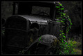
| 09/12/2015 06:21:17 AM | Built Ford Toughby adriano74Comment: *Hello from Sid and the Critique Club*
An interesting image that is assumed to meet the challenge.
What a lovely old vehicle, at rest until someone has the courage and tenacity to restore it back to its former glory. I like the low key way you have exposed the truck that emphasises its demise, it works well. I would also like the greenery if it wasn't so oversaturated, its a real shame because for me it detracts although I suppose you could interpret it as even in the face of death there is new growth and new hope. Looking at the greenery on the left it looks as though you have saturated the green channel as a whole, you really don't want anything in this position to dominate this area of the image the way it does.
I think you have a winning image here that toned back to its original would work even better, thanks for your submission, and apologies for the late critique, Sid |
|
Showing 1251 - 1260 of ~3781 |
Home -
Challenges -
Community -
League -
Photos -
Cameras -
Lenses -
Learn -
Help -
Terms of Use -
Privacy -
Top ^
DPChallenge, and website content and design, Copyright © 2001-2026 Challenging Technologies, LLC.
All digital photo copyrights belong to the photographers and may not be used without permission.
Current Server Time: 05/07/2026 01:55:21 PM EDT.
|