|
|
|
Showing 1221 - 1230 of ~3781 |
| Image |
Comment |
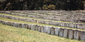
| 09/23/2015 10:03:09 AM | Andersonville Horrorby FraksterComment: *Hello from Sid and the Critique club*
An interesting image that contributes to the open challenge.
Thank you for your interesting comments that enable a fuller understanding of the scene before us, it brings home the senseless destruction and futility of war. Shooting at full aperture works well here to illustrate the endless rows of sacrificed lives that were lost. I like your composition that is using diagonals to help increase its dynamic appeal.
I think you could have improved the end result by getting much closer to the front rows of stones so that we could actually read some detail on one or two of the stones, in that way it makes it much more personal and increases its impact, you can now identify with an individual. You would probably have needed to use a smaller aperture, you would have raised the camera above the front stones so that you could include just the rows of stones without any other background scene but with a similar soft focus effect and again using stronger diagonals.
Apologies for the delay. Thanks for your submission, Sid |
| 09/23/2015 09:43:56 AM | Olinda park in springby tigerluongComment: *Hello from Sid and the Critique club*
A landscape that contributes little to the open challenge.
You probably felt the scene you had in front of you, colourful and appealing as it was, needed a little help in post processing, however, I feel you need to be made aware that the end result has not worked at all. If, as I suspect, you are relatively new to post processing the temptation is to tweak and then tweak and then tweak some more but you quickly reach a point where it becomes detrimental to the end result, as you have here. Your goal should always be to get the best possible image in camera and if necessary to enhance the quality to extract the very best quality in the end result this requires very subtle processing where less is most definitely more.
The colours are way over saturated, there is probably little resemblance to the original. The image is very heavily pixelated suggesting that the submitted jpeg has been too heavily compressed, there are large swathes of the background that lack any detail, the path in the foreground lacks any detail. If you look carefully you will see sudden transitions from blue to green and these areas form blocks of a single colour, all part of the jpeg compression technique.
All of this is a very tough way for you to learn but, to be honest, the image's quality, or rather lack of, is reflected in the voters perceptions too. Sorry to be so negative but I feel I owe it to you to help you improve. Thanks for your submission, Sid |  Photographer found comment helpful. Photographer found comment helpful. |
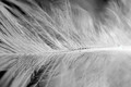
| 09/23/2015 09:20:04 AM | Light as a Featherby AsocComment: *Hello from Sid and the Critique club*
An interesting image that does meet the challenge.
Having read your comments I think you made the best job you could given the circumstances you were working under. This is obviously, as I'm sure you appreciate, not the best way of attempting this, your image has very little if anything of sharp enough focus and detail to appeal. There is another method you could have tried which I think would have been a lot easier and more successful it is called focus stacking. Basically you would have used the lens as normal with a small aperture you would take several images together each at a slightly closer position and then combined them together in PS to create an image that has sharp focus throughout.
I think you could have improved the composition of the image by using the diagonal for the stem of the feather this would have made the image more dynamic and interesting. A white or light background would have given you a high key image which would also have increased its impact and appeal.
Sorry you didn't get any comments during the challenge, I hope this makes up for it. Thanks for your submission, Sid |
| 09/23/2015 09:05:35 AM | • e f f l o r e s c e n c e •by Ja-9Comment: *Hello from Sid and the Critique club*
An appealing image that does meet the challenge.
Congratulations on your high placing Janine. A very accomplished flower shot and not a water drop in sight! The lighting is excellent enabling you to get the best out of the colours and textures for a very pleasing image. I like the off-centre composition it works very well revealing lovely detail that would probably be lost in a symmetrical composition. The shadows and highlights both add additional appeal to your image.
Well done Janine, I can't really fault it. Thanks for your submission, Sid | | Photographer found comment helpful. |
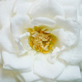
| 09/23/2015 08:57:00 AM | Simplicityby PangurbanComment: *Hello from Sid and the Critique club*
An appealing image that does meet the challenge.
I'm not sure what your lighting and shadows problem was but I think the end result is most acceptable, in fact a very nice high key effect whose shadows are very subtle and blend in well with the end result. Your exposure is very nice you have got some lovely whites without blowing the highlights. A smaller aperture would have got you a better DOF encompassing the petals in the foreground in a sharper way but I think the nature of this high key image allows you to have some softness in those petals in a way that adds to the end result in a pleasing sort of way.
Whilst I prefer an off centre composition there is sometimes a need for a more symmetrical approach such as you have here. Given the size of your subject, a miniature rose being smaller an off-centre composition filling the frame might not have been possible for you being beyond the closest limits of your lens perhaps? If not then I think this would have improved the image substantially.
Sorry you didn't get any comments during the challenge, I hope this helps. Thanks for your submission, Sid | | Photographer found comment helpful. |
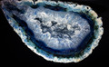
| 09/23/2015 07:27:12 AM | Foetus of a rockby clickodakComment: *Hello from Sid and the Critique club*
An appealing image that does not meet the challenge.
The rock is very appealing in its own right but in order to meet the challenge there should be nothing but rock, ie., no background at all. I can see your reasoning, the rock is certainly womb-like more than foetus like but this is the wrong challenge to use this in because you need to see the whole to understand your concept but to fulfil this challenge brief you need to crop significantly in order to fill the frame.
The lighting is uniform and illuminates the rock well and DOF is good though I wonder if you needed to use quite so small an aperture, perhaps f8 or f11 would have sufficed.
Sorry you didn't get any comments during the challenge, I hope this helps. Thanks for your submission, Sid | | Photographer found comment helpful. |
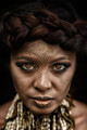
| 09/22/2015 04:31:59 PM | Snake Charmer on fireby chrispyphotosComment: *Hello from Sid and the Critique club*
A spookily appealing image that meets the challenge
Congratulations on your high finish. Looking into the fires of hell, her eyes are captivating, you have nailed the focus well, with a shallow DOF that emphasises her eyes very effectively. You have a very attractive model who would look gorgeous with or without this makeup that I find works on most of her face except the forehead which somehow feels distractingly too much. There is a seductive element to here that is brought out by the sharper focus of her lips which are on the same focal plain as her eyes, this again works very well.
The lighting is very evenly illuminating her with no distracting shadows, well done. Her hair looks lovely and adds to the theme of snakes with its twisting locks. The black background avoids any other distractions. Everything works well together.
Great image very well executed, apologies for the delay, well done. Thanks for your submission, Sid |
| 09/22/2015 04:16:05 PM | Ghostiesby photokopComment: *Hello from Sid and the Critique club*
A spooky image that meets the challenge
I like your different approach in choosing three portraits and compositing them together like this. The actual execution of it is rather lacking in finesse but this is one of those rare occasions that actually adds to the end result. The way the right ear of the middle portrait overlaps the first one is an example of what I am referring to, the cuts are all ragged but again the way they are appearing out of the black has let you get away with it because of the nature of the challenge. I like that you have used the diagonal for your composition it makes it more dynamic.
Good idea, well done. Thanks for your submission, Sid |
| 09/22/2015 03:52:40 PM | Follyby PangurbanComment: *Hello from Sid and the Critique club*
An appealing image that meets the challenge
As you say, a beautiful location. The lighting is very harsh and difficult to control but I think -1EC would have given you a better result it would have saturated the colours more and lessened the effect you have identified of the blown sky. You have done the right thing to reduce the amount of sky in your composition but I think you could have gone further and eliminated it completely in favour of the water. I do like the one calm patch of water that reflects perfectly the folly this really adds impact to the end result. Personally, I would have preferred to see some human interaction here, it would also given it a sense of scale.
Sorry you didn't get any comments during the challenge, I hope this makes up for it. Thanks for your submission, Sid | | Photographer found comment helpful. |
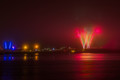
| 09/22/2015 03:42:25 PM | Fireworks in fogby GudjonottoComment: An appealing image that meets the challenge
The fog has added another quality to your image by softening the bright glare from the fireworks and the lights and the water reflections add yet more interest to the image. I particularly like the fog halos around the lights and their reflections, your composition in placing the fireworks to the right has enabled them to balance each other with the blue blue lights mimicking the fireworks shape, good 'seeing', well done.
As regards the challenge brief of f8 this is probably not the best way of making the most of the aperture, for the purpose of the challenge I think it would have been better to show its use through DOF. The choice of subject, there is nothing here to identify with f8 or f16 they would both look similar.
Thanks for your submission, Sid |
|
Showing 1221 - 1230 of ~3781 |
Home -
Challenges -
Community -
League -
Photos -
Cameras -
Lenses -
Learn -
Help -
Terms of Use -
Privacy -
Top ^
DPChallenge, and website content and design, Copyright © 2001-2026 Challenging Technologies, LLC.
All digital photo copyrights belong to the photographers and may not be used without permission.
Current Server Time: 05/07/2026 09:25:37 AM EDT.
|