|
|
|
Showing 1201 - 1210 of ~3781 |
| Image |
Comment |
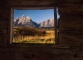
| 10/21/2015 10:49:17 AM | Room With A Viewby Ja-9Comment: *Hello from Sid and the Critique Club*
An appealing image that meets the challenge
The landscape view captured through the window is an excellent image in its own right but when seen as you have composed it from the inside here it raises it up another level. The interior itself whilst a little dark but authentic feels as though it has had a lot of processing, it seems to be lacking in the detailed roughness I would associate with the type of building it all looks much too smooth. I do like the gaps and the tatty structure in particular around the window.
The exposure is good with no blocked out shadows or highlights and your off-centre composition works so much better than a central one. Well done for finding and capturing this scene the way you have.
Congratulations on the HM your image works well in its alternative presentation of the landscape, well done, Sid |  Photographer found comment helpful. Photographer found comment helpful. |
| 10/20/2015 12:45:59 PM | Piped Graffitiby WonderDudeComment: *Hello from Sid and the Critique club*
A failed attempt that does not meet the challenge.
Although the challenge brief does not specifically state low contrast with or without post processing the essence of the challenge is to find in your surroundings a scene that exhibits low contrast characteristics. To take an initially high contrast scene, desaturate it and reduce the contrast is not, in my opinion what this challenge is about and I think that is reflected in your voters reaction too.
I find it interesting that you have chosen to include the drainpipe as an important element within your composition but I am unsure why you have done it. I would imagine the original artistry was very impressive and would have made a good study on its own, its not apparent to me how the pipe adds to the overall end result in any beneficial way.
Well done for trying and do keep on contributing and learning, Sid | | Photographer found comment helpful. |
| 10/20/2015 12:28:39 PM | paddle boardby HUETHComment: *Hello from Sid and the Critique club*
An appealing image that meets the challenge.
I agree with your comments this is a much more dynamic and appealing image than simply photographing the static equipment. Your timing is good with him riding the crest of the wave but I think the background would have been better rendered in softer focus with a wider aperture it rather feels that he is about to crash into the cliffs. It would also have been a lot better if all three of them had been in action at the same time, as it is it merely emphasises how tame the environment is if it is shallow enough for them to stand up in.
The exposure is generally good with detail in most of the white water but the darl shadow from the cliff is very dominant and overpowers the image as a whole. The composition is appropriate for the content.
Thanks for your entry, sorry you didn't get any comments during the challenge, I hope this helps, Sid |
| 10/20/2015 11:48:56 AM | Light Spillby sfaliceComment: *Hello from Sid and the Critique club*
A fascinating image that meets the challenge fully.
A great and original interpretation of the challenge theme, I admire your approach taking simple everyday objects and transforming them the way you have, I bet you had a lot of fun doing this. The end result is good but I think it could have been improved upon with some careful cloning to remove the unwanted light leaks so that your image would just have the most effective and desirable light related elements alone. Where the grater stands on the table and the right hand edge all have leaks of unwanted light.
What I would really like is for the elongated light on the table to be a much more significant part of the composition but I cant quite imagine how you would have done it to be honest. I'm imagining a wide angle lens with the light forming the foreground exaggerated by the perspective from the wide angle of the lens leading to the more distant source of light from the grater in the background. I can see the composition but I'm not entirely sure it would have been possible.
Anyway, thanks for an intriguing entry, Sid | | Photographer found comment helpful. |
| 10/20/2015 11:31:14 AM | Being Greenby WonderDudeComment: *Hello from Sid and the Critique club*
An interesting image that meets the challenge
Power is clearly conveyed through your choice of the solar panels and their inferred generation of electrical power. I like that your father is positioned to allow the rest of the image to be filled with the solar panels but I am not so happy that he is wearing one of 'em! I think it would have worked better if you had him a little more to the right obscuring the building in the background and looking in to the scene towards the panels.
The colour saturation is bordering on being a little too much for my preference but still reasonably acceptable. What is much less desirable are the blown highlights in the clouds they are detrimental to the end result. I don't think you should be too concerned about your high ISO modern cameras such as yours have continued to make significant improvements in the sensor's ability to handle ISO well and at these levels this really shouldn't be an issue.
Thank you for your entry, Sid | | Photographer found comment helpful. |
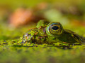
| 10/07/2015 02:30:05 PM | The Prince by PhocalComment: *Hello from Sid and the Critique Club*
An appealing image that is deemed to meet the challenge.
First of all, congratulations on winning this challenge. My own perception of bokeh has always been much more clearly identified with specular highlights as opposed to soft or OOF areas which is where I would place your entry. The challenge brief would also seem to veer more towards the soft focus rendering than my own interpretation. I love everything about this lovely image it is very well executed, however, I would probably have scored it lower than an image with clearly defined bokeh in respect of my definition than has obviously been the case here at DPC.
The image itself is gorgeous, I love the sharp focus on the eye and the shallow DOF both obviously essential regardless of the challenge brief. Its always a classic to photograph a frog emerging with this lovely duckweed on and around it, perfect. I particularly love the eye and the reflections, superb. There's no doubt about it, this really is a lovely image but I still long for 'true' bokeh in it.
Well done Ronnie, an excellent image, Sid | | Photographer found comment helpful. |
| 10/07/2015 11:27:30 AM | Fallby GudjonottoComment: *Hello from Sid and the Critique Club*
An attractive image that comes close to meeting the challenge.
There are a few specular highlights that are starting to form bokeh but I feel that the image as a whole is more soft focus than true bokeh, though it is definitely not far off. I think this could have been more effective if you had, for example, some sunlit water in the background then those highlights would be a lot better defined and much more effective than what you have here.
In terms of exposure I feel you have a little too much of it, there are some severely blown highlights on the leaves of the focused plant in the foreground which are detrimental to the image as a whole. The composition is good with the foreground plant occupying a RoT hotspot and coming in from the corner with diagonals of colour running through the background, it works well.
A good attempt thanks for your submission, Sid |
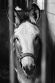
| 10/07/2015 11:12:40 AM | Waiting to be geldedby gulielmusComment: *Hello from Sid and the Critique Club*
An appealing image that does not meet the challenge.
Even following the very loose definition provided by the challenge brief your image does not feature any bokeh at all and therefore does not meet the challenge requirements. See the Wikipedia entry for a definition of bokeh. It is very often misrepresented and I'm sure yours is not the only entry in this challenge that fails but for my own understanding of it it requires a shallow DOF and specular highlights.
The image itself has an appealing subject matter but no bokeh, I see you have used maximum aperture which is good for achieving bokeh but it needs the right background such as sunlit water for example. A soft focus background is not in itself bokeh it is merely a soft focus background, for true bokeh specular highlights are needed to bring out the quality of the lens itself. A good lens will produce highly desirable soft focus shapes that add another element to the overall effect.
I hope this critique helps your understanding, Sid |
| 10/07/2015 11:01:24 AM | Search Nectarby clickodakComment: *Hello from Sid and the Critique Club*
A well executed image that does not meet the challenge.
Even following the very loose definition provided by the challenge brief your image does not feature any bokeh at all and therefore does not meet the challenge requirements. See the Wikipedia entry for a definition of bokeh. It is very often misrepresented and I'm sure yours is not the only entry in this challenge that fails but for my own understanding of it it requires a shallow DOF and specular highlights.
Your entry fails in several ways, there are no specular highlights just a plain black background which is completely the opposite of what is needed. A larger aperture is normally preferable though this is also dictated by your distance to the subject, the closer you are, the shallower the DOF.
The image itself is good in terms of DOF, lighting and execution but it simply does not fit in with the challenge, that is not to say it couldn't have done but the black background would be the first thing to go. Replaced by a natural background of a pool for example the ripples and sunlight on the water would have given you the specular highlights needed, the resulting bokeh is then very much lens dependant on your lens with some lenses producing more pleasing bokeh than others, its all down to the lens design and number of aperture blades of the lens. Good bokeh can be a very desirable addition to an image that can transform an ordinary image into a spectacular one.
Sorry Marcel, I know you will accept my critique in the manner it is intended, to help you better understand, Sid | | Photographer found comment helpful. |
| 10/05/2015 08:36:12 AM | Tempestby sfaliceComment: *Hello from Sid and the Critique Club*
An intriguing image that meets the challenge.
Very creatively done, I can see you had a lot of fun getting this to where it is. What is it? Who cares, it is very different and therefore has its own impact as a result. It feels like a family of aliens, dad on the right mum on the left with their two siblings, all sharing a moment together. The most intriguing elements are the glass 'heads' of mum and dad, in particular the blue of mum and the red blob of dad but also the reflected arched yellowish shape too. I particularly like dads pose its really quite dynamic.
The technical aspects are good and appropriate, you have a full DOF with good detail throughout. The plain red background works well especially with the blue lighting. The textures are coming out well. It all works very well. The title I'm not so sure about, tempest is not the feeling I get from your image, for me its more like 'togetherness'.
Its nice to see an entry that has been created purely for your own pleasure regardless of the anticipated reception from your voters, I think it deserved a lot better but that was not your motivation anyway. Thanks for your submission, well done, Sid | | Photographer found comment helpful. |
|
Showing 1201 - 1210 of ~3781 |
Home -
Challenges -
Community -
League -
Photos -
Cameras -
Lenses -
Learn -
Help -
Terms of Use -
Privacy -
Top ^
DPChallenge, and website content and design, Copyright © 2001-2026 Challenging Technologies, LLC.
All digital photo copyrights belong to the photographers and may not be used without permission.
Current Server Time: 05/07/2026 09:23:43 AM EDT.
|