|
|
|
Showing 1171 - 1180 of ~3781 |
| Image |
Comment |
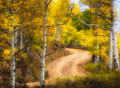
| 11/24/2015 05:52:57 AM | glowingby Ja-9Comment: Hello from the Critique club
An appealing image that meets the challenge
A nice natural scene of this lovely time of year, your composition is very appealing and I like that the road is a natural feature too and not asphalt it blends well with the scene as a whole. The trunks of silver birch are always a treat in any scene and this is no exception. The colours and the light are major elements that are working well in your image. I wasn't very keen on the lack of detail to begin with but its slowly growing on me, I like that in the main you still have some detail in the tree trunks. I love the black elements, the branches and features on the trunks I find them most appealing against the rest of it.
Well done Janine with your high placing, another successful entry. |  Photographer found comment helpful. Photographer found comment helpful. |
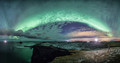
| 11/24/2015 05:33:25 AM | Aurora bow  by GudjonottoComment: Hello from the Critique club
An appealing landscape that meets the challenge.
Ah, those good old Northern lights, they always work well and this is no exception, what a gorgeous framing arc they make here. The landscape is well chosen and interesting and the cloudscape adds more interest too. I find myself, however, drawn to the bright light in the right half and the way it is illuminating your subject, at first I thought it was the midnight sun and realised immediately, no, its the wrong time of year for that. I'm assuming its a strong light you have placed there to illuminate that part of the scene? It's the base that whatever it is that is holding my attention trying to work out what it is. Because of this it is losing some of its effect on me I'm finding it too distracting, but for all that it it is still essentially an excellent panorama.
Congratulations on the ribbon, well deserved. | | Photographer found comment helpful. |
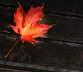
| 11/23/2015 05:55:17 PM | Maple Leafby clickodakComment: Hello from the Critique club
An appealing image that meets the challenge well
A lovely image Marcel, the way the light is highlighting the centre of the leaf works well against the darker background. I like the smaller leaf and its colours and shadows against the larger leaf it works very well to distinguish it. I generally like the composition, though, unlike your commenter I would be inclined to crop some off the bottom right at the point where the bottom of the stalk's step joins the left side of the image, I find the gap below it too distracting for the overall result. The other thing is that the top left of the large leaf is losing a little sharpness and given the nature of the subject it is really desirable to retain the sharpness throughout the leaf.
Well done for spotting the potential here a very good attempt. | | Photographer found comment helpful. |
| 11/23/2015 05:43:50 PM | Forest Floorby sfaliceComment: Hello from the Critique club
An appealing image that meets the challenge well.
Your image has some lovely shapes colours and textures that as one of your commenters has pointed out has a resemblance to dancing flames which gives it another dimension, very artistically done. I love the backlit brighter leaf towards the top which gives it all that burning feel and all of this is accentuated by the lovely base with its twisted shapes supported by the dark vein like structures. The whole composition feels very dynamic as though we are witnessing a brief flickering moment in time.
Your lighting is good with a combination of backlighting and front side lighting it has enabled you to bring out all the detail well. The subtly dual coloured soft focus background works well too.
Your image has lots of appeal and I'm pleased to see that it has been received so well here though those sub 5s are completely unjustified, you can't please 'em all can you? Well done Alice. | | Photographer found comment helpful. |
| 11/23/2015 05:30:51 PM | Not a Divaby snafflesComment: Hello from the Critique club
An appealing image that meets the challenge
This is a very accomplished pet portrait, everything that needs to be is nicely sharp against a suitably soft background. The lighting is good and even and brings out all the important details in her. I find the colours and textures in her eyes a little disconcerting, they feel a little spooky. When I compare the two sides of the image the left feels a little washed out, I would love to be able to see those whiskers more, as clearly as I can on the right, and the pinks too. I also find my eye keeps getting drawn to that long hair in the right ear, I think it would benefit from being cloned out.
This is one you can treasure for the future and it's good to see your lovely image has gained a respectable score from the voters here, well done Susan. | | Photographer found comment helpful. |
| 10/30/2015 12:25:09 PM | bluebirdby posthumousComment: Hello from the Critique club
An interesting image that meets the challenge
I am not familiar with Cutout's work but a quick look at his front page suggests that your image fits the challenge. It is an intriguing image that holds the viewer and demands a longer look to work out the reflections, shadows and original detail that makes up the whole. Although it is massively overexposed it works in an appealing sort of way. The toning suits the subject well. I have had to look long and hard at the bird itself to work out its rather strange posture as clinging to the wire of the fence and looking over its back towards the space it is in.
It works well and has been favourably received here by your voters, well done, Sid | | Photographer found comment helpful. |
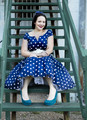
| 10/30/2015 12:08:44 PM | The steps to her apartmentby PompouspeteComment: Hello from the Critique club
An appealing image that meets the challenge well
What a lovely portrait of a lovely girl in a lovely dress sitting on lovely steps! All the colours work really well together, apart from the brown supports for the steps, given the lovely blend of the major elements together I may have been tempted to recolour them to something closer to the steps but its a minor point really. She is a very attractive lady and looks delightful the way she is dressed she has a lovely smile and those ruby red lips are so enticing.
Your focus is where it should be on her face and the DOF has everything that needs to be sharp nicely covered with softness helping her to stand out from the background. The steps above her are leading to the unknown that intrigues us and keeps us interested but still focused on her.
It all works well and was respectfully received by your voters, well done, Sid | | Photographer found comment helpful. |
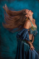
| 10/26/2015 12:05:03 PM | Na'ilah in her grooveby Pixel PeteComment: Greetings from the Critique club
An appealing portrait that contributes well to the open challenge
A great action shot, all credit to you for seeing the potential in her gorgeous red hair and for making it feature so effectively in this lovely portrait, the shape of her hair as it falls is adding a really dynamic element to the image. The lighting is good and uniform with good detail throughout but that small wisp of hair catching the light is forming a small highlight that draws the attention I think it would benefit from toning down to the same as the rest of the hair. The only other comment I have is that it feels just a little too tightly cropped, I would like her to have a little more space on both sides but its still a lovely image that deserved a higher score.
Apologies for the delayed critique, Sid |
| 10/26/2015 11:54:35 AM | Battery Point Lighthouseby aliquiComment: Greetings from the Critique club
An appealing landscape that contributes well to the open challenge
I don't think I would like to be in those waters they look rather dangerous and definitely in need of the lighthouse. I like your composition it is well constructed, the placement of the lighthouse with its distinctive red roofs is perfect and the trees really add to that part of the scene but what really makes this are the foreground rocks with the motion of the breaking waves, its lovely. The low clouds are acting as a diffuser for the light overall and also adding a sense of foreboding fitting for the scene.
Apologies for the long delay for this critique, Sid | | Photographer found comment helpful. |
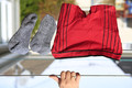
| 10/26/2015 11:46:38 AM | Laundry Daysby clickodakComment: Greetings from the Critique club
An intriguing image that meets the challenge well
A very clever idea Marcel and well executed, the placement of your hand really throws and intrigues the viewer, I'm still trying to work out exactly how you did it!I'm assuming it is a low line that you were able to hold during the remotely controlled exposure? Anyway, its very much a quirky, smiley image which will have increased its appeal here, I like the bright colours of the undies, seems a shame to hide them under your clothes! The DOF is good, though the exposure does have some blown highlights the important parts of the image are well exposed. The satellite dish is a bit distracting, perhaps it might have been better taken from a lower level shooting up with a predominantly sky background.
Well done again Marcel, another front page entry, you're definitely on a roll! Keep 'em coming, Sid | | Photographer found comment helpful. |
|
Showing 1171 - 1180 of ~3781 |
Home -
Challenges -
Community -
League -
Photos -
Cameras -
Lenses -
Learn -
Help -
Terms of Use -
Privacy -
Top ^
DPChallenge, and website content and design, Copyright © 2001-2026 Challenging Technologies, LLC.
All digital photo copyrights belong to the photographers and may not be used without permission.
Current Server Time: 05/07/2026 06:48:38 AM EDT.
|