| Image |
Comment |
| 12/23/2015 06:15:38 AM |
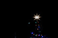
Moravian Star by dpeden182Comment: Hello from the Critique club
An uninspiringing image that meets the challenge
The star itself is quite impressive but I'm afraid the rest of the image doesn't really have a lot going for it. I like that your composition is off-centre but I really think your choice of subject would have been better suited to portrait orientation to balance more coloured lights against the large star which dominates the image. As for the moon it is so insignificant especially in the context of the star I think you would be better to remove it to be honest. As for the figure it is so ill-defined that most people may probably not see it at all which is probably a bonus because once seen it becomes an irritant and again would be better removed.
The main problem is it is black with a big star and a few coloured lights but there isn't sufficient detail anywhere to hold you, it just isn't interesting enough, sorry.
Thank you for your entry, hope you have a lovely festive holiday and a creative New Year to you. |
 Photographer found comment helpful. Photographer found comment helpful. |
| 12/23/2015 05:58:02 AM |
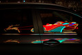
Santa and His Reindeerby dtremainComment: Hello from the Critique club
An appealing image that meets the challenge well
Very creatively done, this is an excellent way to approach your subject, though I'm probably biased because of my love of reflections! There's very little not to like here, I like the clarity of the glass reflection against the darker mass of the rest of the image, I like the missing bits on the door pillar, I like the chrome strip reflections. I adore the bodywork reflection and its distortions. I like your composition and the placement of the reflections, especially the sledge over the door handle, it all works very well for me.
The only minor criticisms I do have concern the top of the image, in particular the distracting highlights, they would be better cloned out and the whole of the top dodged to subdue it to the same level of darkness as the rest of the image.
Thank you for an excellent image, hope you have a lovely festive holiday and a creative New Year to you. |
| Photographer found comment helpful. |
| 12/21/2015 09:03:38 AM |
Me 'n my Girlby enikoComment: What a gorgeous image Eniko, though I'd probably prefer the original without the filter. |
| Photographer found comment helpful. |
| 12/21/2015 08:17:10 AM |
all at once by jagarComment: Congratulations, a truly excellent image!
A wonderful mix of allegory and pathos, perfect timing and composition together with lovely mono processing, superb. Well done John |
| Photographer found comment helpful. |
| 12/21/2015 06:27:12 AM |
Bloated...In Death as in Lifeby PhocalComment: Hello from the Critique club
An interesting image that meets the challenge.
Great use of fisheye lens to create an allegorical illusion as you have. I like your mono processing, perfect for the subject it enhances it very effectively. The vault you have used is also perfect for the scene with its cracks and ageing textures it adds a realistic impression to the concept you are trying to convey. I see you were disappointed with the light, a photographers recurring difficulty, but given the nature of the subject I would say this has worked well for you especially the dramatic sky. Just a couple of minor criticisms, that white knob stands out like a sore thumb, it just keeps drawing your eyes to it, I think it would benefit from some dodging to subdue it a little. The other thing is the very tight crop, its just too tight. I can understand your dilemma, to get the most out of your lens you needed to be in close to exaggerate the distortions but I just wish we could see all of it complete.
Great subject, great image, well done Ronnie.
|
| Photographer found comment helpful. |
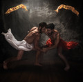
| 12/21/2015 06:09:12 AM |
The Struggle by tangueraComment: Hello from the Critique club
An exemplary image that meets the challenge fully
Congratulations on your excellent result for your equally excellent image, and thanks also for the synopsis of all the hard work you had to go to in order to create the image, we are all indebted to you.
This is very allegorical and symbolic of the troubled times we are living through. The pose of the two men is very dynamic and your splendid choice of lighting has defined the physique well, especially of 'faith'. That same lighting generally works well in defining the most important aspects of the image to good advantage amongst the predominant darkness which in itself is equally important in making the image work as well as it does. I would imagine it was difficult to decide on the right pose that gave both equal emphasis whilst still looking authentically combative, I would say you have achieved it well. I can also imagine how hard it was to time their falling cloths with the shutter to achieve the dynamic result you needed and again I would say you have achieved it well.
The only minor criticism I would voice concerns the effect of the lighting which has given emphasis to the white cloth making it stand out quite significantly from the rest of the image especially in relation to the red which also given it smaller size is comparatively insignificant. The same lighting is also causing near blown highlights on the left of the reason banner. I would suggest that some dodging on these two aspects would correct this minor problem.
I would say you achieved your goal of a biblical scene and your comments about the banners are relevant but I would say they do not adversely affect the end result. It's good to see that it has been so well received in terms of votes and comments, very well done Johanna, another to proudly add to your massive roll of DPC achievements! |
| Photographer found comment helpful. |
| 12/16/2015 09:06:28 AM |
Exhaustionby PhocalComment: Hello from the Critique club
An interesting image that meets the challenge well.
Congratulations on the ribbon, very well deserved. A great image that captures both the strength and the fatigue. I like to do cycle racing shots myself and end up with no end of 'head down no eyes shots' so this challenge would have been a welcome relief to such as myself! Your focus and DOF is accurate and appropriate and coincidentally echoed by the name of the bike too. I have to make comment about the background which I do find a rather unfortunate distraction and wonder, contrary to my previous comment, if a smaller aperture to bring out enough detail to recognise it better may have improved it.
Well done for submitting such a strong shot that has been justifiably well received |
| Photographer found comment helpful. |
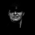
| 12/16/2015 08:57:19 AM |
Thug #3by snafflesComment: Hello from the Critique club
An interesting image that meets the challenge well.
I'm afraid your Clockwork Orange visual reference is lost on me but it certainly resonated with one of your commenters so well done, it obviously worked! I love the low key approach and the way the detail bleeds into the dark background, this together with the shaded, invisible eyes fulfils the challenge brief fully. You have done a great job with the lighting, just enough to bring out essential detail without spoiling the low key effect.
A great job that has been deservedly well received, I just hope I don't meet you up a dark alley! |
| Photographer found comment helpful. |
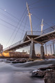
| 12/14/2015 11:10:36 AM |
highland bridgeby nstevens85Comment: Hello from the critique club
An interesting image that meets the challenge
Its commendable that you have chosen a viewpoint that has enabled you to use the river for a creative foreground but that same viewpoint means you are including the cranes and pole none of which add to the image's appeal. The foreground river is detracting from the main subject the bridge itself which in terms of the challenge is detrimental. The moon whilst appealing pulls the eye away from the bridge too, it would probably be best cloned out. Given the challenge theme I think you would have been better to compose in landscape orientation, with less of the river, excluding the background detail and fitting in more of the buildings in the background.
Technically the shot is good with adequate depth of field and the long shutter speed has given the water plenty of motion blur. I'm sorry you didn't get any comments during the challenge I hope this makes up for it. Thanks for your entry. |
| Photographer found comment helpful. |
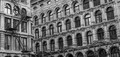
| 12/14/2015 10:50:06 AM |
arch windowsby clickodakComment: Hello from the critique club
A cluttered image that meets the challenge on a basic level
Hello Marcel. What a lovely old building you have found here its architecture certainly fits the challenge well. I'm sorry but I have to say I feel quite uncomfortable with the composition it just doesn't work for me. Whilst I like and often use diagonals they can be very effective but here they make me feel as though the building is about to topple over. This effect is compounded by the foreground building on the left of the frame, it is perfectly straight. The lamp is very intrusive in a way that is not lending itself to the overall image. The staircase is an interesting feature but it is just too much in relation to the overall image. I think there is just too much going on here for it to work effectively, as they say, less is more.
I like the mono processing and the full range of tones you have. As the image itself stands perhaps a squared up crop of the right part of the main building excluding the lamppost might work. Whilst I like the foreground building I don't think a square crop of that would work because you would have to include that unattractive and intrusive lamppost in a way that just wouldn’t work at all.
I see the corner of the foreground building is rounded, if the windows too are rounded I think a return to those windows and looking at the reflections of the main building in them could be well worth looking at. In my minds eye I am seeing some gorgeous reflections that capture this lovely building in all its glory and having the windows themselves as the frame you will capture those lovely windows too.
|
| Photographer found comment helpful. |
Home -
Challenges -
Community -
League -
Photos -
Cameras -
Lenses -
Learn -
Help -
Terms of Use -
Privacy -
Top ^
DPChallenge, and website content and design, Copyright © 2001-2026 Challenging Technologies, LLC.
All digital photo copyrights belong to the photographers and may not be used without permission.
Current Server Time: 05/07/2026 06:47:22 AM EDT.