| Image |
Comment |
| 01/15/2016 03:38:37 PM |
|
 Photographer found comment helpful. Photographer found comment helpful. |
| 01/15/2016 03:38:13 PM |
|
| Photographer found comment helpful. |
| 01/15/2016 03:37:39 PM |
|
| 01/15/2016 03:29:37 PM |
|
| Photographer found comment helpful. |
| 01/15/2016 03:01:51 PM |
|
| Photographer found comment helpful. |
| 01/15/2016 10:01:22 AM |
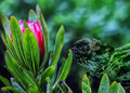
Winged Chariotby sfaliceComment: Hello from the Critique club
An intriguing image that does not meet the challenge
It took me a while before I even saw the bird so the plant in isolation didn't really mean anything to me, but to be honest I'm not sure your meaning is much clearer now. Perhaps I'm missing something significant but I can't see how this fulfils the challenge brief apart from the title which echoes a line referred to in the brief's poem. The flower itself is nicely isolated from the background with the chosen focal length but its all very soft which I presume is intentional. As for the bird its not immediately obvious which again, I assume is your intention, it certainly worked on me! The surreal representation and the title are, again I assume, meant to be some sort of a metaphor?
I'm sorry the image hasn't worked in the way you intended either for me or for the voters, I'm also sorry it hasn't prompted any response either I hope this goes some way towards helping you. |
| Photographer found comment helpful. |
| 01/13/2016 07:15:18 AM |
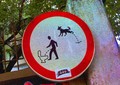
Eggocentricby SoultComment: Hello from the Critique club
An amusing image that meets the challenge
The sign itself is excellent, very amusing, I can honestly say I've never come across a sign quite like this before! The red circle of the sign obviously complies with the challenge brief. A trademark of your images seems to be the use of very high ISOs with resultant high image noise so I wont make any obvious comments in this regard.
I get the impression that you don't take yourself or your photography too seriously which is to be commended
Well done, thanks for making us smile with your highly amusing entry. |
| 01/13/2016 07:07:16 AM |
CIRCLEby RussianMasterPhotographerComment: Hello from the Critique club
An amusing image that meets the challenge
The sign itself is excellent, very amusing, I can honestly say I've never come across a sign quite like this before! The red circle of the sign obviously complies with the challenge brief. A trademark of your images seems to be the use of very high ISOs with resultant high image noise so I wont make any obvious comments in this regard.
I get the impression that you don't take yourself or your photography too seriously which is to be commended
Well done, thanks for making us smile with your highly amusing entry. |
| Photographer found comment helpful. |
| 01/13/2016 06:50:27 AM |
Point of convergenceby clickodakComment: Hello from the Critique club
An appealing image that meets the challenge
I somehow knew this was yours Marcel before I came to your name, a lovely simple idea, well executed. I particularly like the way you have placed the convergence on the lower left thirds hotspot it enhances the composition very effectively. I like the circle of cross section of the end pencil in the middle of the points, but I think this could have been improved with a round pencil as opposed to hexagonal. Another minor point is the blunted lead of the blue pencil it spoils the symmetry a little but its not a major issue. Overall the image feels a little on the dark side, I think it could have enhanced it with some +EC to brighten it all up but its generally well executed.
Well done, thanks for your excellent entry. |
| Photographer found comment helpful. |
| 01/13/2016 06:39:53 AM |
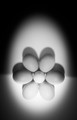
Empty Circlesby gipper11Comment: Hello from the Critique club
An appealing image that meets the challenge
I love the simplicity of your entry, the shapes are very appealing and I like your non-symmetrical approach using five glasses not all different colours and arranged the way you have. The pastel shades are very effective and enhanced by your sympathetic lighting which very effectively lights them perfectly without heavy shadows. The circles of the top of the glasses are very effective and I also like the repetition of the circles implied by the bases. To be honest I can't really fault it, I think you have done an excellent job and it has been recognised here with a respectable score too.
Well done, thanks for your excellent entry. |
| Photographer found comment helpful. |
Home -
Challenges -
Community -
League -
Photos -
Cameras -
Lenses -
Learn -
Help -
Terms of Use -
Privacy -
Top ^
DPChallenge, and website content and design, Copyright © 2001-2026 Challenging Technologies, LLC.
All digital photo copyrights belong to the photographers and may not be used without permission.
Current Server Time: 05/07/2026 05:55:53 AM EDT.