| Image |
Comment |
| 01/22/2016 01:33:31 PM |
Annaby ArnaMarieComment: Hello from the Critique club
An appealing image that meets the challenge
You could stage manage these sort of shots but what you have here is the sort of image that shows Anna in a way that you can easily imagine and remember her in your unfortunate separation from her. For that reason the dummy becomes acceptable though I do agree it would be nicer to have seen all her features without it. What is vital in any portrait is to get the eyes nice and sharply focused and that's exactly what you have done and your shallow DOF has placed all the emphasis on that eye which makes it a very effective image. I like the mono processing.
You have got some good critique from patches and I can understand what he is saying but I actually like it the way it is, but what really matters is that you have a very special image that will always mean so much to you so DPC and scores are really quite secondary.
Well done, thank you for your entry.
|
 Photographer found comment helpful. Photographer found comment helpful. |
| 01/22/2016 01:20:13 PM |
Man in the mistby jgirl57Comment: Hello from the Critique club
An appealing image that meets the challenge
A great and enduring composition with a lot of appeal though the mans gesture with his stick is somewhat ill fitting. I commend your choice of mono and the processing it works very well indeed, this would be nowhere near as effective in colour. My one big issue with the image is the sharpening it has been way overdone, in fact this is the sort of image where none is needed a softer emphasis is more desirable here especially with the atmospheric conditions. It's a real shame because it does significantly mar the end result. But, well done for seeing and interpreting the scene in the way you have done.
It shows the quality of this demanding challenge that your 6 has not placed higher, well done, thank you for your entry.
|
| Photographer found comment helpful. |
| 01/22/2016 01:10:38 PM |
Sunshine hillby tigerluongComment: Hello from the Critique club
An appealing image that meets the challenge
The lighting in your landscape has emphasised the undulating nature of the ground producing some lovely shadows giving it all more of a 3D feel. However, I feel the colours have been saturated to the detriment of the overall end result. The strong blue cast especially of the sky and hills also affects the image quality. The white clouds on the right add an interesting counterpoint to the rest of the image
I'm sorry you didn't receive any comments during the challenge I hope this makes up for it, well done, thank you for your entry.
|
| Photographer found comment helpful. |
| 01/22/2016 12:58:37 PM |
Street corner conversationsby RulerZigzagComment: Hello from the Critique club
An appealing image that meets the challenge
A fascinating street scene, we get to do some people watching from the comfort of our armchair! I like that you have chosen to use mono and done the processing so well, a broad range of tones and detail throughout. There is lots to absorb and hold our interest from foreground shadows to the bench to the shop interior to the man on the left and his surroundings, all very interesting. The only minor criticism I do have is in your title the only person who may possibly be conversing is the lady but his stance is certainly not conducive to such a possibility, perhaps 'street corner observations' may have been more appropriate?
In a less demanding challenge this would have placed even higher, well done, thank you for your entry.
|
| Photographer found comment helpful. |
| 01/22/2016 12:45:17 PM |
Strolling Along the Canalby chaliceComment: Hello from the Critique club
An appealing image that meets the challenge
There is an air of appealing mystery in your image and spacious minimalism that is created by the broad featureless canal that separates the frenetic detail of the foreground trees and the functional buildings from the really interesting lower left part of the image. This path that recedes into the distance is transformed from a mainly featureless waterside walkway into something intriguing with the inclusion of the figure of the walking man. To a lesser extent the person on the wall adds some more interest but I feel that this would be even stronger if she wasn't there at all. Your composition and the man's position is what makes this all such a strong image
In a less demanding challenge this would have placed even higher, well done, thank you for your entry.
|
| Photographer found comment helpful. |
| 01/22/2016 12:31:28 PM |
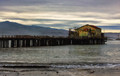
The Old Pierby sfaliceComment: Hello from the Critique club
An appealing image that meets the challenge
What a lovely old structure that pier is though I'm not sure I would feel too safe in the building! I am intrigued why you seem to have so much noise with such a low setting? I like the combination of near mono together with the muted colours of the building. I think the composition could have been improved by reducing the foreground in favour of the sky which has some interesting detail and texture in it and it would also remove the foreground detail I find rather distracting. The mast is so close to the left edge it should either have more room or have been cropped out. At the other edge the distant beacon is a little too close to the right edge, I think the whole composition would have benefited from a small move to the right.
A respectable result in such a demanding challenge, well done, thank you for your entry.
|
| Photographer found comment helpful. |
| 01/22/2016 12:15:57 PM |
School Spiritby jeroweComment: Hello from the Critique club
An appealing image that meets the challenge
A lovely portrait of a very attractive lady the shot tells us that she is inextricably linked with the Magnolia public school by placing her between the two coaches together with her clothing. Your lighting and exposure have worked well to make her stand out from the darker background although there are some darker shadows under her chin it is not excessive. Your lower shooting position has enabled you to use more of the sky in a less distracting way than a normal viewpoint. All in all a very competent portrait, well done
It has been well received in this highly popular challenge, thank you for your entry.
|
| Photographer found comment helpful. |
| 01/22/2016 12:07:15 PM |
Sunset Over Lake Ontario 2015by FauxtoemanComment: Hello from the Critique club
An appealing image that meets the challenge
A lovely landscape scene during the last remains of the 'golden hour'.Your long exposure has resulted in a pleasant mix of detail together with motion smoothness of the waters. I'm a little frustrated that the sunset strip is interrupted on the left as much as it is and left feeling I wish you had moved over to the right a little more, assuming of course that was possible, so there was less of the lower left in favour of more unobstructed sunset. Overall its a very competent landscape of an attractive scene.
In a less demanding challenge this would undoubtedly have placed higher but well done anyway, thank you for your entry.
|
| 01/22/2016 11:58:08 AM |
Clearing Stormby Five_SeatComment: Hello from the Critique club
An appealing image that meets the challenge
A very atmospheric shot with those looming storm clouds and fascinating cityscape against the foreground waters it all works very well together. The lighting and the dusk adds a lot of impact to the shot with the city lights all lit up it makes for a very dynamic scene. Your composition is very well considered placing the emphasis on that broody sky, however, in fact I would probably have given it even more emphasis with a mere strip of water about equal to the depth of the cityscape at the base of the frame.
It is no mean achievement to place so highly in such a demanding challenge, thank you for your entry.
|
| Photographer found comment helpful. |
| 01/22/2016 11:47:46 AM |
Fly No Moreby GudjonottoComment: Hello from the Critique club
An appealing image that meets the challenge
You have given us some of the best aurora shots out there and this is yet another stunning example, well worthy of your high placing. Your choice of foreground interest is key to the additional interest and impact that the shot has. I have to say that I am drawn to the lovely distant mountains on the right and left feeling, I wish your composition had been more off-centre moving the plane to the left with more of the right, I think you would still have retained the most dynamic effects of the aurora but with an even more pleasing composition.
Thank you for your entry in this very demanding challenge
|
Home -
Challenges -
Community -
League -
Photos -
Cameras -
Lenses -
Learn -
Help -
Terms of Use -
Privacy -
Top ^
DPChallenge, and website content and design, Copyright © 2001-2026 Challenging Technologies, LLC.
All digital photo copyrights belong to the photographers and may not be used without permission.
Current Server Time: 05/07/2026 03:08:24 AM EDT.