| Image |
Comment |
| 01/22/2016 03:09:10 PM |
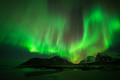
Dragonby darnokComment: Hello from the Critique club
An appealing image that meets the challenge
A very impressive aurora landscape. Your choice of viewpoint has made effective use of the mountain backdrop together with the beach foreground to create additional interest. The obvious crowning glory of your shot is the aurora itself a truly impressive spectacle that you have captured well. Its quite uncanny the way the aurora has mimicked the shape of the mountains. In any other challenge this would have won but you have a well deserved front page position.
Well done, thank you for your entry.
|
| 01/22/2016 03:02:36 PM |
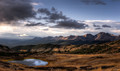
The Summitby Ja-9Comment: Hello from the Critique club
An appealing image that meets the challenge
A very impressive landscape Janine, made even more impressive by the lovely lighting. The water and its lovely reflection make a good foreground point of interest. What a lovely sky you have to complete the effect, however, the upper right feels quite empty in relation to the rest of the frame and I wonder whether a panoramic crop just above the mountains may have improved the end result? It's the nature of this demanding challenge that your image didn't finish higher but it remains a very competent and appealing landscape.
Well done, thank you for your entry.
|
 Photographer found comment helpful. Photographer found comment helpful. |
| 01/22/2016 02:55:36 PM |
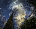
Convergenceby sfaliceComment: Hello from the Critique club
An appealing image that meets the challenge
A great cloudscape your composition works well to emphasise the vast expanse of cloud. I like that you have waited for the cyclist to add additional interest to your image. I think this would have worked better in mono, the cyclists yellow jacket is such a strong focus point it pulls your eyes away from the sky itself, the distant car may also become less obvious in mono. You could really make those clouds stand out against a strong red filtered sky, I think it would give it huge boost of impact.
Well done, thank you for your entry.
|
| Photographer found comment helpful. |
| 01/22/2016 02:47:23 PM |
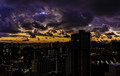
Clouds in the Eveningby dpeden182Comment: Hello from the Critique club
An appealing image that meets the challenge
Great viewpoint and great use of the fisheye lens to create something a bit different. I like your commenters analogy with a giant dandelion – excellent. I can understand why you were captivated by the marvellous colours of the clouds, I find them absolutely fascinating. Although I'm no fan of HDR your processing is quite sympathetically done, although in this instance you could argue that the extra detail detracts from the clouds themselves therefore diluting the effectiveness of your entry for this particular challenge. I also think the blue of the sky would benefit from some desaturation. All in all a competent image
Well done, thank you for your entry.
|
| 01/22/2016 02:40:31 PM |
Winters Eyeby PhocalComment: Hello from the Critique club
An appealing image that meets the challenge
There's no denying that clouds are definitely the subject here! I like your extreme composition it certainly captures the sunrise moment well, the start of a new day and new opportunities. I also like the resulting distortion from the fisheye lens but it feels unbalanced with the bulk of the land features on the right. In this situation where you are dealing with an obvious distortion like this a better option would have been to tilt the image to give it more balance, it really doesn't matter that your original horizon is way off level. Its good that you have captured some water to enable some reflections too.
Well done, thank you for your entry.
|
| Photographer found comment helpful. |
| 01/22/2016 02:32:47 PM |
Watch your step !!!by clickodakComment: Hello from the Critique club
An appealing image that meets the challenge
At first I thought this was the same image as you won your yellow with Marcel, which effectively it is but a slightly different version. I can understand why you would want to do this given your previous success but these sort of challenges are in themselves very challenging and best met with an image that you consider to be your best as opposed to a DPC most successful. This image lacks the impact of your other in terms of processing, the mono tones and contrast are too limited. The image rotation of your other created an illusion and interest that is sadly lacking here. I think you could have tried something a bit more creative with a panoramic crop of the lower half of the shot with a much brighter background with burnt in shadows which would have given you something very different, perhaps you might try it and see what you think?
Well done, thank you for your entry.
|
| Photographer found comment helpful. |
| 01/22/2016 02:16:10 PM |
6:35 amby chaliceComment: Hello from the Critique club
An appealing image that meets the challenge
I've no doubt that you have a much improved image from the original you describe but I think you may have just started to cross the tipping point in your processing, the sky is very noisy and unnatural looking especially at the top part of the frame. I think the darkening of the lower half has benefited especially given the challenge brief we don't want too much detail we need to have the sky dominate the image as indeed it does. However, the lump on the lower right is spoiling the composition for me I think a crop to remove that would be a big improvement. I'm sure there is a lot of potential in your original washed out image that with more subtle processing could give you an even better end result.
Well done, thank you for your entry.
|
| Photographer found comment helpful. |
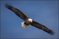
| 01/22/2016 02:05:07 PM |
Airborne Intensityby TommyMoe21Comment: Hello from the Critique club
An appealing image that meets the challenge
Technically a great shot very well captured, everything is good the detail, the diagonal frame filling composition, the DOF with good sharpness throughout, its difficult to fault, technically. However, I know I am probably in a minority here but I miss any sense of motion that such sharply captured images fail to portray, I need something much more dynamic, some blur in the wingtips from a slower shutter speed or a blurring from a panning shot with a much slower shutter speed, anything that gives me the same sense of freedom that this bird is experiencing would be far more appealing to me. I reiterate there's no doubt you are skilled in what you are doing here.
Well done, thank you for your entry.
|
| 01/22/2016 01:53:18 PM |
Amazementby PhocalComment: Hello from the Critique club
An appealing image that meets the challenge
It is always rewarding to capture a natural expression of awe in a candid shot and to that end you have achieved just that here, I just wish that expression had been created by something much more worthy. Your choice of position and composition is excellent. The interior lighting is good but the outside is harsh and overexposed but the most important part, her face, is well exposed and thats what matters most here. I think you could crop the bottom to the level of her red garment for the benefit of the end result.
Well done, thank you for your entry.
|
| Photographer found comment helpful. |
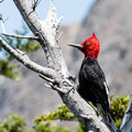
| 01/22/2016 01:42:07 PM |
Knock knock, Who's there?by aslezakComment: Hello from the Critique club
An appealing image that meets the challenge
What an extraordinary bird, very distinctive though your capture is technically sound it just feels rather inanimate as though the bird is stuffed and nailed to the tree. The exposure has worked well for the bird but at the expense of the tree which is significantly overexposed with some loss of detail. I'm sure you have done well to capture this bird, I don't know how rare it is, your lens suggests that you were quite close to it, but I'm sorry I can't really get excited about it, it is missing the wow factor.
Well done, thank you for your entry.
|
| Photographer found comment helpful. |
Home -
Challenges -
Community -
League -
Photos -
Cameras -
Lenses -
Learn -
Help -
Terms of Use -
Privacy -
Top ^
DPChallenge, and website content and design, Copyright © 2001-2026 Challenging Technologies, LLC.
All digital photo copyrights belong to the photographers and may not be used without permission.
Current Server Time: 05/07/2026 03:08:14 AM EDT.