| Image |
Comment |
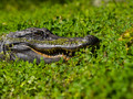
| 02/08/2016 11:13:06 AM |
Cloverby PhocalComment: Hello from the Critique club
An interesting image that contributes well to the free challenge
Given your focal length you were closer than I would have cared or dared to be, well done for bravery alone! Your shot is accurately focused on the alligator nicely defined against the soft focus foreground and background it stands out well in an appealing way. There is good clarity of detail throughout the image. The green of its surroundings is in bold contrast to its dark skin. It is an accurate documentary record shot but that is all, there is no wow factor that takes your breath away perhaps if you had offered him one of your limbs it would have that missing factor but then so would you have missing bits and that, all said and done, is a little too much to expect!
Thank you for your entry |
 Photographer found comment helpful. Photographer found comment helpful. |
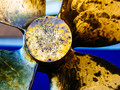
| 02/08/2016 10:59:45 AM |
Prop Washby PhocalComment: Hello from the Critique club
An interesting image that meets the challenge
Perfect choice of subject for the challenge, I like your viewpoint and I like your crop. Yes, you have over-saturated but I rather think it has enhanced the image. It has helped to bring out the ravages of wear and the traces of workings as a result of maintenance. The various shades and colours make it more appealing than a straightforward shot of a prop accurately reproduced as a record shot. Your exposure is good with good detail throughout.
I really rather like it, I am sorry it didn't score higher and that you didn't get any comments during the challenge, I hope this makes up for it. Thank you for your entry |
| Photographer found comment helpful. |
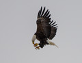
| 02/08/2016 10:52:26 AM |
Inflight Snackby DrakeComment: Hello from the Critique club
An interesting image that contributes well to the free challenge
Like you, I've never seen this myself, he must have been hungry! It also confirms how natural flight is to a bird that they can maintain their flight while concentrating on something else. In terms of frozen action this is an excellent example of it though personally I prefer to see more emphasis on motion, for example, with softness in the wingtips. I would also prefer the composition to be less central, this would crop well square with the bird in the upper right of the frame. A little less sharpening would benefit too there is some over-sharpening with halos on the feathers. I think the background could be lightened up just to make a little more appealing.
Thank you for your entry |
| Photographer found comment helpful. |
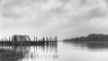
| 02/08/2016 10:42:59 AM |
Right Timingby tigerluongComment: Hello from the Critique club
An interesting image that contributes to the free challenge
Well done in capturing an instance in time where we have a common scene transformed by your timing and perspective. Though, in itself it is not intrinsically appealing especially as there is a softness throughout the image and there are problems with overblown highlights particularly on th e
top of your main subject, the plane in flight. The two figures with their high-vis vests draw your eyes towards them, in view of this it may have been better to convert to mono for this reason and also to subdue the predominant blues.
Thank you for your entry |
| 02/05/2016 06:09:31 AM |
Fog is rain that whispers ~ Olivia Dresherby Ja-9Comment: Hello from the Critique club
An interesting image that subtly meets the challenge.
Although this is a pleasing composition my first impression was that it did not meet the challenge but on further inspection I can see that there is a vague mistiness against the trees so it would appear to meet the challenge but not in an obvious way. The image reflects the dull sort of day that is often experienced where the uniform light lacks modelling and does not create a huge impact. I do like that you have used mono conversion with a good range of tones to bring out the detail in the clouds and emphasise the sombre mood. I tend to disagree with the comment about contrast I think you've got the balance about right you would start to lose important detail with any more contrast.
A respectable score and result, well done Janine |
| Photographer found comment helpful. |
| 02/05/2016 05:57:05 AM |
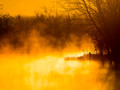
Dragons Breathby PhocalComment: Hello from the Critique club
An interesting image that meets the challenge.
This is probably the most golden hour I've ever seen! If I'm perfectly honest, which I always try to be, its not entirely to my taste but it certainly captures that early morning moment well and it fulfils the challenge brief with the morning mists. I get the impression that you have applied some saturation, I may well be wrong but I think this would work better with some desat to reduce it to more pastel shades, I find the vivid yellow of the water hurts my eyes. By doing so it may well also bring out the mists on the water itself as opposed to just the darker background. Having said all that, I appear to be in a minority here so well done with your score, result and positive comments |
| Photographer found comment helpful. |
| 02/02/2016 05:15:20 AM |
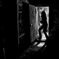
Kill Bill IVby snafflesComment: Hello from the Critique club
An appealing image that meets the challenge
Well thought out and executed, I like your action pose, glad I'm not on the receiving end of that blade! Your title probably means more to folk on your side of the pond than it does to me but the message is quite clear. I like your composition but I think its a shame the detail doesn't continue into the left half of the image it leaves the image feeling a little unbalanced. Your sillhouette works really well with just a hint of detail and the space beyond adds a really nice backdrop to your wicked pose.
Another excellent contribution Susan that has received a respectable score, well done. |
| Photographer found comment helpful. |
| 01/28/2016 06:16:17 AM |
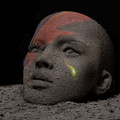
Ashes to ashesby snafflesComment: Hello from the Critique club
An excellent image that meets the challenge well.
Wow Susan! Everything about this is just so good, right from the original concept of the idea through to the finished result, there is a lot of thought and hard work that has been put into this. I cannot fault it but I suppose I can see why you got the comment about the teardrop but your explanation, which was obviously not available to your commenter, clarifies it.
You were up against some tough opposition regardless of the invincible gyaban but thoroughly deserving of your high score and placing, well done and thanks for your original creativity in this sad challenge. |
| Photographer found comment helpful. |
| 01/25/2016 10:00:14 AM |
Seasoned - Panoby gipper11Comment: Hello from the Critique club
An appealing image that meets the challenge.
This is quite an interesting study, I like that you have chosen three different shapes and colours of the leaves. I also like that the floorboards on which the are shown has been carefully and deliberately photographed on the diagonal it makes the end result a lot more dynamic. Those same boards, however, feel a little unreal, as though have been over-sharpened, its not a major issue and I suppose it helps make the leaves a little more prominent. The only small problem is the lighting on the green leaf on the left, it is not as uniform as the others and detracts a little but again its not a major issue.
I'm pleased for you that it has been well received here and got you on the front page, well done, thanks for your entry. |
| Photographer found comment helpful. |
| 01/22/2016 03:16:01 PM |
Lady Bug on Wheatby PartyPaulComment: Hello from the Critique club
An appealing image that meets the challenge
A lovely golden image that has a natural appeal, although it feels somewhat overexposed it suits the nature of the image well. The shallow DOF works well. The ladybird is the obvious focal point for the image and that is where I have a problem. I wish you had composed it more off-centre to the left, I also wish you had completely excluded the distracting sky, so I would suggest a crop just to the right of the furthest tendrils of the ladybird's stalk and just below the lowest point of the sky, I think this would make a big difference to your end result.
Well done, thank you for your entry.
|
| Photographer found comment helpful. |
Home -
Challenges -
Community -
League -
Photos -
Cameras -
Lenses -
Learn -
Help -
Terms of Use -
Privacy -
Top ^
DPChallenge, and website content and design, Copyright © 2001-2026 Challenging Technologies, LLC.
All digital photo copyrights belong to the photographers and may not be used without permission.
Current Server Time: 05/07/2026 06:48:44 AM EDT.