| Image |
Comment |
| 02/15/2016 05:29:36 AM |
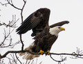
Posing for the USPSby DrakeComment: Hello from the Critique club
An interesting image that does not meet the challenge
I am assuming that the 'broken' advanced editing rule is your cloning as described in your description but this is allowable in the rules so it is not broken. If that is not the case then it is not obvious to me, or indeed, your voters what rule has been broken. Having said that it is has placed and scored very respectably. In terms of the image itself I seem to find myself repeating myself in that I like to see an element of animation through motion blur and there is evidence of over-sharpening, these are both aspects that I know I have commented on before. I really don't want to give a negative impression with regard to your otherwise excellent eagle images but I have to be honest with both of us.
Thank you for your entry. |
 Photographer found comment helpful. Photographer found comment helpful. |
| 02/15/2016 04:39:29 AM |
Follow the Light Path by clickodakComment: Well done Marcel! What an excellent result and what an excellent image, thoroughly deserved. As Sue says, it is all down to your efforts and your willingness to respond to constructive criticism in order to improve your results, I also am very proud of you very well done Marcel. First of many more to come... |
| Photographer found comment helpful. |
| 02/08/2016 12:15:05 PM |
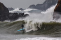
Two surfers in paradiseby sfaliceComment: Hello from the Critique club
An appealing image that contributes well to the free study
That looks a very challenging environment with all those rocks, your viewpoint makes that element of it really work, as opposed to an open sea image of two surfers you get a sense of the danger of their surroundings. Your timing is good with both surfers captured in action and appearing to be in control. The spray off the surf adds to the overall feel you can hear the noise and smell the brine in the air. A very dynamic shot that has been well executed. You could argue that the contrast and brightness could have been raised but I prefer it the way it is it makes the important parts of the image, the surfers and spray stand out more effectively
Well done and, thank you for your entry. |
| Photographer found comment helpful. |
| 02/08/2016 12:08:37 PM |
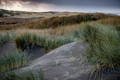
Storm over the Towola Dunesby Catherine_BComment: Hello from the Critique club
An appealing image that contributes well to the free study
I can see what attracted you to take this image. I like your composition and DOF which give emphasis on the foreground dunes. The textures and colours are all very appealing, there is lots of interesting colour and texture to be soaked up here. Even the sky in the background adds an interesting touch of drama to the scene though the exposure of the clouds is close to overexposed I think you have kept it within its limits with detail still held.. All in all, a lovely image
Well done and, thank you for your entry. |
| Photographer found comment helpful. |
| 02/08/2016 12:01:17 PM |
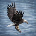
Grabbing Some Lunchby TommyMoe21Comment: Hello from the Critique club
An appealing image that contributes well to the free study
A great action shot that is I suspect the result of many hours dedication as opposed to simply being in the right place at the right time. These are always going to be very appealing, certainly to me anyway. I like that you have chosen not use too high a shutter speed and left some inference of motion in his wingtips that works really well for me. My only two preferences would be for a little less blueness of the water, I think it would have worked better in its natural state. The other thing is that it is a little too tightly cropped, it would be preferable to have room for the bird to fly into. The execution of the shot itself is excellent and you deserve every credit for accuracy and timing.
A respectable score, well done and, thank you for your entry. |
| Photographer found comment helpful. |
| 02/08/2016 11:52:36 AM |
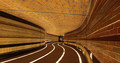
16_01_Kaufmann Sunriseby jbcarleComment: Hello from the Critique club
An appealing image that contributes well to the free study
I like your composition with the emphasis on the diagonals of the supports with the sunset sky in the background and the reflections of it on the right. Those reflections are indeed the most appealing part of the image for me, the colours are vivid but I most like the broken diagonals . The very nature of the image with all those diagonals makes it very dynamic. I like the reference to a harp one of your commenters made and agree a more meaningful title would have a refernce to a harp in there.
A respectable score, well done and, thank you for your entry. |
| 02/08/2016 11:46:04 AM |
Never • Eat • Soggy • Waffles by Ja-9Comment: Hello from the Critique club
An appealing image that meets the challenge well
Thanks for that Janine, I've not heard that one before – I know, I've led a very sheltered life! What lovely compasses. I generally like your composition though I might prefer to see a small amount of cropping of the bottom of the front compass in preference for more of the top of the image. Also, a smaller aperture to clearly define all of the front compass with the rest in soft focus would have made it even more appealing to me. I quite like the lighting but it is a little on the bright side in places, the colours are all well reproduced.
I'm sorry you didn't get any comments during the challenge, but yes, I did get and enjoy the title immediately, thank you for your entry. |
| Photographer found comment helpful. |
| 02/08/2016 11:37:42 AM |
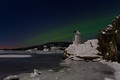
The Little Lighthouseby asijComment: Hello from the Critique club
An appealing image that contributes well to the free challenge
An attractive landscape made even more appealing by the addition of those good old Northern Lights. Your composition is good with interesting foreground and background. The undulating horizon and proximity of the greens and reds make it very appealing, however, I do wish there was more sparkle in the whites of the snow I think this could benefit greatly from some burning in to make the whites whiter and more snow-like whilst still retaining the evening darkness in the rest of the image.
Thank you for your entry. |
| Photographer found comment helpful. |
| 02/08/2016 11:31:17 AM |
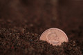
In God we Trustby clickodakComment: Hello from the Critique club
An interesting image that meets the challenge
Good accurate focussing in this close up and wide aperture to isolate it well from the background. It's quite an interesting choice to use soil and reasonably conceivable that a coin could fall in such a way in soft soil so well done. I like that the coin is on one of the Thirds hotspots, I might perhaps have chosen to use the lower left to give more room for the eyes of the person to look into, in the same sort of way that it makes a normal portrait more interesting. The coin is well lit with the lettering and head standing out well though it sort of looks a bit artificial I think perhaps a little burning in may have helped but not too much as it still needs to stand out from the soil.
Thank you for your entry Marcel |
| Photographer found comment helpful. |
| 02/08/2016 11:18:57 AM |
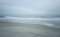
w h i s p e r • s o f t l yby Ja-9Comment: Hello from the Critique club
An interesting image that contributes well to the free challenge
What a lovely abstract. There are some lovely pastel shades running through the image with nothing dominating, it all contributes collectively to make for a very appealing and intriguing image. The only minor improvement would be the sharply defined centre portion might be better softened up a little so that it is not quite so clearly defined and more in keeping with the rest of the soft image.
A very respectable score, thank you for your entry Janine |
| Photographer found comment helpful. |
Home -
Challenges -
Community -
League -
Photos -
Cameras -
Lenses -
Learn -
Help -
Terms of Use -
Privacy -
Top ^
DPChallenge, and website content and design, Copyright © 2001-2026 Challenging Technologies, LLC.
All digital photo copyrights belong to the photographers and may not be used without permission.
Current Server Time: 05/07/2026 02:10:40 AM EDT.