|
|
|
Showing 1041 - 1050 of ~3781 |
| Image |
Comment |
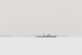
| 03/09/2016 12:24:50 PM | islandby fngood83Comment: Hello from the critique club
An appealing image that contributes well to the free study challenge
I like your simple high key image, the darker island contrasts well against the distant background and the sky. Personally, I think I would have made more of the lovely tones of the foreground against the less impressive tones of the sky by recomposing with predominantly foreground with a much reduced sky. However, the simplicity of your original vision remains and works very well, these are often the most effective sort of shots, the simpler the better.
Thanks for your entry, well done |
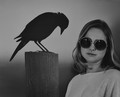
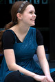
| 03/09/2016 11:58:42 AM | untitledby MeMex2Comment: Hello from the critique club
An appealing image that contributes well to the free study challenge
It is a nice composition and works well in mono. In terms of your assignment I would say the lighting is quite effective, there are no harsh shadows or highlights it is fairly even.
Before I answer your specific questions I have to disagree with one of your commenters, the title is always an important element of every submission, it helps your viewer to discern your intention in creating the image and their own interpretation of the end result. You can clearly see from your commenters that your image did work in the way that you intended, so very well done there. For me, although I do like those huge dark glasses they do reflect the rest of the room you were using, which wouldn't have been such a big problem if had been a darkened room without windows! As it is the windows and bright spots are hugely distracting and detract fro the end result, other than that, the contrast in your model ought to be raised to avoid the crow dominating quite so much as it does but perhaps this was a deliberate part of your intention?
Anyway, well done and thanks for a very interesting entry Jane |
| 03/09/2016 11:44:17 AM | Studying the Old Fashioned Wayby dpeden182Comment: Hello from the critique club
An appealing image that contributes well to the free study challenge
When I saw your lens details I thought wow, all that light-gathering power, only to see that you stopped down to f3.5, presumably for sufficient DOF on the candle and flame. You were right to see the mono potential in your image and I agree it is a great image, you ought to approach the candle manufacturers to use it in their advertising.
I like your composition, I like the predominant low key lighting, there is a good range of tones throughout and the depth of field works well throughout. Perhaps the only thing I might have changed would have been to turn the candle round to hide the text and an authentic quill would have been a lovely touch too.
I'm disappointed for you that it didn't get the recognition in score and comments that it deserved, it's great to see you participating at such a young age, I look forward to seeing more from you soon, I hope this helps, thanks for a great entry Daniel.
P.S.
Hope the homework went well! |
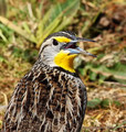
| 03/09/2016 11:05:58 AM | Wild Female Meadowlarkby sfaliceComment: Hello from the critique club
An appealing image that contributes well to the free study challenge
The vivid colouring and detail are the elements that give your image additional impact. You made very best use of the golden opportunity that presented itself to you by careful selection of the technical details, a choice of aperture to get sufficient depth of field to capture all of the bird, including its beak, whilst isolating it from the background and retaining sufficient soft focus detail. This is a very accomplished study that deserved a higher score and comments, I hope this makes up for it. Well done Alice. |  Photographer found comment helpful. Photographer found comment helpful. |
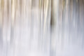
| 03/09/2016 10:52:30 AM | w i s p s • o f • d r e a m s by Ja-9Comment: Hello from the critique club
An appealing image that contributes well to the free study challenge
I knew it was yours Janine before I even saw your name! As you know, I like these motion abstracts, many of your included. I love the subtle shades and the blend into more uniform and lighter base, it all feels very vibrant. Unfortunately this is not always going to work for the masses! I am disappointed for you that the score was so low and the lack of comments but perhaps it was just too abstract for them to appreciate? You'll always have one who appreciates them here Janine, thanks for your entry. | | Photographer found comment helpful. |
| 03/09/2016 10:44:18 AM | Sisterhoodby dtremainComment: Hello from the critique club
An appealing image that meets the challenge
She is a lovely model and you have captured her nice natural smile in a very attractive way. However, I feel it lacks the sharpness necessary to give it that extra impact, there feels a softness throughout that may be down to camera shake. Looking at your EXIF the 1/125 should under normal circumstances avoid this problem but I see you have used 173mm focal length in which case I think I would have raised the ISO to 800 to get into the 1/250 range which should hopefully have given you a sharper image. Failing that the softness may be inherent in the lens itself, whilst they are a great travel lens they inevitably come with some shortcomings.
The other problem is the fall of the light itself, it is lighting areas of her forehead, cheek and nose and arms in a not entirely enhancing way. The problem is that it is forming highlights in these areas. In the case of her arms and hands this may have been best avoided with a closer crop of just her face and shoulders.
A good attempt, thanks for your entry David.
|
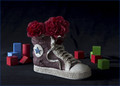
| 03/09/2016 10:25:00 AM | Child's Play in the Window Lightby gipper11Comment: Hello from the critique club
An appealing image that meets the challenge well
Lovely effective use of available light with an interesting and original composition that works well against the dark background. The subtle but sufficient light from the right serves well to avoid the dark shadows that would result from the main window alone. The inclusion of the blocks is both clever and effective in revealing the light through its varying shades and colours.
It surprises me it didn't score higher, I think it all works very well to make best use of the available light, well done Larry. | | Photographer found comment helpful. |
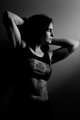
| 03/09/2016 10:03:02 AM | Working it outby snafflesComment: Hello from the critique club
An appealing image that meets the challenge well
A very accomplished self portrait Susan, you've made great use of that lovely bulls-eye window. I like the way the light emphasises your face and arms with the sudden transition from light to dark around the neck and arms. With your use of mono, there is a lovely full range of tones throughout, I like the way the darker tones are at the lower half of the frame blending into a firm dark base. Your choice of pose works well avoiding the problems you anticipated and yes, showing your lovely figure off to our delight, you really are in excellent shape, go easy on the sirop d'erable!
I haven't seen the other entries but I am surprised this didn't score higher. Nice to see you proudly sporting your Canadian top Susan. | | Photographer found comment helpful. |
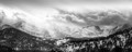
| 02/15/2016 05:43:42 AM | m a j e s t i c by Ja-9Comment: Hello from the Critique club
An excellent image that meets the challenge well
Its a funny old challenge this, I don't know how the voters decide what is the broken rule and how they react to it, positive or negatively in their scoring. Anyway, you have a great landscape that has been enhanced by the broken rule in such a way that it is perfectly believable, we've all seen this sort of sky at some time. I like your mono processing there is a wide range of tones. I think it should have scored better than this but this is obviously due to the nature of the challenge itself.
Thank you for your entry. | | Photographer found comment helpful. |
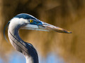
| 02/15/2016 05:38:42 AM | GBHby PhocalComment: Hello from the Critique club
An excellent image that meets the challenge well
I can understand and relate to your comments wholeheartedly, I am equally confused by the voters reaction having just commented an image that scored a lot higher than yours and yet this both in terms of the challenge and the image itself is the better image in my opinion. You've certainly filled the frame well here and you've nailed the sharp focus that is essential for this type of image. Your manipulation of the image with the canvas is only faintly evident with the benefit of your description which, of course, the voters don't have the benefit of. The difference in the canvas part is such that it would be perfectly acceptable in an original image. I love the twin shadows from his crest on the back of hos neck, I think you've made an excellent job of everything about the image and I commend you.
Thank you for your entry. | | Photographer found comment helpful. |
|
Showing 1041 - 1050 of ~3781 |
Home -
Challenges -
Community -
League -
Photos -
Cameras -
Lenses -
Learn -
Help -
Terms of Use -
Privacy -
Top ^
DPChallenge, and website content and design, Copyright © 2001-2026 Challenging Technologies, LLC.
All digital photo copyrights belong to the photographers and may not be used without permission.
Current Server Time: 05/07/2026 09:58:27 AM EDT.
|