| Image |
Comment |
| 03/21/2016 06:31:39 AM |
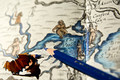
The Pooleby PangurbanComment: Hello from the Critique club
An interesting image that meets the challenge well
What a lovely interesting map you’ve used it is a great background for the pencil. I have to be honest and say that I’m not really sure why you added the shaving I feel it rather detracts from the end result, but since you have and you have asked for advice regarding the processing if you applied local dodging to the shaving alone this would not have affected the background and woud have brought out a little more detail in the shaving itself. With regards to the depth of filed I think its perfect it focusses our attention on the Poole and pencil whilst giving us an appealing soft focus view of the other interesting detail in the map.
I can imagine the jocularity yer piddles and pooles caused as a nipper! Thanks for your entry Ellie |
 Photographer found comment helpful. Photographer found comment helpful. |
| 03/21/2016 06:21:24 AM |
Make the Finishing Touchesby gipper11Comment: Hello from the Critique club
An interesting image that meets the challenge well
You’ve found an interesting background for your pencils it works well to convey the idea of using the pencils to colour the image. Having said that I have to say that I don’t find the way the pencils have been laid on top really adds much to the overall image, they just feel a little too regimented all being aligned in a similar fashion. I actually like the way the hand is holding the implements in the drawing appealing and I would have liked to seen this sort of chaotic order replicated so that they were to one side or the other of the hand in a similar way, I think it could have worked well and for me more appealing
Thanks for your entry Larry |
| Photographer found comment helpful. |
| 03/21/2016 06:11:55 AM |
Paint-Cilby clickodakComment: Hello from the Critique club
An excellent image that meets the challenge very well
What a great concept Marcel, I hope you’ve patented the idea, it could take the world by storm! Seriously though it is a great and, as far as I am aware, original idea, the colours of the pencils are perfect nice and vivid against the more sombre background. Isn’t it interesting how your two commenters differ so much on the lighting aspect, personally I think you’ve made a good job of it, the lighting is nice and even but it does lead me on to my minor criticisms. Its down to that all important attention to the minor details, it would have been even more impressive if all of the tips of the pencils had been perfectly level and also the lighting on the blue pencil, the yellow next to it is casting a shadow on it. Like I say, they are only minor but they are important.
Well done Marcel for submitting another excellent entry. |
| Photographer found comment helpful. |
| 03/18/2016 03:49:21 PM |
High Schoolby snafflesComment: Hello from the Critique club
An appealing image that meets the challenge.
Well there's definitely a hint of Cindy Sherman here Susan, the fun is self-evident. You've captured the spirit of her work in the awkwardness of that 'moment' in the smile and the natural unpreparedness of a 'selfie' meant to be a reflection of someone other than yourself. Even down to the lighting reflected in the glasses and lips you've nailed it, normally such highlights would be less than desirable but in the context of the challenge they are the icing on the cake!
Thanks for your entry Susan. |
| Photographer found comment helpful. |
| 03/16/2016 04:53:04 PM |
Frozen islandby marvinComment: Hello from the Critique club
An appealing image that nearly meets the challenge.
From your title we can see what your intention was ie., to centre the island to fulfil the challenge brief. However, in the true sense of the challenge brief it only loosely fills that centred requirement, yes its centred vertically but not horizontally but that would have altered the composition detrimentally so you have done the right thing but your choice of subject, appealing as it is, is not really enabling you to meet the challenge fully. In addition the lighting is harsh and flat with a plain uninteresting sky. Good landscape photography is as much about the light as it is about the composition, you really need to go back again and again until you hit it with the right light that transforms your image from a snapshot to an image with that magic wow.
Thanks for your entry Robert. |
| 03/16/2016 04:44:10 PM |
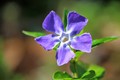
In the Springby tolovemoonComment: Hello from the Critique club
An appealing image that meets the challenge.
A competent shot of a lovely looking flower more or less centred in an oblong frame with off-centred foliage and that is one of the things that detracts from a true centred composition. I think you would have been better here to have close-cropped it to a square so that it filled the frame more and therefore gave it more prominence and impact. As it stands although you have nice lighting that serves to model the flower well it lacks wow and has foliage foreground and background that detracts from the core intention for a centred composition. Although I like the non-symmetrical lower left petal again it detracts from the overall result.
Thanks for your entry Tracy. |
| 03/16/2016 04:34:44 PM |
Shuttlecock Stuck in Racquetby clickodakComment: Hello from the Critique club
An appealing image that meets the challenge.
Is that what you call a power shot? Initially intriguing the way you have embedded the shuttlecock into the strings the way you have, that's not going anywhere in a hurry! Yes, I do like your composition but the nature of the subject is such that although its centred it doesn't really feel like it, there is a predominance of the shuttlecock towards the near left because of the composition. A properly centred composition that would have shown the shuttlecock to be more centred would have been far less appealing than your composition.
Thanks for your entry Marcel. |
| Photographer found comment helpful. |
| 03/16/2016 04:25:45 PM |
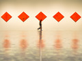
Running Artby PhocalComment: Hello from the Critique club
An appealing image that meets the challenge well.
You were right to ask the question and I think your score and comments have answered it for you! Whilst I adored your original and I still regard this image as excellent per se, it really doesn't do it any favours to so closely replicate the original even if it was so successful. I think you needed to distinguish from it predecessor to make it another original. Given the challenge brief in my mind I see this in portrait orientation with just the one red diamond or three at most with the camera on the floor making dynamic focused use of the centred tile line. Or alternatively zoomed in on those gorgeous reflections but then you're starting to lose the challenge theme.
Nice to see this gorgeous image again but not so soon. Thanks for your entry Ronnie |
| 03/14/2016 07:07:00 AM |
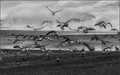
To Fly Awayby sfaliceComment: Hello from the Critique Club
An interesting image that meets the challenge well
I agree with you, this feels like a free study its a very loose theme, your image fulfils the brief with the birds leaping into flight and freedom leaving us all grounded and envious, again I agree, wouldn't it be nice just once...
I like these frame filling shots of birds in various stages of flight they are always so dynamic and therefore appealing and your timing has caught them in the act of 'leaping' into flight. Initially, I thought the image had been over-sharpened but I am assuming the effect is due to a filter that you have used? If this is a seascape then the horizon needs levelling but not if it is a landscape, however, in view of its ambiguity I would have levelled it anyway.
Sorry you didn't get any comments I hope this makes up for it. Thanks for another interesting entry Alice |
| Photographer found comment helpful. |
| 03/14/2016 07:06:43 AM |
To Fly Awayby sfaliceComment: Hello from the Critique Club
An interesting image that meets the challenge well
I agree with you, this feels like a free study its a very loose theme, your image fulfils the brief with the birds leaping into flight and freedom leaving us all grounded and envious, again I agree, wouldn't it be nice just once...
I like these frame filling shots of birds in various stages of flight they are always so dynamic and therefore appealing and your timing has caught them in the act of 'leaping' into flight. Initially, I thought the image had been over-sharpened but I am assuming the effect is due to a filter that you have used? If this is a seascape then the horizon needs levelling but not if it is a landscape, however, in view of its ambiguity I would have levelled it anyway.
Sorry you didn't get any comments I hope this makes up for it. Thanks for another interesting entry Alice |
| Photographer found comment helpful. |
Home -
Challenges -
Community -
League -
Photos -
Cameras -
Lenses -
Learn -
Help -
Terms of Use -
Privacy -
Top ^
DPChallenge, and website content and design, Copyright © 2001-2026 Challenging Technologies, LLC.
All digital photo copyrights belong to the photographers and may not be used without permission.
Current Server Time: 05/07/2026 01:14:31 AM EDT.