|
|
|
Showing 751 - 760 of ~1585 |
| Image |
Comment |
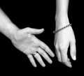
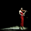
| 06/08/2006 01:11:35 PM | I want to hold your hand...by BadgerComment: ==Greetings from the Critique Club==
Composition
You've used the rule of thirds well, and the lines leading from left to right are very nice. Cutting off both hands in mid-forearm is a little bit distracting, for me, though.
Camera Technicals
The exposure is basically good, but the high contrast leaves it feeling like the hands are out in space.
Post Processing
I think I would have chosen to emphasize some colors, rather than going for the true black and white looks, to show some of the "cheer" that is in the song.
Challenge
Without a question this meets the challenge very well, and it wouldn't even require the title for me to know that.
Overall Impression
The hands seem a bit disconnected from EVERYTHING, and that doesn't work really well for me. The song you picked is a "happy" song, and I think the picture is a little "sad". It's technically well done, and I like the bracelet, but it could probably be stronger with some happy colors and cheerful things.
These are just my thoughts and impressions. I hope you find them to be helpful and constructive. Please contact me by PM if you have questions or responses. |  Photographer found comment helpful. Photographer found comment helpful. |
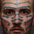
| 06/07/2006 11:13:52 PM | 'Til I'm Blue in the Faceby nards656Comment: Just for clarity in the world... :)
This WAS a bounced flash, I was just very close to the camera and that's why the dark eyes.
Thanks for the feedback! Very much appreciated. |
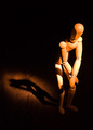
| 06/07/2006 11:05:10 PM | Woody Presleyby tngrndreamComment: ==Trading Post==
Congratulations on a new personal best! That's always a neat accomplishment.
I like the woody - and a lot of other folks do to. The lighting on him is a touch harsh - gentling that would go a long ways and be worth at least one point from me.
Your composition is excellent. Inclusion of the shadow is also very appropriate. I think I would like to see the texture that is in the shadow area extend outward just a little more, but that might kill the shot too.
As always, just my thoughts. Keep up the good work.
EDIT TO ADD - ISO was too high, I agree. | | Photographer found comment helpful. |
| 06/07/2006 11:01:40 PM | A Glass of Wine with a Bottle to Goby chaliceComment: ==Trading Post==
I really like this compositions and the colors, even though the red is a little too "dense", whatever I mean by that! I like the sparkle on the glass.
The black is almost too black. I would like to see some shine and more of a reflection from the bottle. For some reason the black has a really "processed" appearance.
I really dig the texture in the wineglass. | | Photographer found comment helpful. |
| 06/07/2006 10:37:39 PM | | | Photographer found comment helpful. |
| 06/07/2006 10:10:10 PM | total successby DanSigComment: ==Trading Post==
I love the negative space. It does intrigue me that she's looking OUT of the picture and it comes across this well. A good example of breaking rules and it working well.
The lighting - obviously out of your control - IS a bit harsh :)
| | Photographer found comment helpful. |
| 06/07/2006 09:31:19 PM | "Crying, Waiting, Hoping"by MelethiaComment: ==Trading Post==
Trying to catch up from being so far behind...
Wow, no 1s. That's an accomplishment. That's an amazing capture, and the pure "difficulty" factor garnered you a lot of high votes. Your photography has come a LONG ways recently. The composition here is strong, even though I don't think I would have cropped it quite this way. | | Photographer found comment helpful. |
| 06/07/2006 09:29:01 PM | unwilling modelby timfythetooComment: --Trading Post--
Trying to catch up on some of the comments I'm behind on....
I really like this. I like the skintone, and I really like the blue eye. The single light source is very obvious and very well done. The composition is a bit centered and thus feels static, but I'm not sure if it would look better off center or not. | | Photographer found comment helpful. |
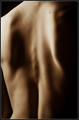
| 06/07/2006 09:10:58 PM | Bodyby zenelfComment: ==Greetings from the Critique Club==
Composition
My eye wanders a lot as I study this shot. There are really no leading lines, and there are no points that I can easily focus on. The shadows are dominant and the crop seems a little bit off. I wish I could offer more constructive advice here, but I'm not sure of what I would do to improve this particular composition.
Camera Technicals
The histogram is probably acceptable, but the harsh lighting makes this a higher contrast picture than I think would work best. Softer lighting would have made this a more "sensual" image, I believe.
Post Processing
Here again, the overall result seems a little more harsh than optimal.
Challenge
You've very clearly met the challenge description. I doubt there was much question about that, as the use of shadows emphasize it.
Overall Impression
To me, this is a confusing image to look at, and the subject is hard to define. However, as a bit of an abstract, it is well done and technically good. It creates more questions than it answers, and it leaves me questioning what the photographer is attempting to communicate. I did not vote in this challenge, but probably would have given this a 6 or 7.
I hope you find these thoughts to be helpful and constructive. Keep up the good work! This is a good score. |
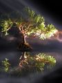
| 06/07/2006 08:58:56 PM | Juniper Bonsai in Early Morning Fogby deepfrog17Comment: ==Greetings from the Critique Club==
Composition
The overall choice of composition intrigues me because it's not really centered, it's not rule of thirds, but it's only slightly off center. I think I would prefer the horizon line just a touch lower, but that's just my initial impression.
Camera Technicals
Overall, the exposure is good, but the overexposed highlights create more contrast than I think is best for a "fog" picture. Fog would be best presented in a slightly "flatter" exposure, I think.
Post Processing
Seems well done, but the abundance of green destroys the "fog" mentality a little, so maybe desaturating or using selective color might allow the fog to be more dominant.
Challenge
I think it's clear you met the challenge, and the use of directional light enhandced that very well.
Overall Impression
My single biggest negative thought is that I don't "feel" the fog. Perhaps it was not dominant and wasn't intended to be, or it was difficult to bring it out. However, once you put that in the title, I really expected a more "foggy" image.
I hope you find these comments and thought to be helpful and constructive; they are simply expressions of my opinion and are not intended at all to be harsh or overly critical. Thank you! | | Photographer found comment helpful. |
|
Showing 751 - 760 of ~1585 |
Home -
Challenges -
Community -
League -
Photos -
Cameras -
Lenses -
Learn -
Help -
Terms of Use -
Privacy -
Top ^
DPChallenge, and website content and design, Copyright © 2001-2026 Challenging Technologies, LLC.
All digital photo copyrights belong to the photographers and may not be used without permission.
Current Server Time: 07/23/2026 02:54:37 AM EDT.
|