| Image |
Comment |
| 01/17/2006 04:33:10 PM |
Streamby gurlwithapenComment: this is very very busy. its not helped by the sepia tone which doesn't allow any portion to pop out for lack of different color tones. the subject is lost to my eye, and as far as the entire image as the subject nothing reads clear enough to tell u anything other than a very small portion of a streem. |
 Photographer found comment helpful. Photographer found comment helpful. |
| 01/17/2006 04:28:06 PM |
Neuschwansteinby ChiquiComment: very nice love the warm color tones and the off whites would've like just a tad bit wider framing so my eye could really taken not just the subject but the sroundings also, great subject and color (imo) poorly composed.
GL |
| Photographer found comment helpful. |
| 01/17/2006 04:25:56 PM |
Poster Girlby mrmorrisComment: cool, the gentelmen at the far left really makes this work well. his conection with the poster and the girl-in-red's conection with him. it makes the eye go all around the image looking at each person. well seen. |
| Photographer found comment helpful. |
| 01/17/2006 04:23:31 PM |
Paleochora Sunsetby michael_pComment: the foreground looks very washed-out/hazy a contrast layer adjustment to just the water beach and rocks would've really helped this image to pop over all. much like the sky does on its own.
wounderful color tones in the sky tho. good luck |
| Photographer found comment helpful. |
| 01/16/2006 01:58:39 AM |
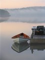
"ET Bugaboo"by getnoutsideComment: this is pretty, the colors are verry nutral and not so stimulating but this helps the main point of intrust in poping the wood inside the boat, nicly taken
(btw i don't understand the title) |
| Photographer found comment helpful. |
| 01/16/2006 01:56:11 AM |
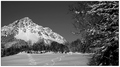
Mountain Tracksby KHoltComment: there are alot of jpg artifacts in the sky...tonaly in is a rather nice image but there is not main focus that draws the viewers eye instead u wander across the entire image...it is rather poor compositionaly (IMO) and fights itself as an image and espicaly a B&W |
| Photographer found comment helpful. |
| 01/16/2006 01:53:14 AM |
Freedomby TerramarComment: this would be alot stronger image if it were composed with the rule of thirds kept in mind center subject just isn't as dynamic |
| Photographer found comment helpful. |
| 01/16/2006 01:51:55 AM |
|
| Photographer found comment helpful. |
| 01/16/2006 01:50:56 AM |
Enzo Ferrariby mhansonComment: use of a polorizer may have aided in cutting down the reflections om the side of the car.
the composition is getting there but not quite rule of thirds which would've given this image a much stronger look far more graphic then it is now. |
| 01/16/2006 01:37:31 AM |
Bicycle at the Marketby JeanComment: oh good i truly love this image its in my favs. from your portfolio.....
and prob. (but i have not yet been through all the other submitions) my fav. in the entire challenge.
absolutly splended you know the score u get/deserve. |
| Photographer found comment helpful. |
Home -
Challenges -
Community -
League -
Photos -
Cameras -
Lenses -
Learn -
Help -
Terms of Use -
Privacy -
Top ^
DPChallenge, and website content and design, Copyright © 2001-2026 Challenging Technologies, LLC.
All digital photo copyrights belong to the photographers and may not be used without permission.
Current Server Time: 07/17/2026 07:37:29 PM EDT.