| Image |
Comment |
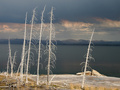
| 01/26/2006 02:45:40 PM |
Paradiseby A ShrubberyComment: an increse in saturation would make this a killer shot.
also very stok in framing and concept, not a bad thing but seen a 100 shot just like it. GL |
 Photographer found comment helpful. Photographer found comment helpful. |
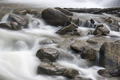
| 01/26/2006 02:42:38 PM |
Base of Boulder Fallsby donnievComment: hasn't even loaded all the way but i can tell very nice image absoulty lov the framing and u hit the nail on the head exposure wise. well done. |
| Photographer found comment helpful. |
| 01/25/2006 12:25:11 PM |
Dorothea Langley: The Haunting Eyes of Despairby SandyPComment: the capture is great the editing is far to obvious, and IMO more that she would do. your seperater edit to the backround is what i am refurring to, u should feather next time u do an outline like the 1 u did. also what every edit u did (looks like curves) has some odd hot tones 2 it, that have been very harchly grayed out and appear in very strange color. |
| Photographer found comment helpful. |
| 01/25/2006 12:04:05 PM |
|
| Photographer found comment helpful. |
| 01/25/2006 12:00:06 PM |
|
| Photographer found comment helpful. |
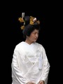
| 01/25/2006 11:59:20 AM |
Japanese Brideby cfischlComment: looks like the backround was once there and was taken away...its an odd blend the really white and the stark black.
if it were me i would have put her almost out of the frame 2 the left, so about half her body was in and you could see her stare across the black, it would be very striking that way. try a crop and then enlarge the canvis using black to that side...see how it looks. i don't know might not work at all, but to me center subject framing has is place and this doesn't hit it. very great capture tho. GL |
| Photographer found comment helpful. |
| 01/25/2006 11:54:49 AM |
Speedby payambComment: this image is smaller in size than the 640, it is a great shot but would be much better at a higher resolution and larger size. there are ways to meet the web's requirments, espicaly if u have photoshop. GL |
| 01/25/2006 11:52:42 AM |
''It should have been me....''by MikeOComment: nice contrast, the blacks don't totaly go black on the mac gamma. but thats fine i know what it would look like its just a little hazy. the left arm of the subject bothers e it oddly darkened and looks brused...its vey strange and i can't tell if is a natural shadow or if u did something to it, anyhow a dogg around it would really help to my eye, it would be a little less odd and drastic in that tonal area. |
| Photographer found comment helpful. |
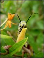
| 01/25/2006 11:48:32 AM |
Musical Loveby kosmikkreeperComment: nice pose, nice high key/highcontrast, looks great in sepia, as far as i can imagen it would be less dynamic in B&W. or at least a different shot... pretty guitar also i like the engraving plate around the tuners.
very well composed no complains here. u have a very nice shot.8 |
| Photographer found comment helpful. |
| 01/25/2006 11:45:06 AM |
Unititledby mandyturnerComment: this is great its amost like a water color, and the grain adds so much, it all really works.
its like a fine art shot of a not normaly fine art subject, really great image GL |
| Photographer found comment helpful. |
Home -
Challenges -
Community -
League -
Photos -
Cameras -
Lenses -
Learn -
Help -
Terms of Use -
Privacy -
Top ^
DPChallenge, and website content and design, Copyright © 2001-2026 Challenging Technologies, LLC.
All digital photo copyrights belong to the photographers and may not be used without permission.
Current Server Time: 07/16/2026 04:58:41 PM EDT.