| Image |
Comment |
| 11/26/2004 09:31:53 PM |
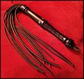
dominationby coldaComment: Ouch... for some reason Im kinda disturbed you just had this lying around. he lighting here is nice but the set up appears a little artifiical. 6. |
 Photographer found comment helpful. Photographer found comment helpful. |
| 11/26/2004 09:30:26 PM |
|
| Photographer found comment helpful. |
| 11/26/2004 09:29:13 PM |
The King of His Domain by LegatoMuzicComment: I get the feeling this will come very close to winning this challenge.... but I'm not exactly thrilled with the crop here, I think You've left too much space at the top and perhaps taken too much off at the arms. 7. |
| 11/26/2004 09:27:27 PM |
|
| 11/26/2004 09:25:57 PM |
U N Flag.by H R VerryComment: Given the current (sad) state of world politics I'm not sure that the UN is exactly a great embodiment of authority :), but this is a relatively nice flag shot (if A little uninspiring). |
| Photographer found comment helpful. |
| 11/26/2004 12:44:02 AM |
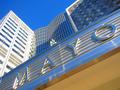
medical authorityby ssenguptaComment: Hmmm... is that a hospital.... is MAYO an acronym for something ?? Otherwise I'm not really getting the challenge link here. I'll give you the benefit of the doubt and a 6 for an interesting perspective. |
| 11/26/2004 12:42:45 AM |
|
| Photographer found comment helpful. |
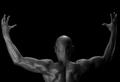
| 11/26/2004 12:41:43 AM |
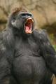
the world is mineby imagesloyolaComment: The lighting is fantastic here, and he's a pretty great subject for a shot like this. As an added bonus the pose definately conveys authority (at least in my humble opinion). Hope you do well... on the whole I haven't really been impressed with this challenge, but I really like this.9. |
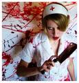
| 11/26/2004 12:38:22 AM |
N U R S Eby RegoComment: Oh man you are going to get cut to shreds over this one.... :P.
An okay idea, the nurse looks suitably menacing, but the focus appears a little too soft, the image is too small and I dont necessarily equate psychotic with authority. |
| 11/26/2004 12:34:57 AM |
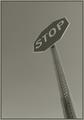
I dare you!by twentyfivesComment: I like the use of the angle here.... makes it considerably more interesting than it would have otherwise been. The over saturation makes the sign look great but the sky is much tooo blue in the top left. |
| Photographer found comment helpful. |
Home -
Challenges -
Community -
League -
Photos -
Cameras -
Lenses -
Learn -
Help -
Terms of Use -
Privacy -
Top ^
DPChallenge, and website content and design, Copyright © 2001-2026 Challenging Technologies, LLC.
All digital photo copyrights belong to the photographers and may not be used without permission.
Current Server Time: 06/25/2026 07:33:58 AM EDT.